Brainstorm
John Pfahl
|
|
|
John Pfahl is a photography who has quite literally shaped the way we see photography. His altered images, all of the enviromet that surrounds him master the use of space and composition to transform the given world into art. Born in America and brought up in New Jersey, Pfahl studied at Syracuse University and has since become an celebrated artist and educator in photography. His work has appeared in multiple very important collections such as Albright-Knox Art Gallery, J. Paul Getty Museum, Los Angeles County Museum of Art, San Francisco Museum of Modern Art and more. He has received awards for his pieces.
Pfahl uses the Environment surrounding him in his images and often alters these as for the rest he wants, this obviously works seeing his work and the recognition he has got.
Pfahl uses the Environment surrounding him in his images and often alters these as for the rest he wants, this obviously works seeing his work and the recognition he has got.
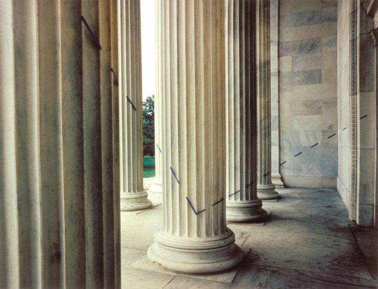
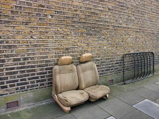
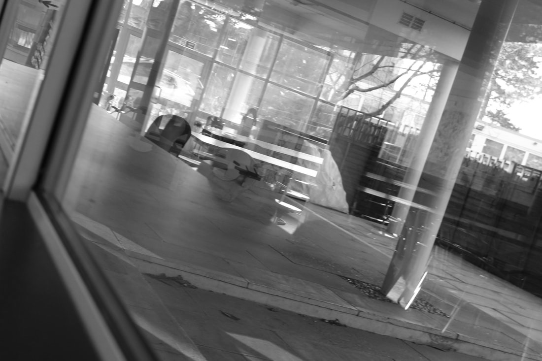
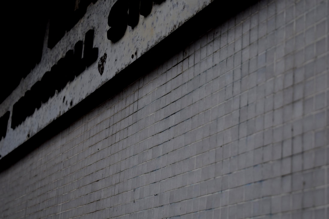
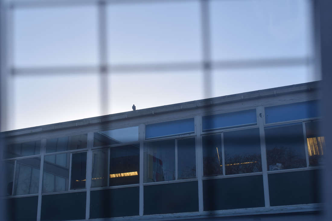
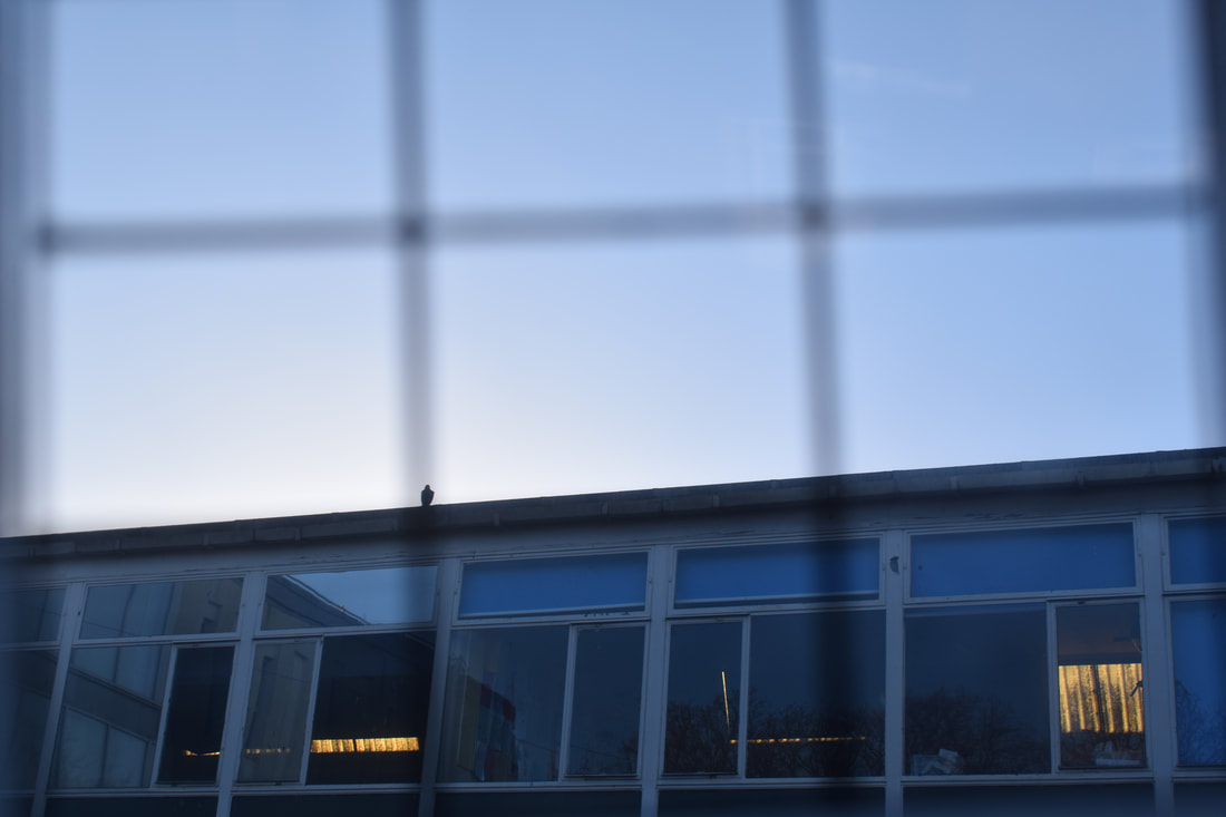
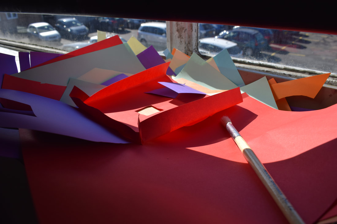
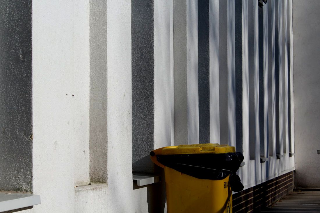
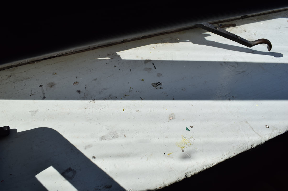
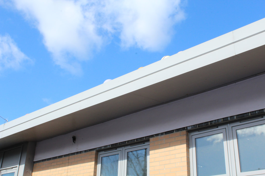
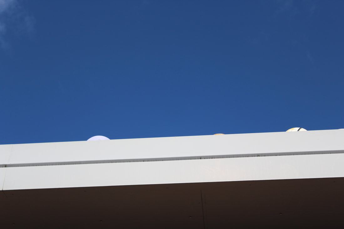
I picked the first photo on the left because the lighting and composition of the photo caught my eye. The way the shadow falls and the slant of the columns. Pfahl creates a sort of surreal image from completely normal environmental settings. The fact he drew on top of the photo creates more structure to the photo.
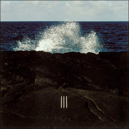
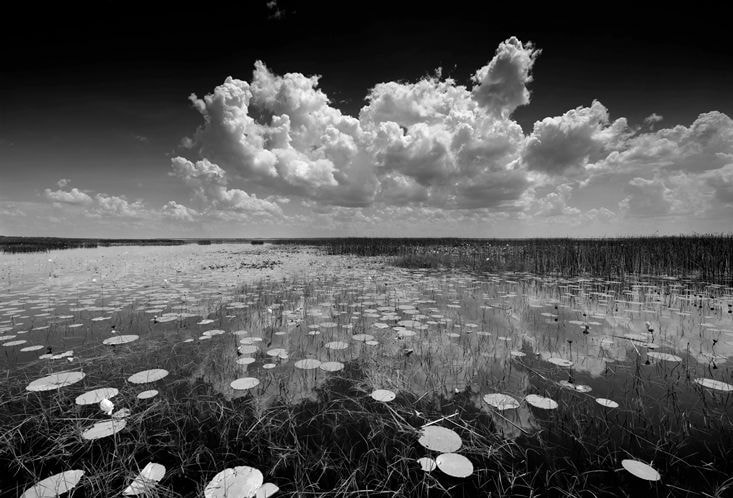
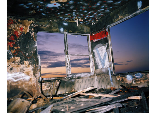
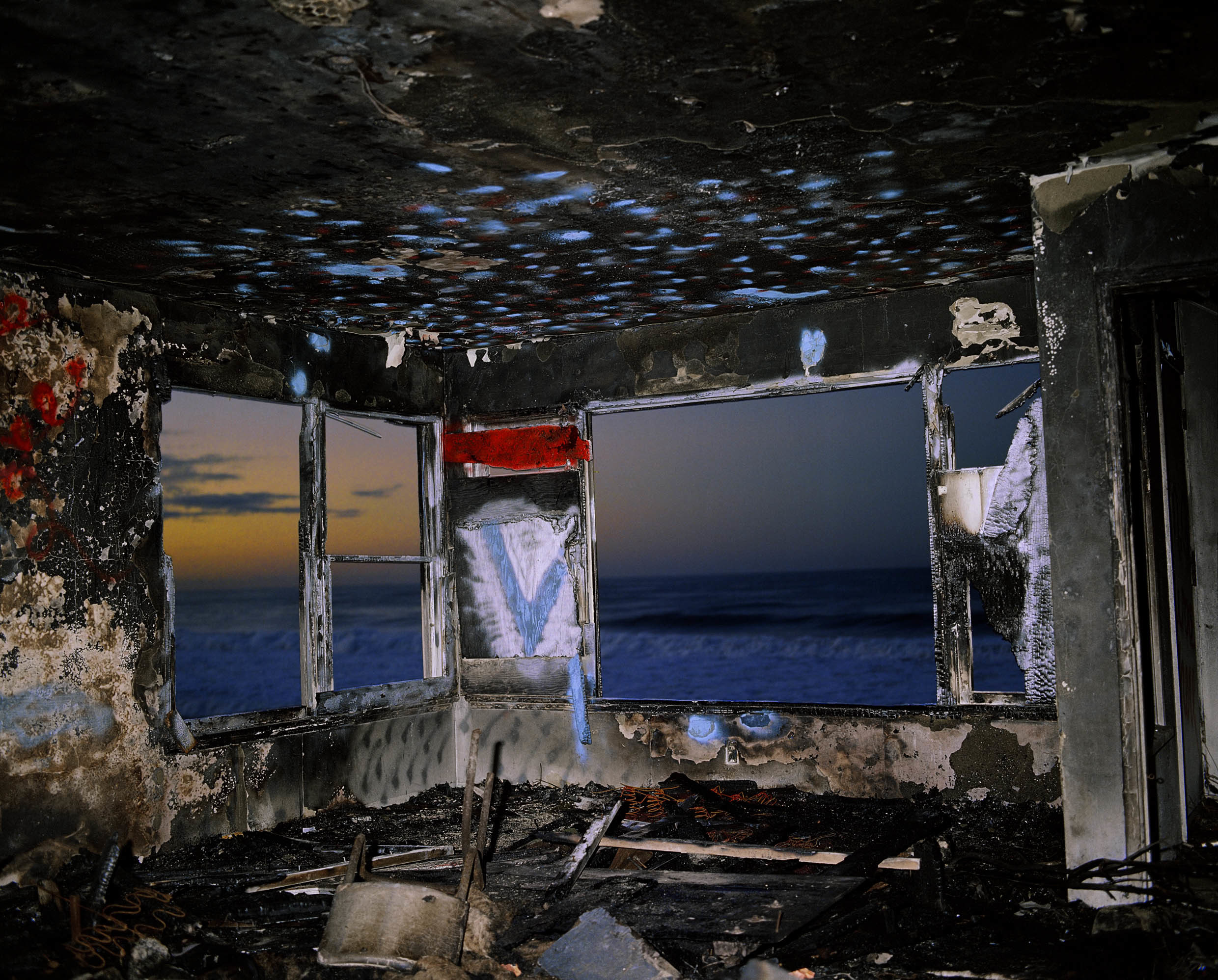
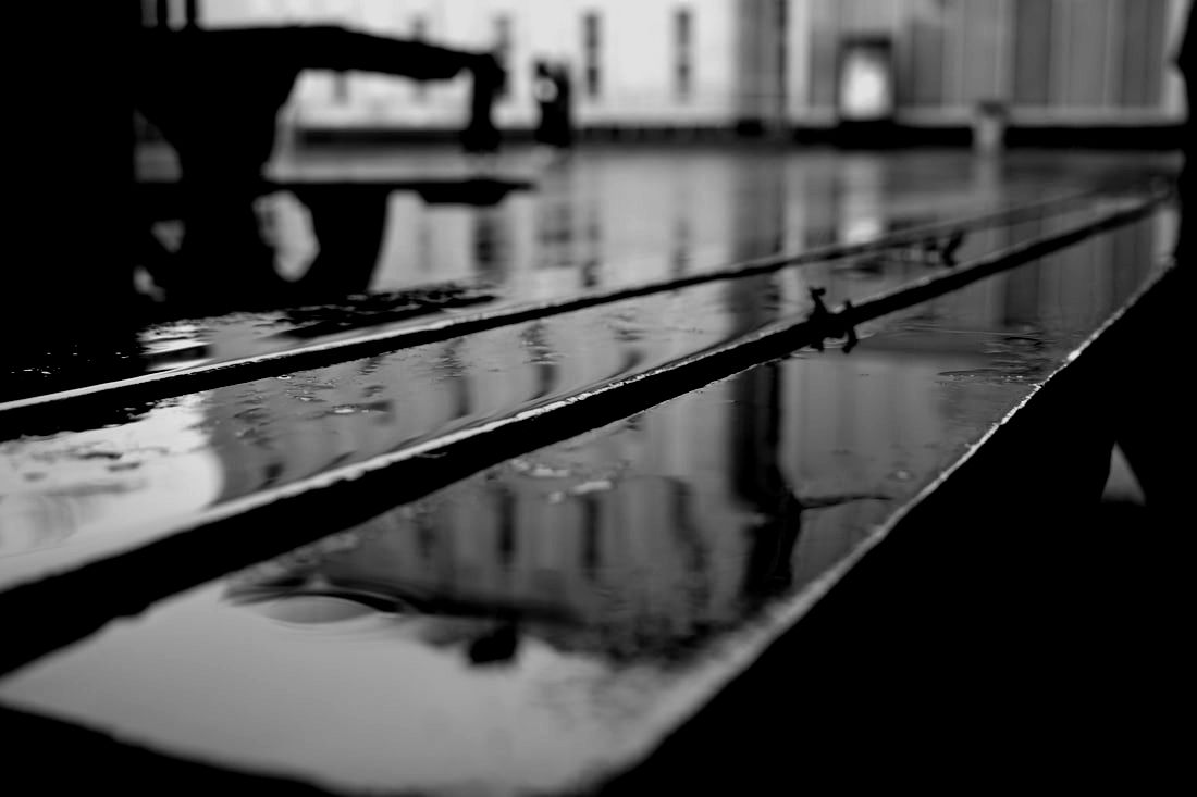
The photo in the middle transforms the simple waves into powerful image that shown how Pfahl sets the scene up and uses the rule of thirds to draw attention to the wave in the centre whilst not ignoring the dark rocks beneath.
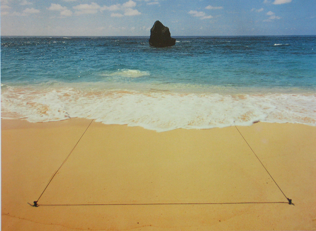
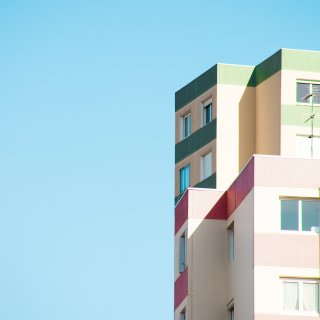
The last photo (on the right) caught my attention due to the colour scheme and composition of the photo. It draws the eye's attention to the centre and and the use of pen on top of the photo combines the photographers ideas .
The photo in the middle transforms the simple waves into powerful image that shown how Pfahl sets the scene up and uses the rule of thirds to draw attention to the wave in the centre whilst not ignoring the dark rocks beneath.
The last photo (on the right) caught my attention due to the colour scheme and composition of the photo. It draws the eye's attention to the centre and and the use of pen on top of the photo combines the photographers ideas .
Clyde Butcher
|
|
|
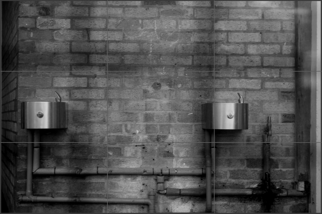
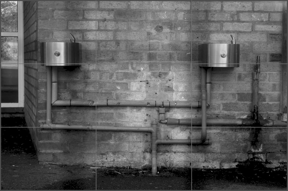
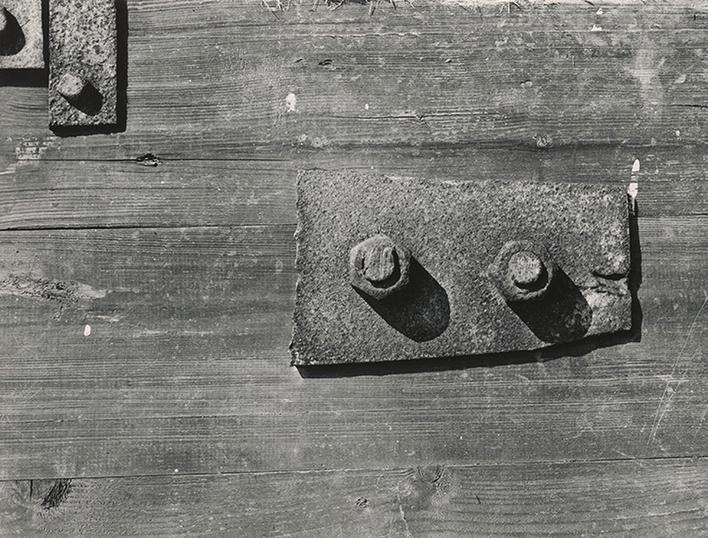
Clyde Butcher, born in 1942, Kansas City; is a fine arts photorapher popular for having insane detail and clarity in his environmental pieces. After gradating from California Polytechnic Sate University with a degree in architecture, Butcher taught himself photography in order to get around his inability to draw, vital for presentations of model buildings. He originally made a living in colour landscapes but then switched to large scale black and white images.
Butcher uses American landscapes to take beautiful environmental images without colour and his use of detail makes a beauty only seen rarely.
Butcher uses American landscapes to take beautiful environmental images without colour and his use of detail makes a beauty only seen rarely.
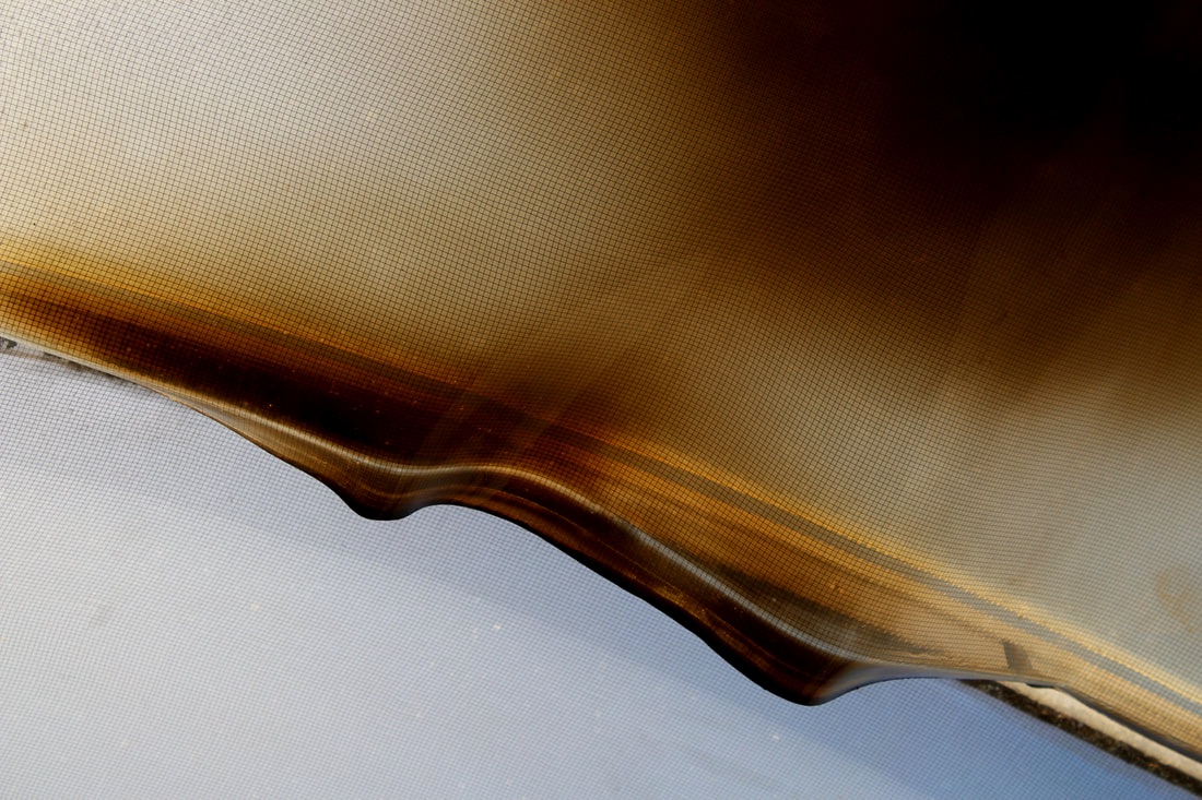
I chose the first photo on the left because of the surrealness of the photo and the way the cloud is portrayed. The way the light and composition is used makes the cloud look fluffy and aggressive at the same time.
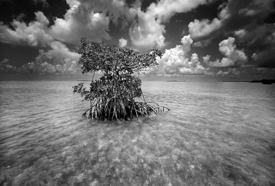
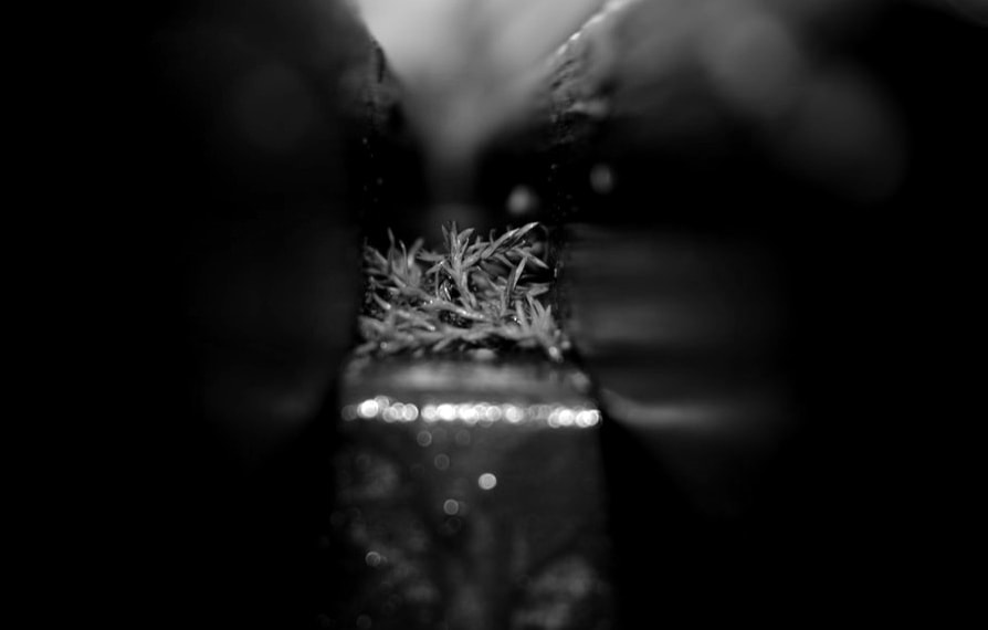
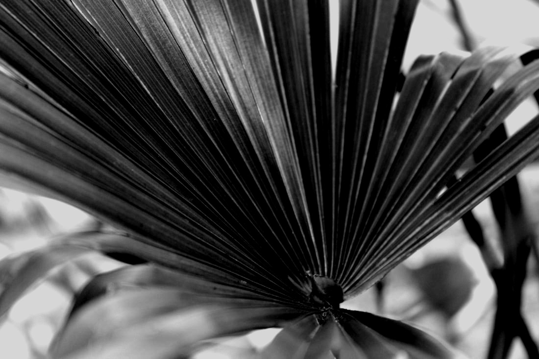
In the middle photo the way the plant is at the centre of the image and the water looks stormy shows how the artist uses the camera to create beautiful photos.
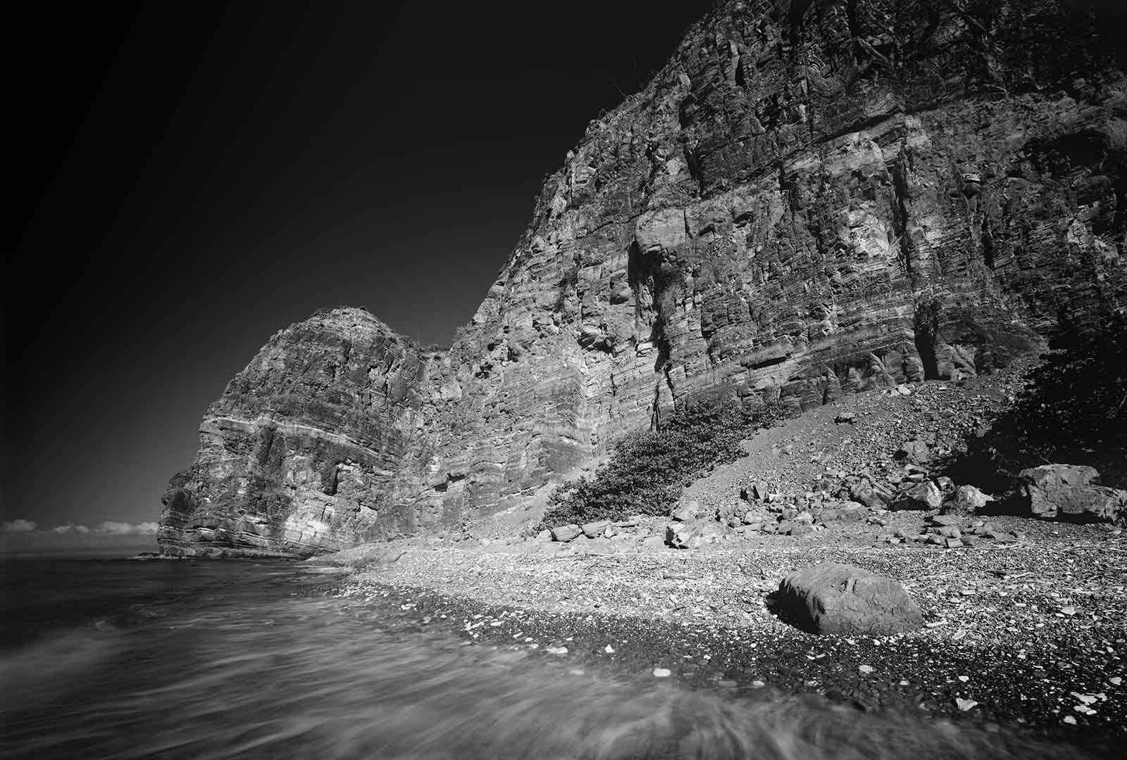
In the last photo mainly the use of lack of colour transforms the image by changing the normalish cliff to a beautiful photo.
In the middle photo the way the plant is at the centre of the image and the water looks stormy shows how the artist uses the camera to create beautiful photos.
In the last photo mainly the use of lack of colour transforms the image by changing the normalish cliff to a beautiful photo.
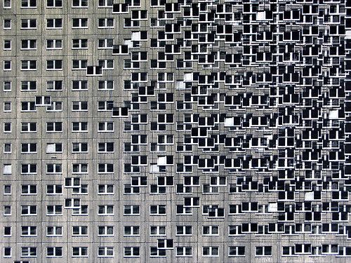
Evol
|
|
|
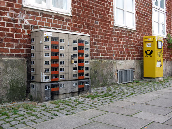
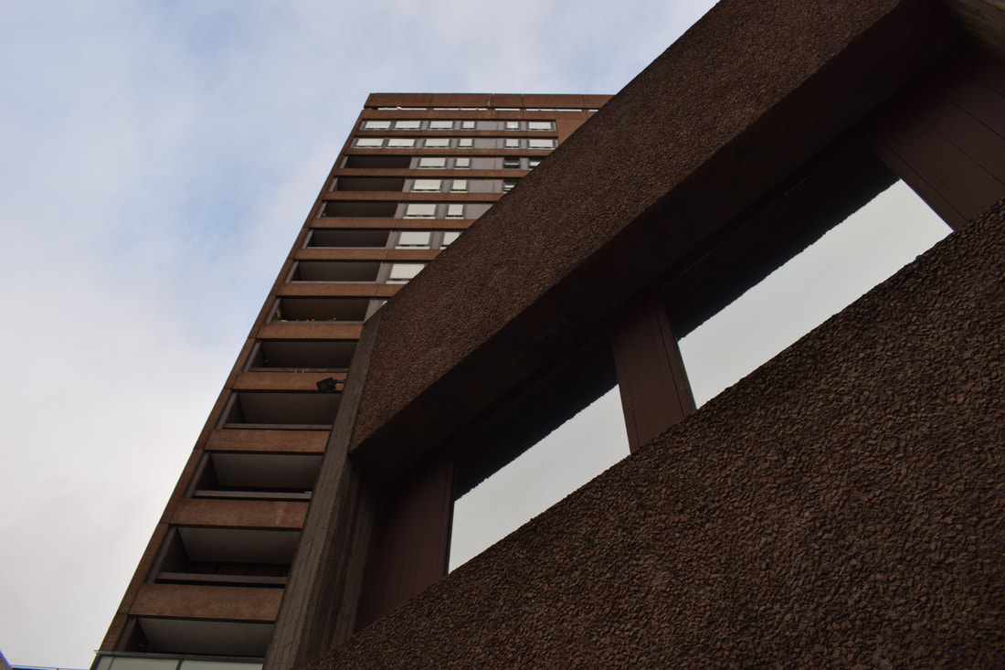
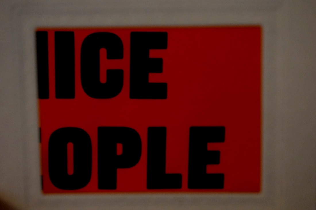
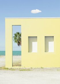
I picked the first photo by Evol because of the the powerful message it sends to society because of the the way the apartment building is next to the fake apartment building.
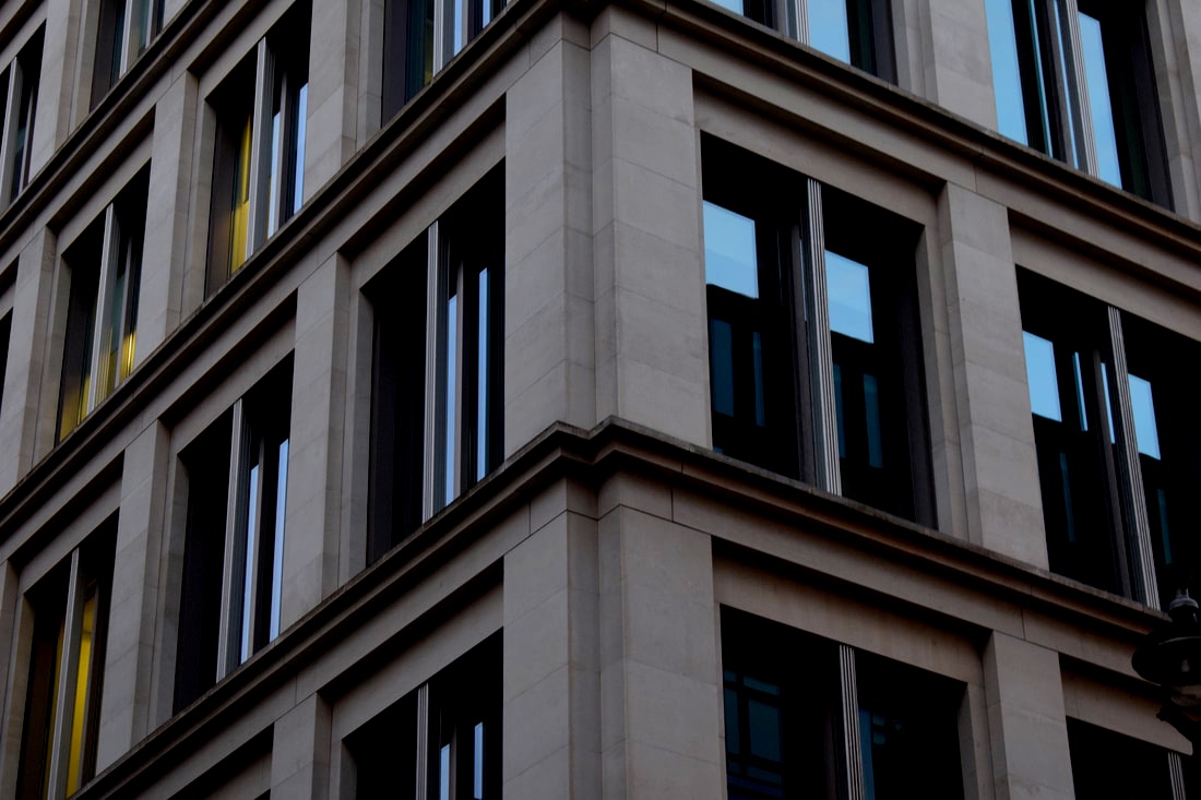
I picked the middle photo because of its sort of confusing look the gradual but exponential growth of the amount of windows is weirdly beautiful and the straight level of the lines are simple to the eye.
The last photo caught my attention because of again the bigger issue that is society and the way people live in the world.
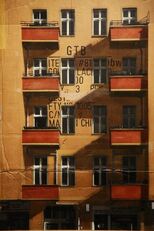
Ritchard Wentworth |
The Good, Bad and Ugly - School |
|
|
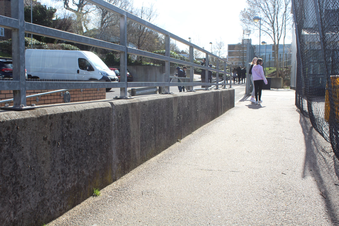
Wentworth is a British artist and photographer who was born in 1947 in New Zeland. In 1965 Wentworth went to University in Horsey collage Of Art. In addition to art and photography Wentworth taught foresight years at Goldsmiths Collage. Wentworth was appointed Commander of the Order of the British Empire in 2011 for services to art. He photographers his surroundings and everyday life with a creative twist of an artist.
In this task I will be exploring emotion through photography in environments. I will be seeing my ideas of good in the world and ugly around me. I will be working on my framing and eye in this task. The task links to the theme environment because it is acknowledging the good, bad and ugly of my environment and eventuating that. My intention in this task was to capture the aspects of my environment and the extents which the environment changes.
Good
|
|
|
|

Bad

|
|
Ugly

|
|
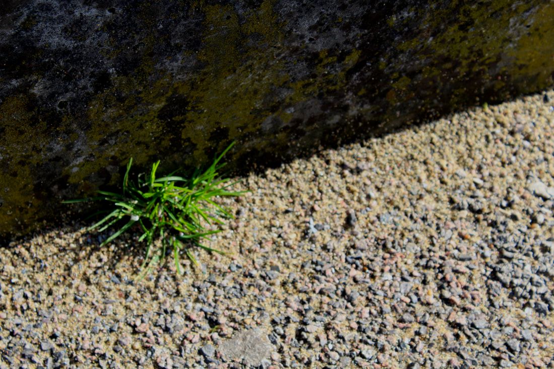
www: i like how i used close up of dirt in the school for my photos and the ideas behind my images are good.
ebi: I think i could have used composition of the image more to improve the photos.
ebi: I think i could have used composition of the image more to improve the photos.
Good, Bad, Ugly - Homework
Good
|
|
|
Bad
|

|
|
Ugly

|
|
|
www: I like the overall ideas of my photos and the composition of my photos.
ebi: I think i could have improved the lighting of my photos.
ebi: I think i could have improved the lighting of my photos.
Artist and Me
|

|
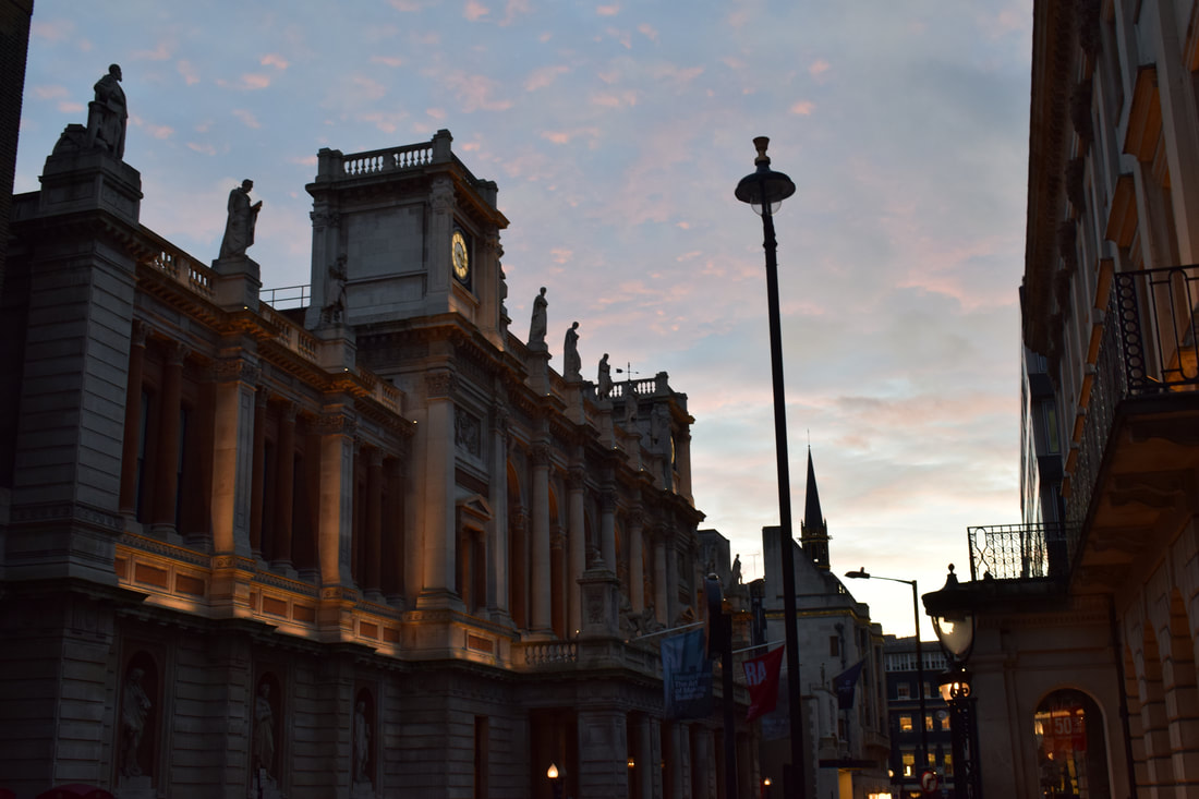
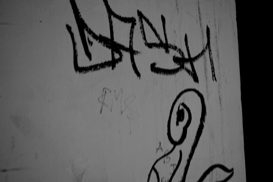
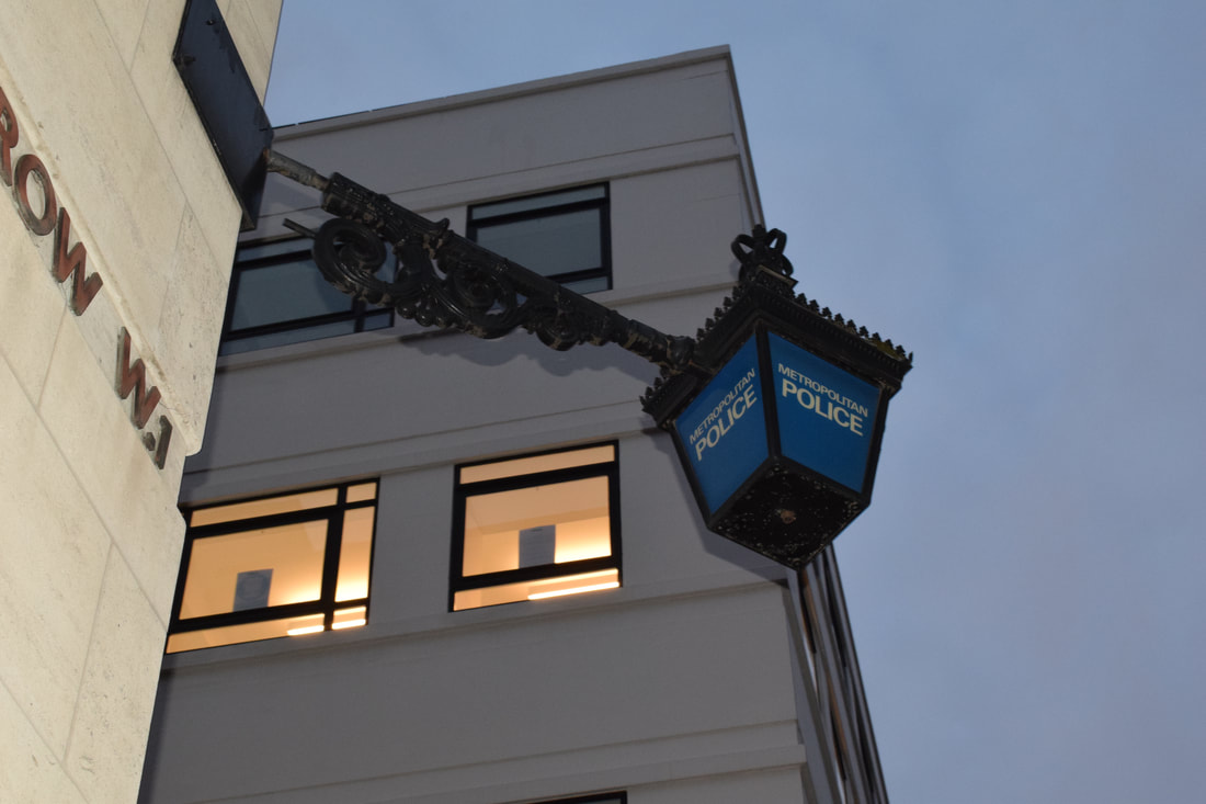
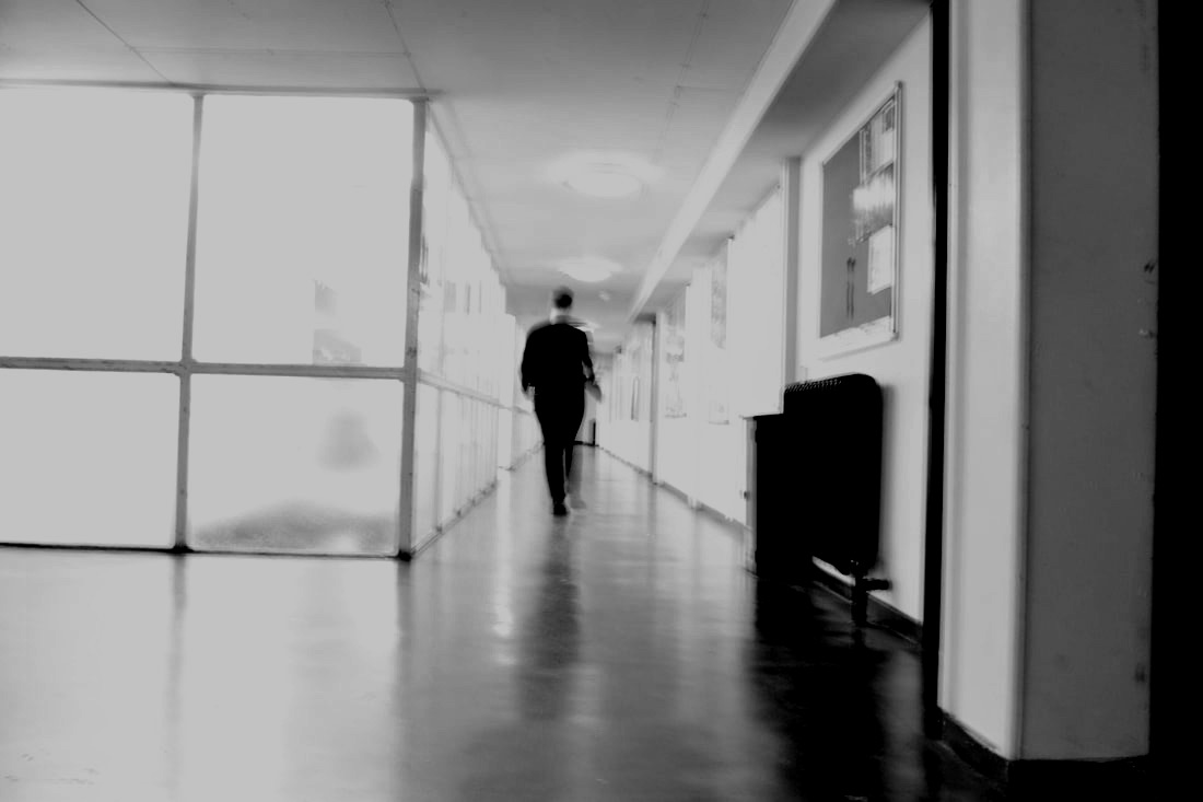
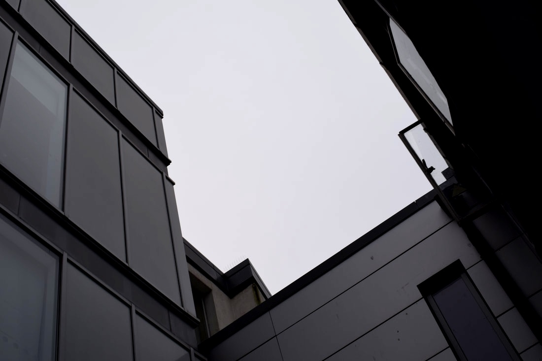
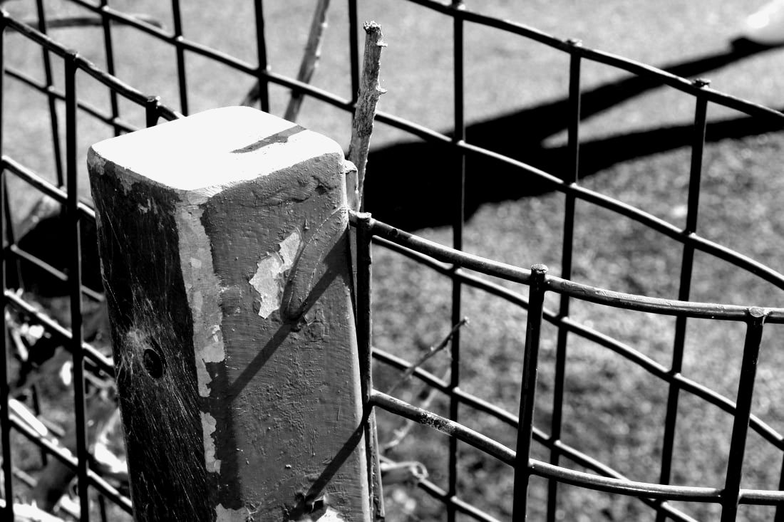
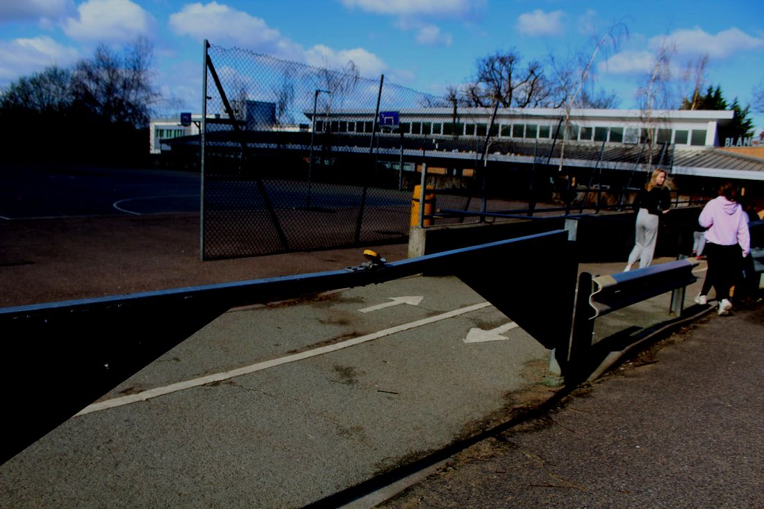
At first these two photo's don't look alike but the focus of the two images is the same. Harsh contrast between the straw and pavement in Richard Wentworth's image is mirrored in my adaptation. Also a theme in Wentworth's image is neglect and destroying property, shown in the rubbish and graffiti.
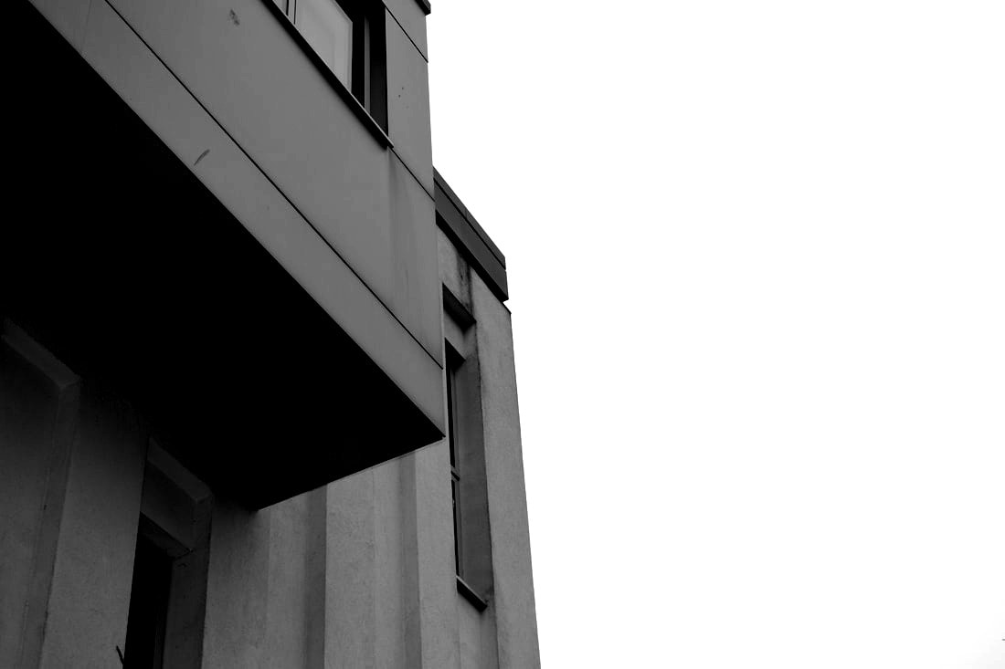
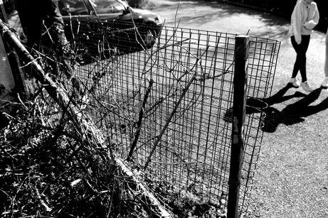
Rule Of Thirds
The rule of 3rds is the idea that any photo is made better with a little bit of composition. If you imagine a grid of 6 lines on your photo and line up the most important thing on a cross of the lines your photo will automatically be improved.Studies have shown that when viewing images that people’s eyes usually go to one of the intersection points most naturally rather than the center of the shot so using the role of 3rds creates a captivating image and by placing your focal point of the image on these lines you will create a better image.
|
|
Www: I likes the composition of the images.
ebi: I couldn't figure out to get the lines to be more clear.
ebi: I couldn't figure out to get the lines to be more clear.
Framing
John Divola - Zuma
|
|
Divola is an American who uses photography as a further form of art, in his project 'Zuma' he photographs sea views through worn down beach houses to create two inter-lapping landscapes. His work is both abstract and specific focusing, he uses windows and stunning views to create his almost confusing photos.
1st Response
By using a frame in my photos it will help me in thinking about what to include in my photos and how to compose the photos.
|
|
|
www; I like my use of colour in the photos.
ebi: I think i should use more close ups.
ebi: I think i should use more close ups.
2nd Response
Now I will be mainly looking at letters and words in photos and how to create more abstract shots. Also I will be doing more close up shots.
|
|
www: I did try and incorporate more close up shots
ebi: I think my photos lack variety,
ebi: I think my photos lack variety,
Formal Elements
In this task I was required to take photos focusing on a variety of words as a guide for my photos. this task links to the theme, environment as it shows a range places in the school. My intention was to take lots of different types of photos instead of many of slightly diffrent ideas.
perspective
focus
Texture

Movement
|
pattern

contrast
Scale
Tone
|

layers
negative space

Colour

Balance
|
www: I think the subjects I chose to photograph was good.
ebi: I think some of the photo's are underexposed.
ebi: I think some of the photo's are underexposed.
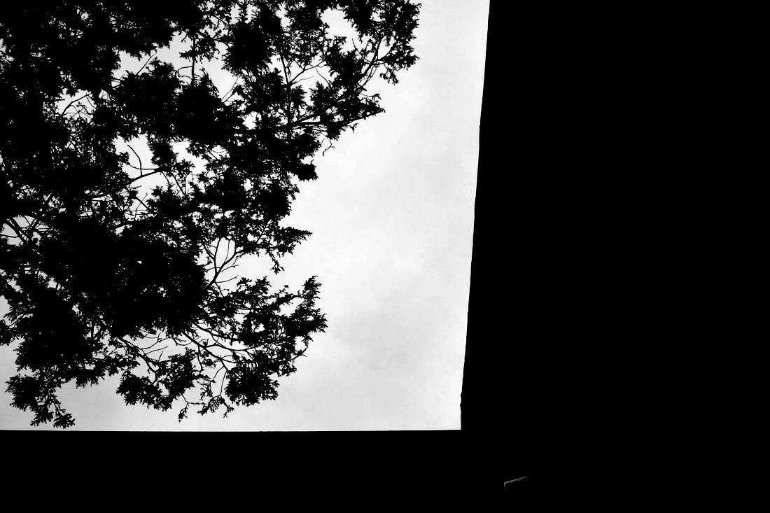
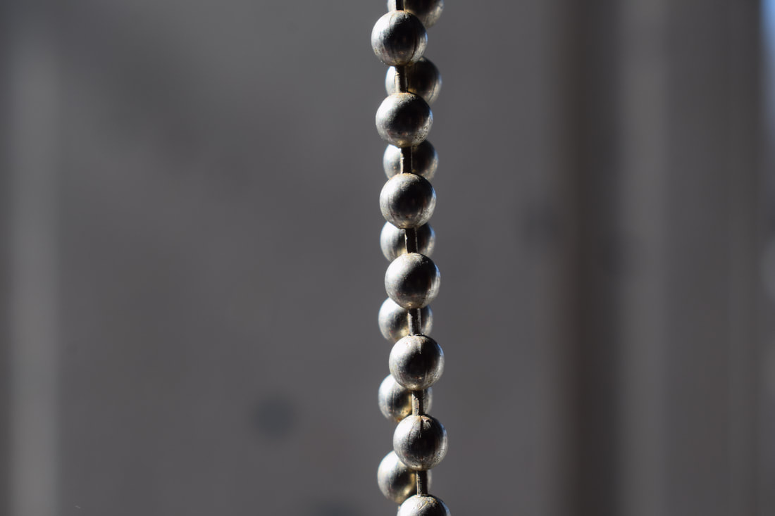
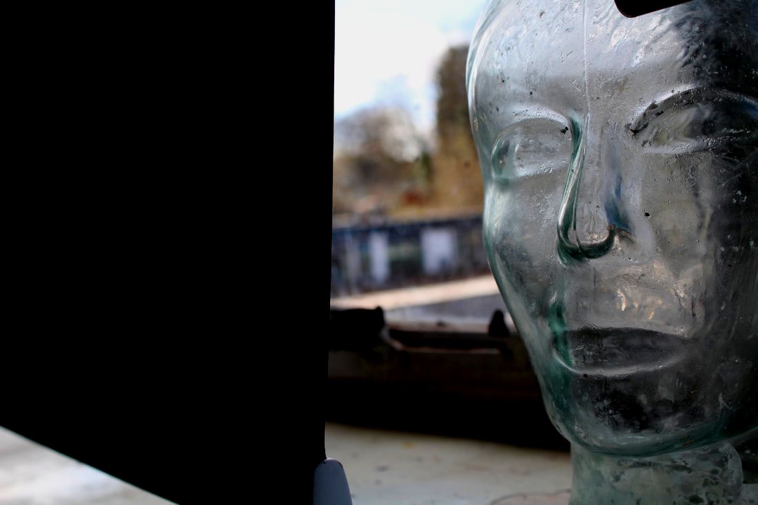
Negative Space
Matthieu Venot
Ventot takes negative space photos using bright colours to outline the space, usually sky blue but with the addition of sunset colours. He has only done work for 3 years and he has taken photos for famous reasons for example Tyler the Creators album cover. He is 35 years old and based in Brittany and he used to be an architect and uses his ideas to inspire him in his art. The use of colours is Ventots way of conveying his optimism in daily life .
|
|
|
1st Response
|

|


|
www: I like the abstract ideas that I took.
ebi: if I took a bigger range of photos and more.
ebi: if I took a bigger range of photos and more.
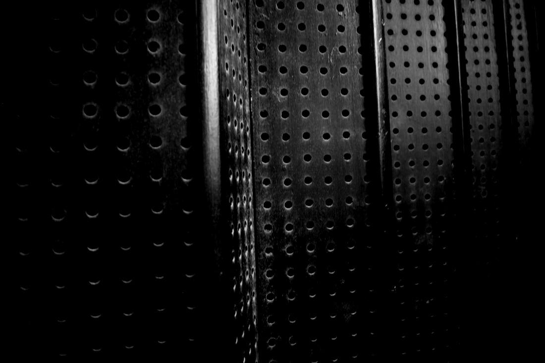
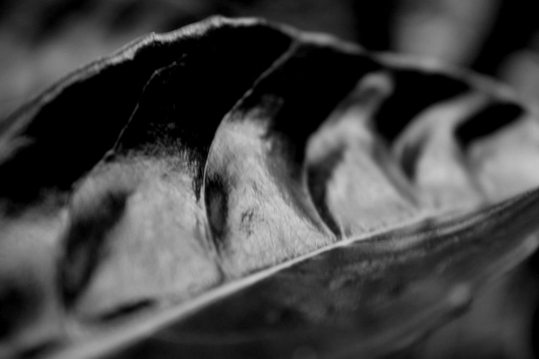
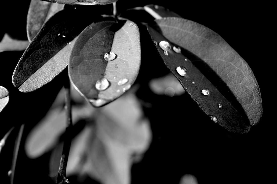
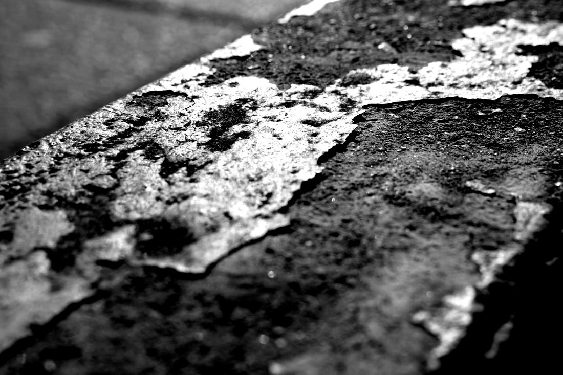
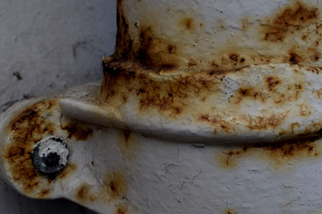
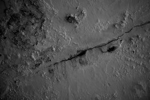
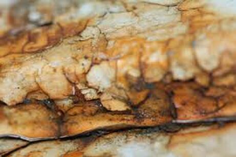
Texture - Aaron Siskind
|
|
|
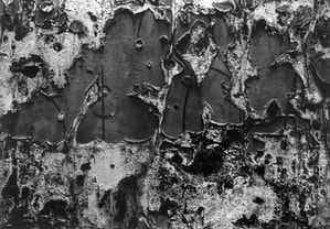
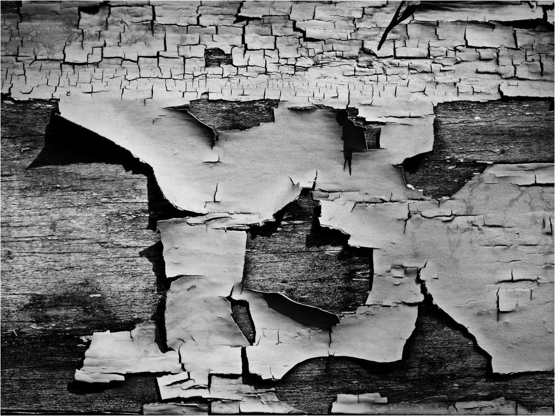
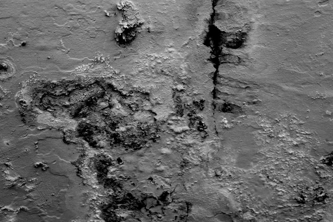
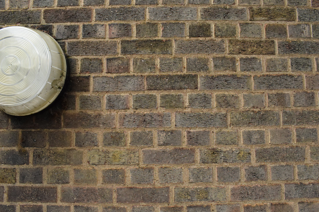
Siskind (December 4, 1903 – February 8, 1991) was an American photographer. He is considered one of the greatest artists in photography, and was closely involved with, if not a part of, the abstract expressionist movement. Born in New York, Siskind grew up on the Lower East Side. Siskind was a grade school English teacher in the New York Public School System for 25 years. Siskind made photographs of "close-up details of painted walls, asphalt pavement, rocks and lava flows",cracked, peeling paint on weathered surfaces", so that is were we got our inspiration for the topic.
Response
|
|

|
www: I like the framing of the photos
obi: I think some of them look a bit like stock photos so I could improve on my colouration of the photos.
obi: I think some of them look a bit like stock photos so I could improve on my colouration of the photos.
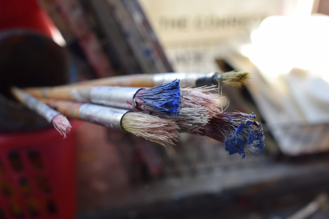
Favorite Pieces

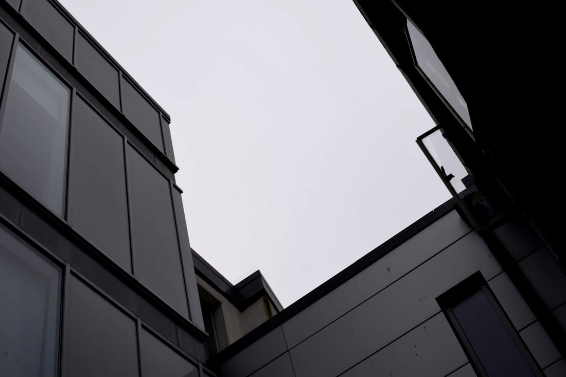
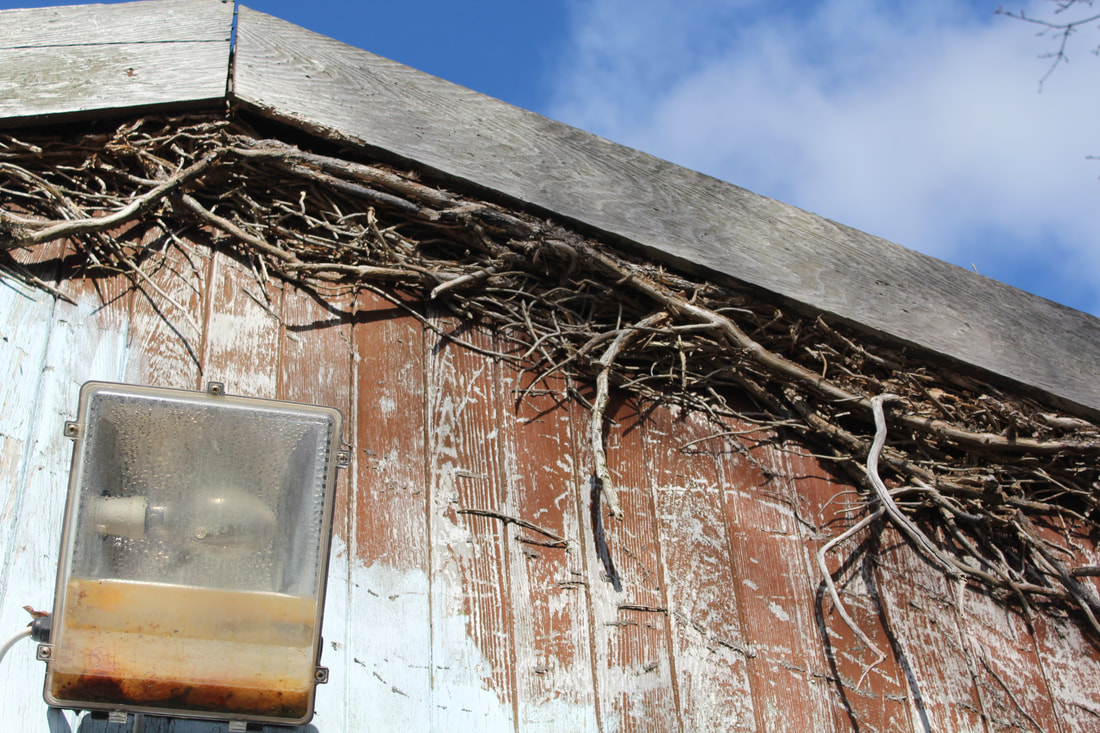
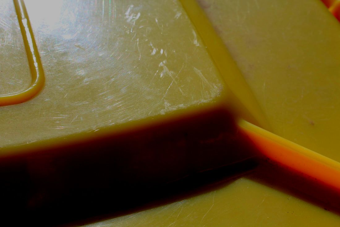
contrast
colour
close up
|
seperation
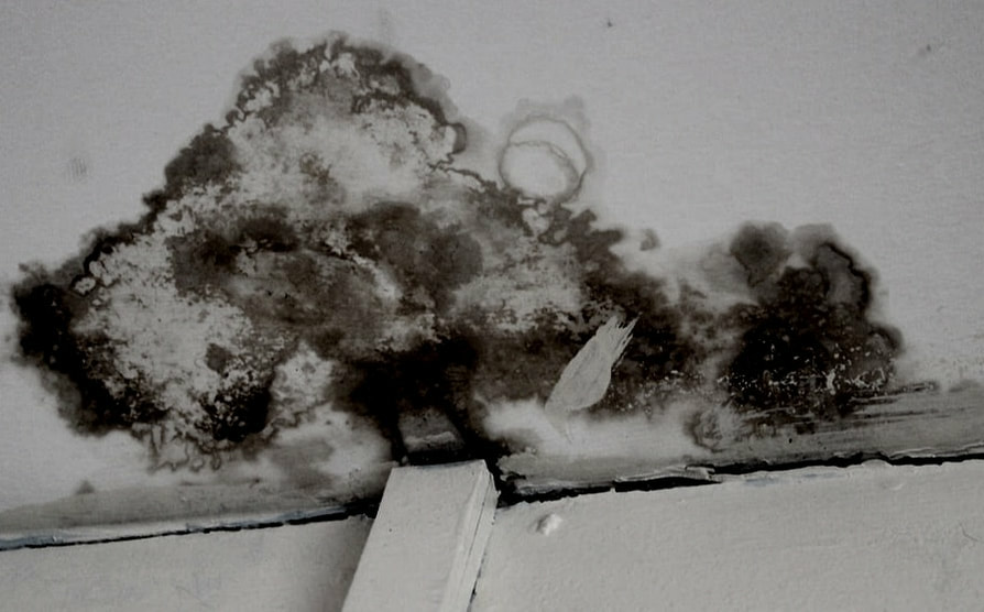
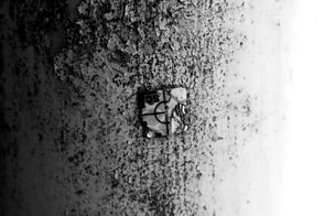
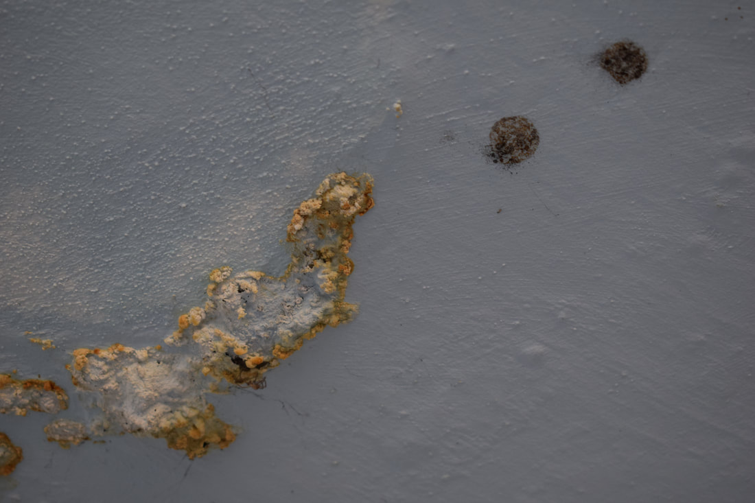
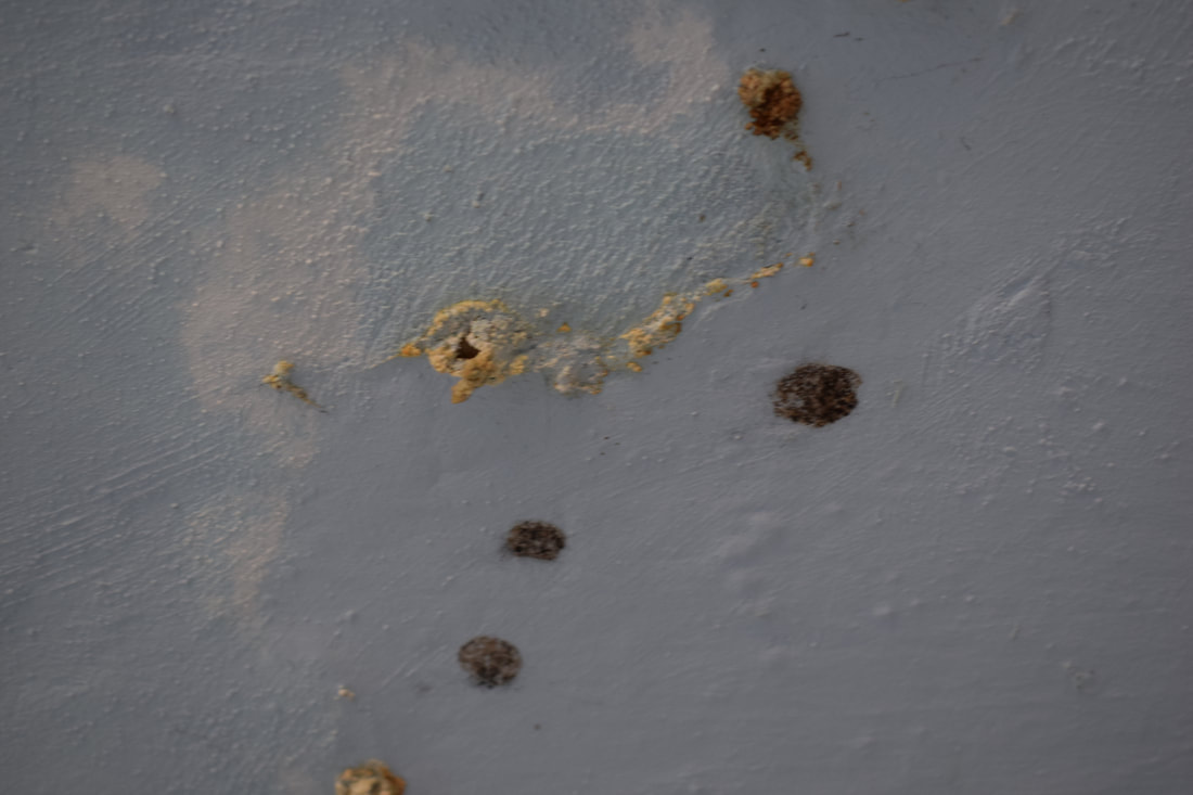
mold
|
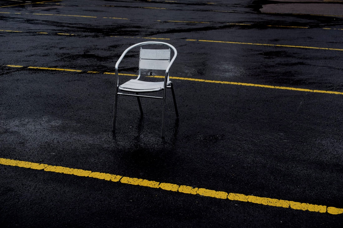
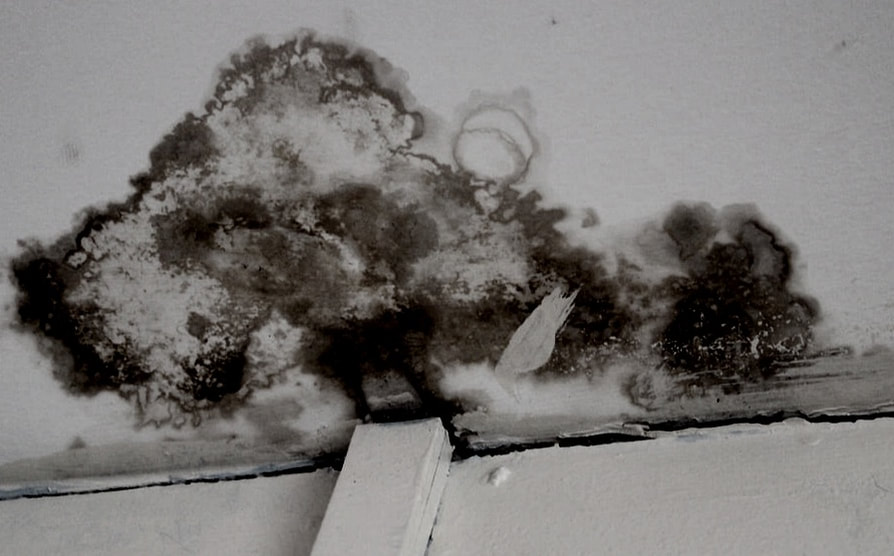
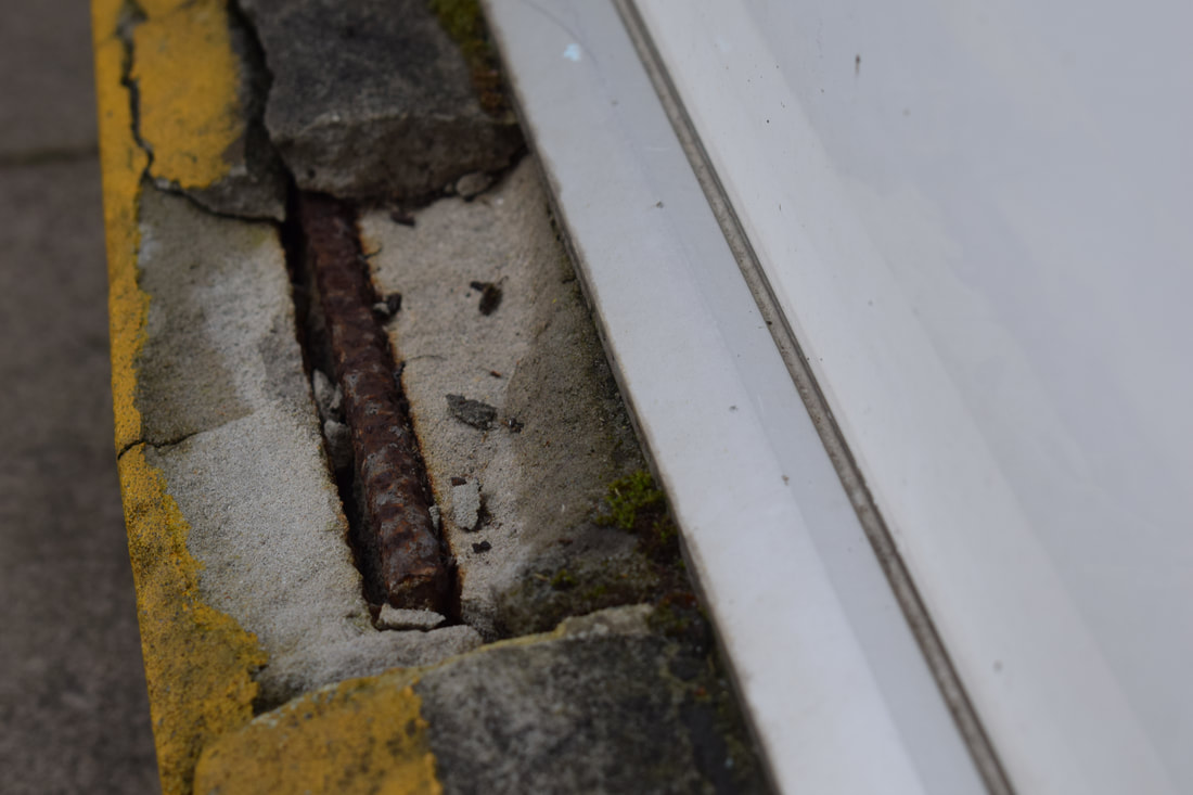
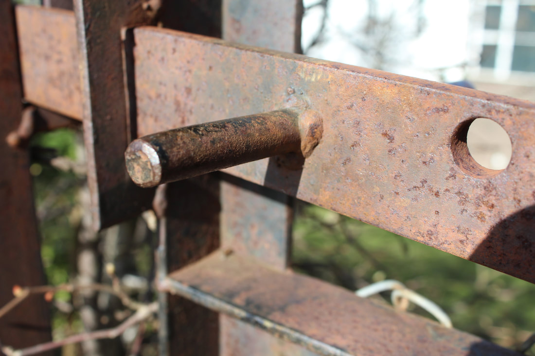
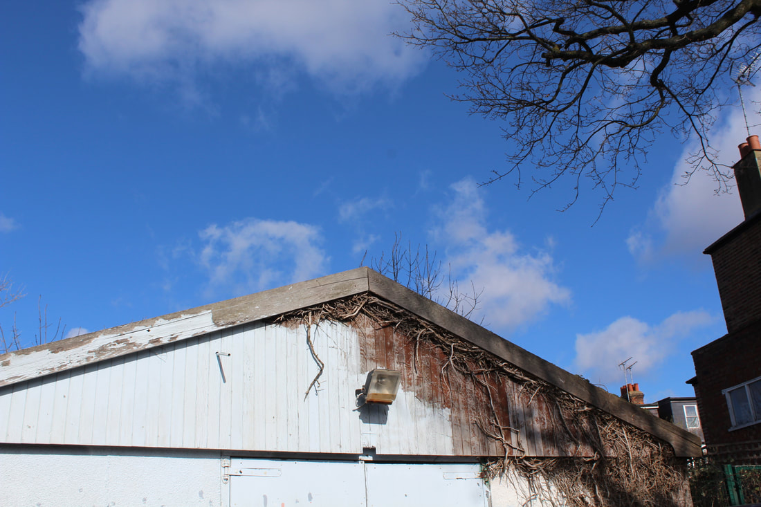
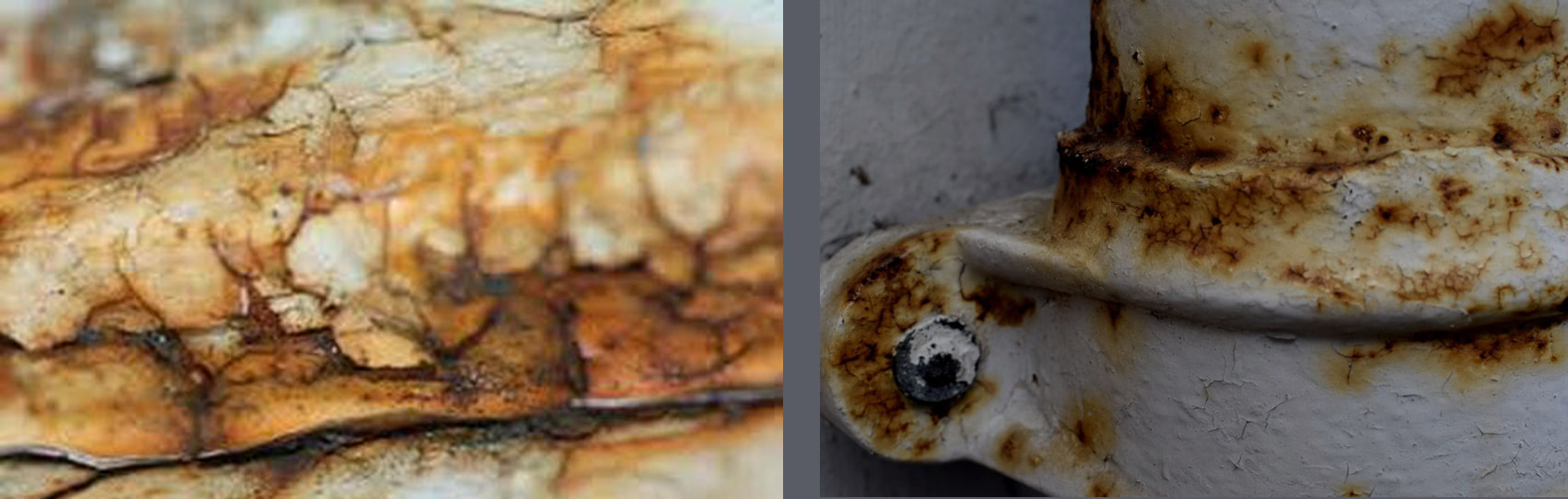
Neglect
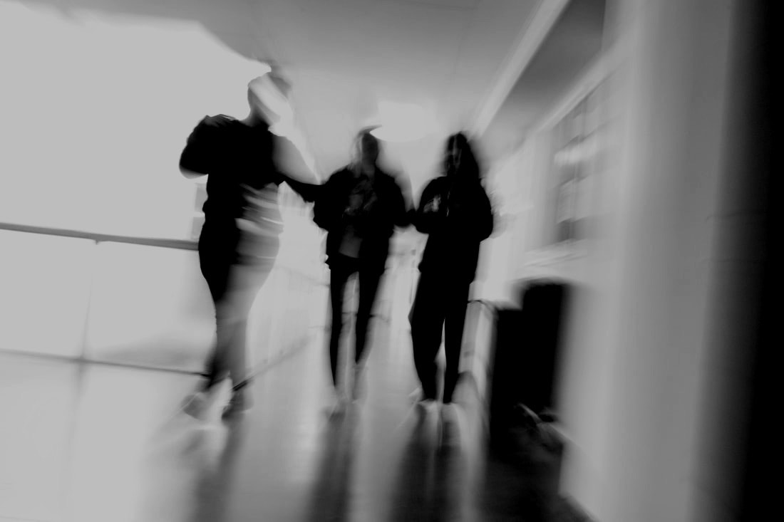
Ghosts Movement
|
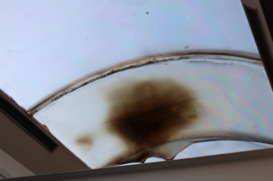
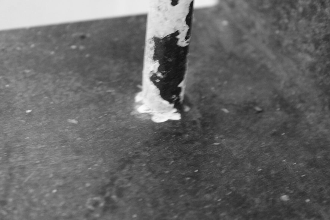
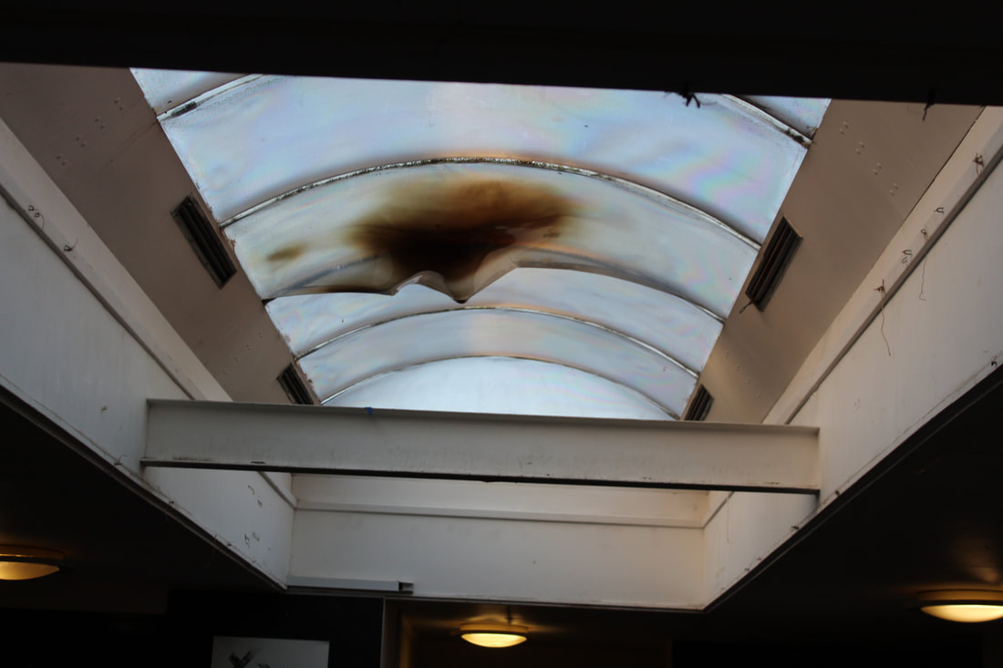
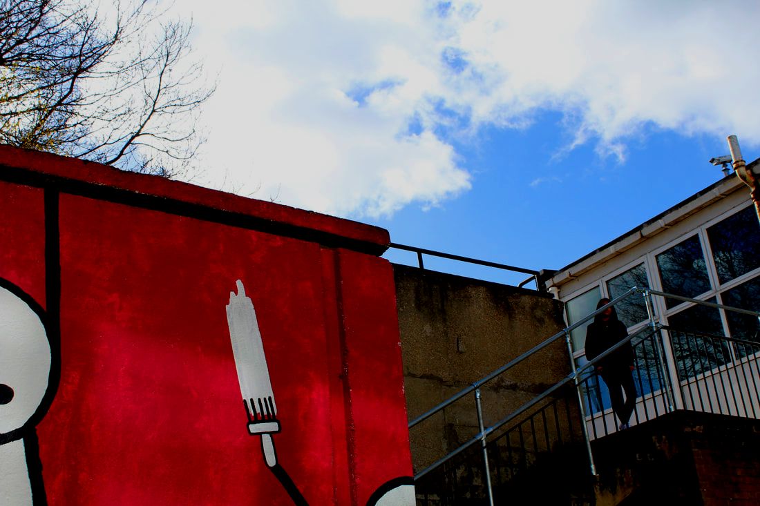
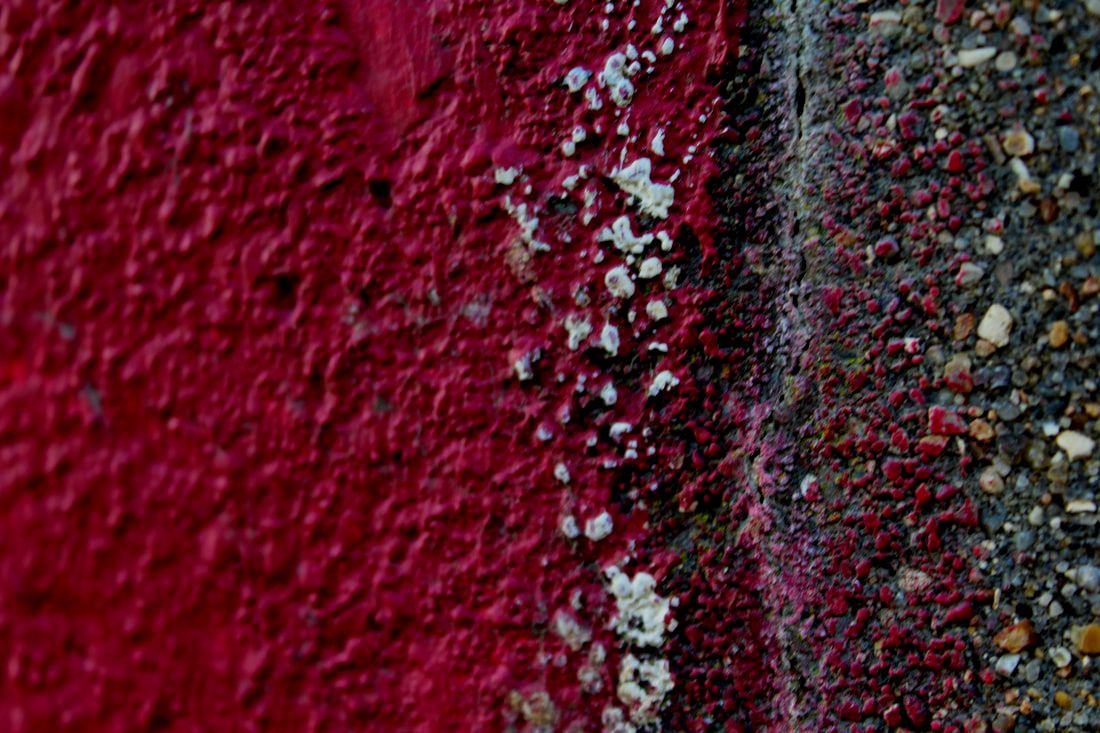
Colour, Contrast and Abandoned
|

|

|
|
|

|


|
|
|

|

|
|
|
|
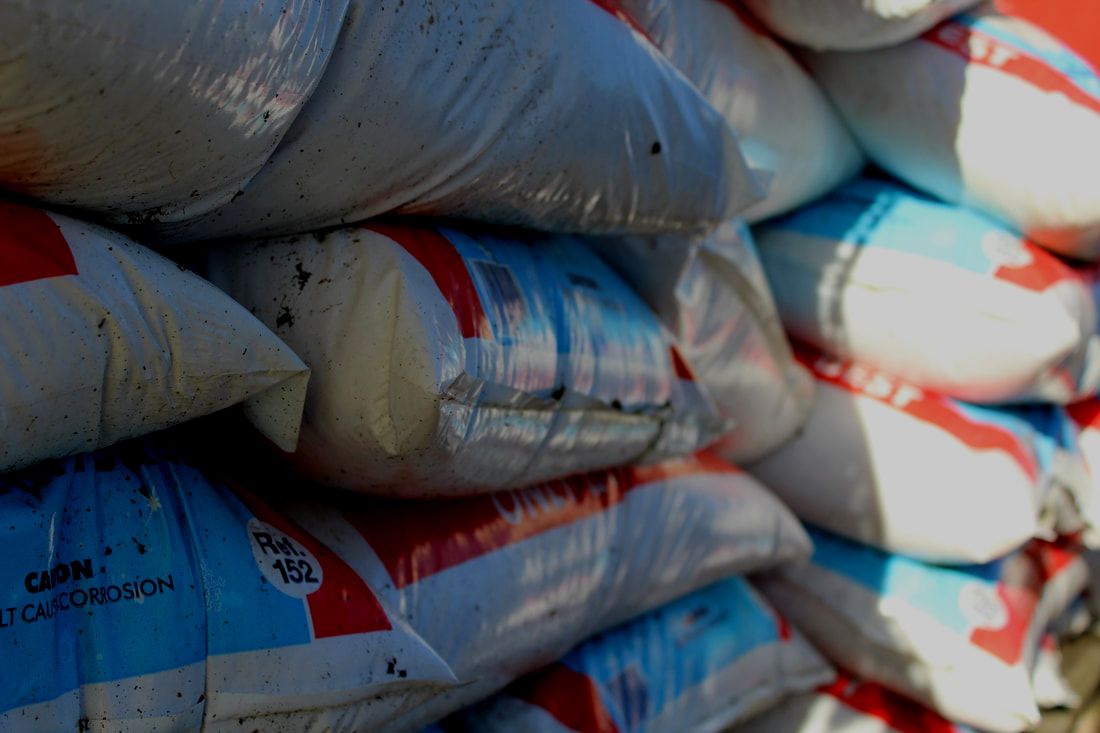
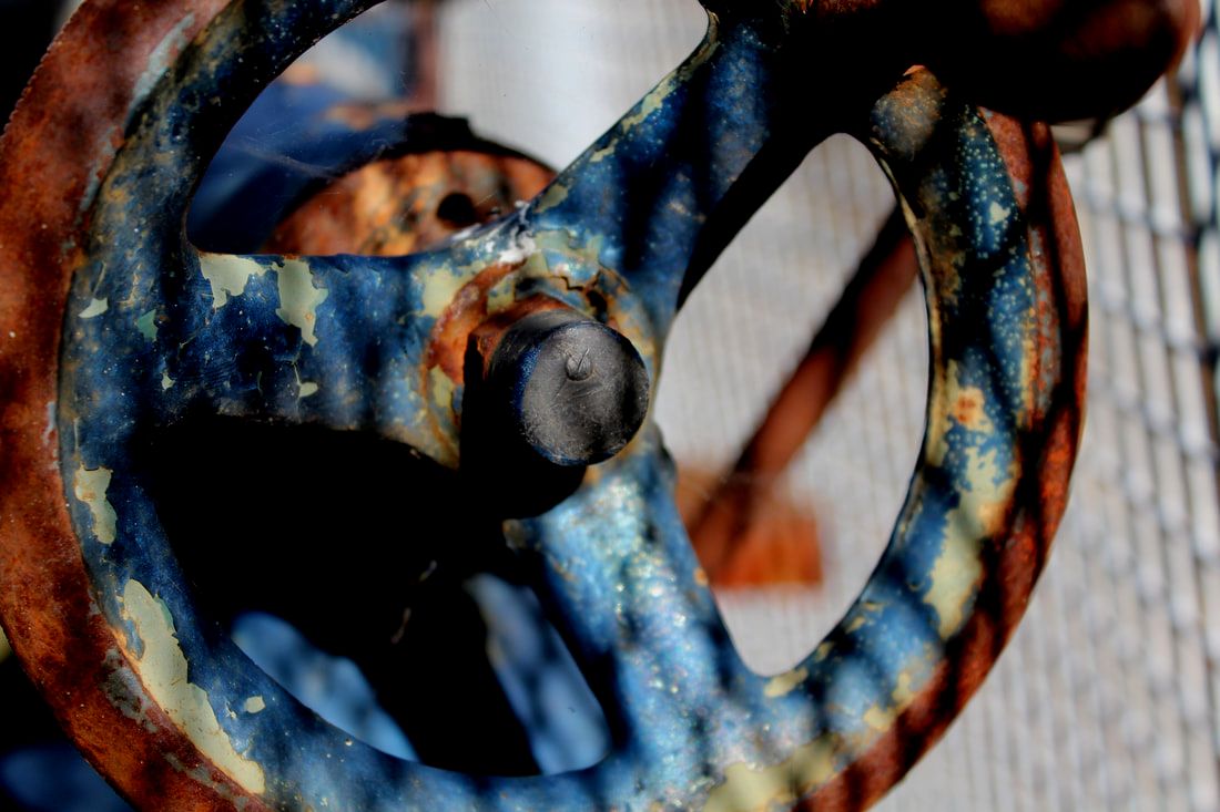
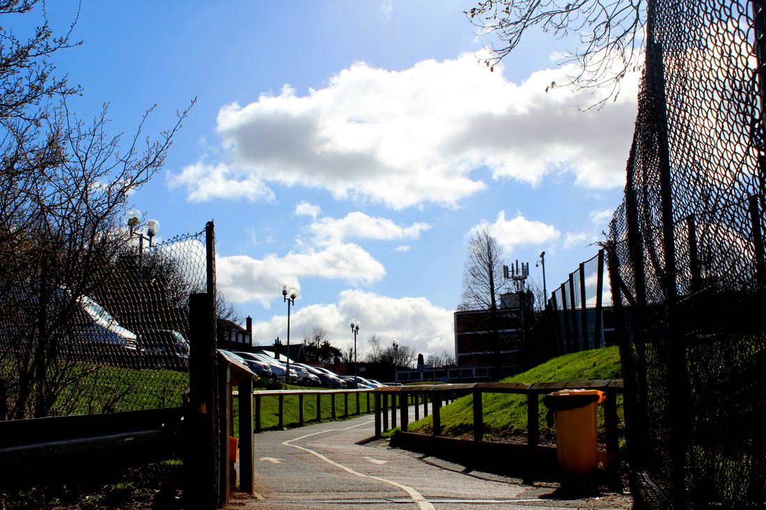
Contrast

|

|

|
|
Neglect
|
|
|

|
www: Overall I like my photos I think i have a range of ideas and styles and I like my composition.
ebi: I think next time i will try and get more close up shots.
ebi: I think next time i will try and get more close up shots.
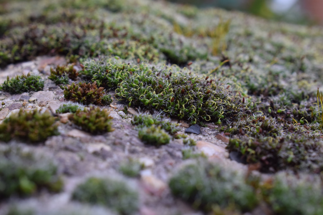
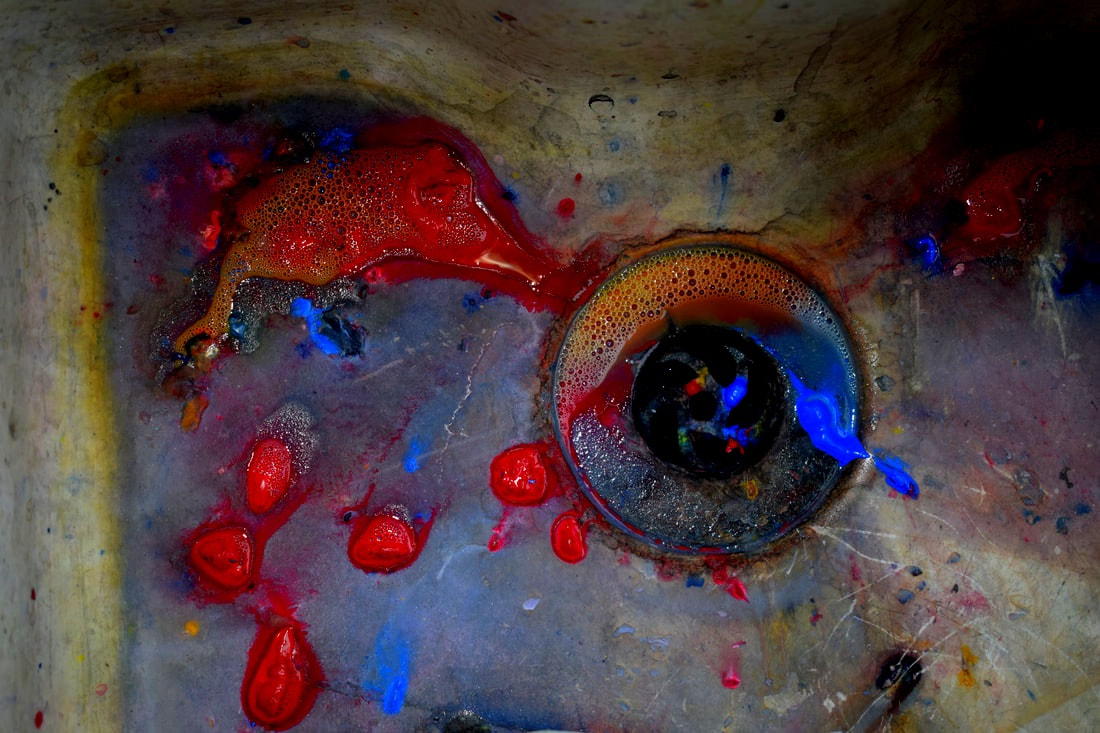
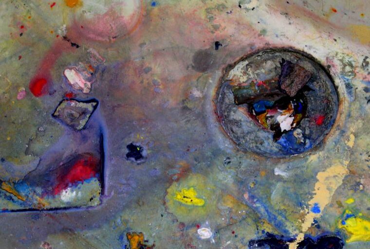
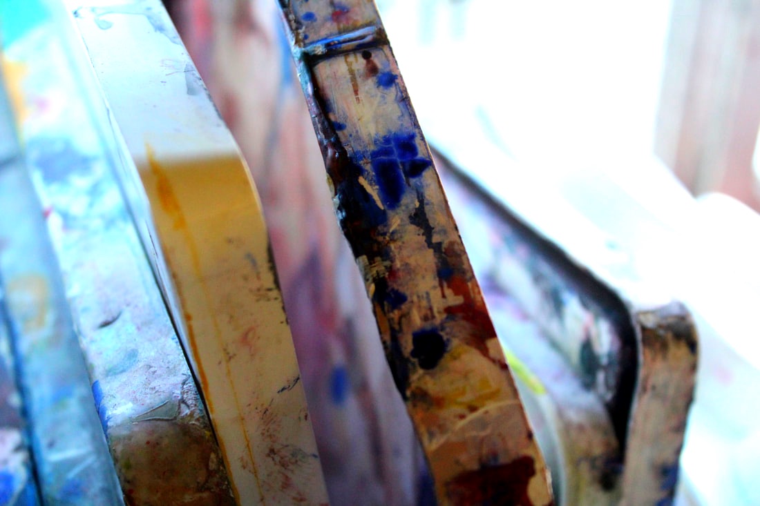
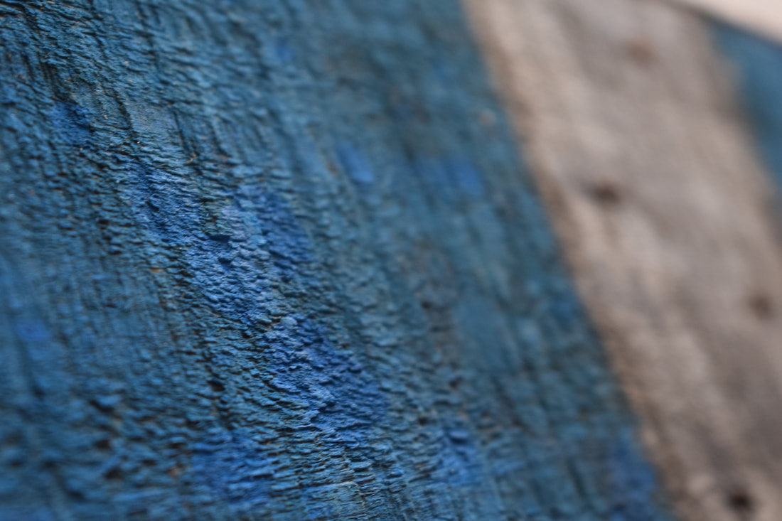
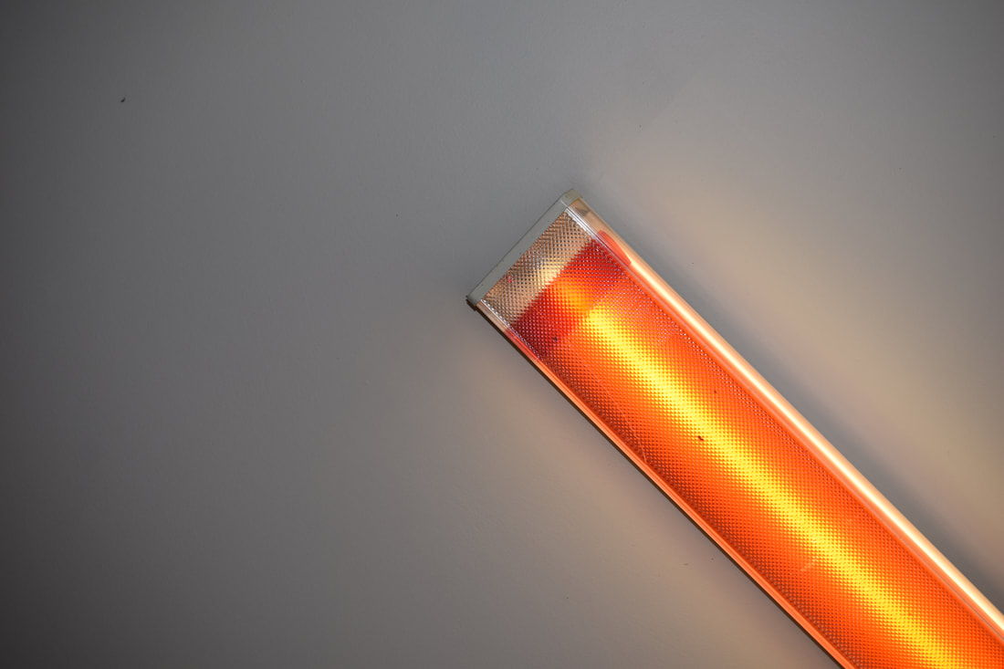
Colour
Final Piece
|
|
|

|
|
|
|
|
|
|
|
|
|
|
|
|
Final Piece
Colour
Contrast
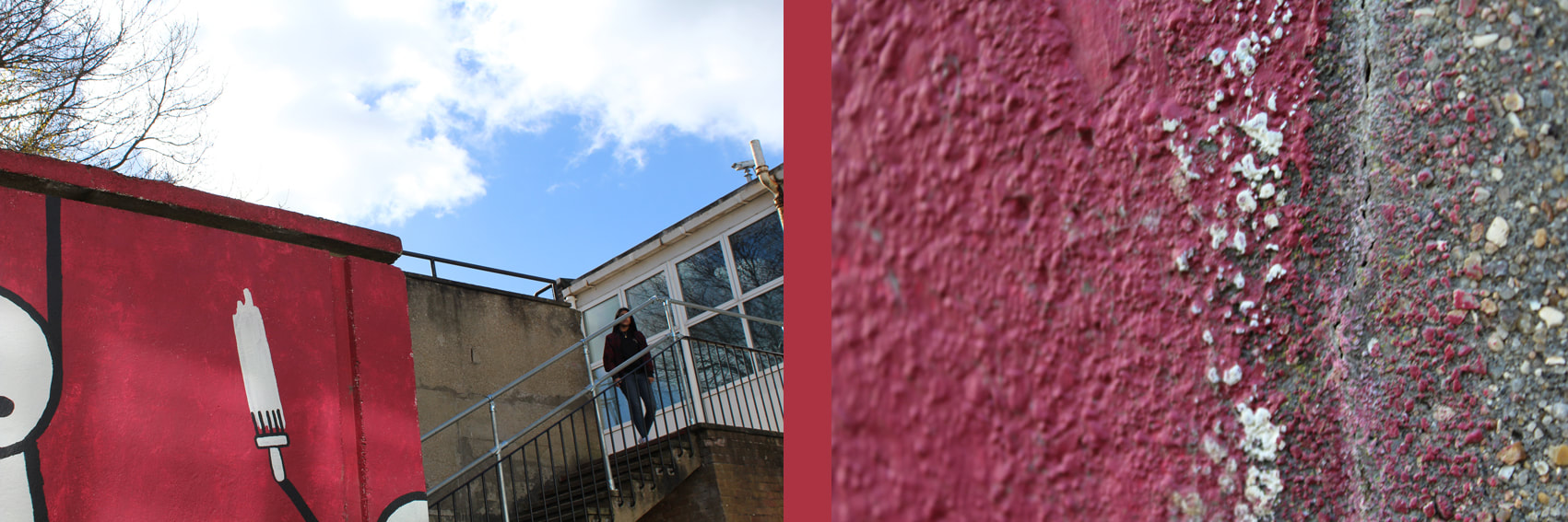
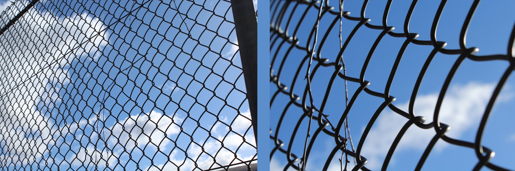
Neglect
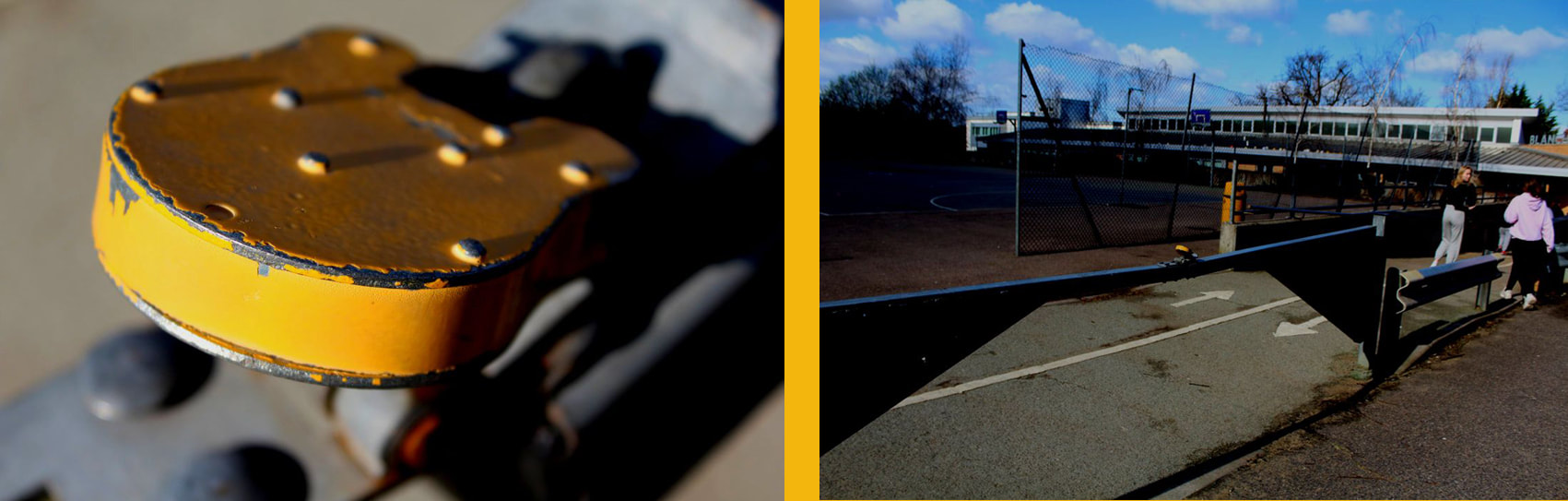
www: I like the composition of my photos.
ebi: Some of the photos are a bit blurry.
ebi: Some of the photos are a bit blurry.
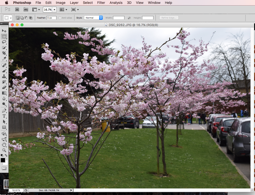
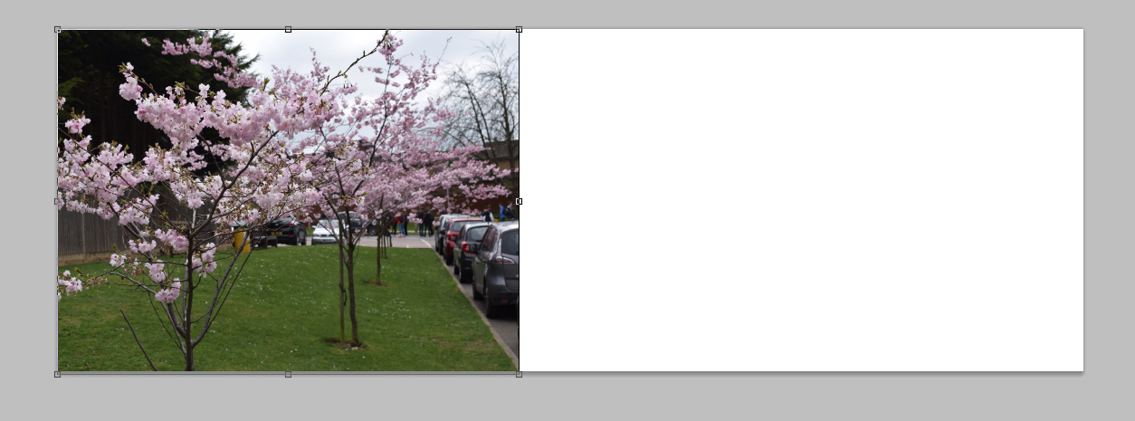
How I Edit My Photos
3. Once you have your photo repeat steps 1 and 2 and open a second photo that is the close up version ----------------------------->
|
|

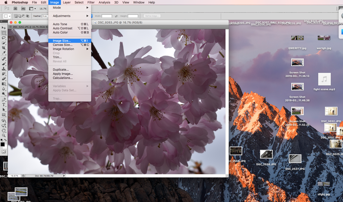
4. Go on Image then Image size to change both image rights to the same.
|
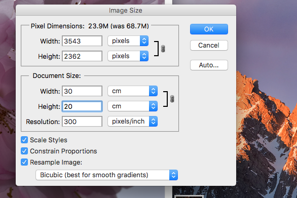
5. change the hight to 20 cm and make a note of the width for BOTH photos.
|
6. To create the base and background of the edit go on File and New.

8.Select this tool to be able to move your photos to the white base.
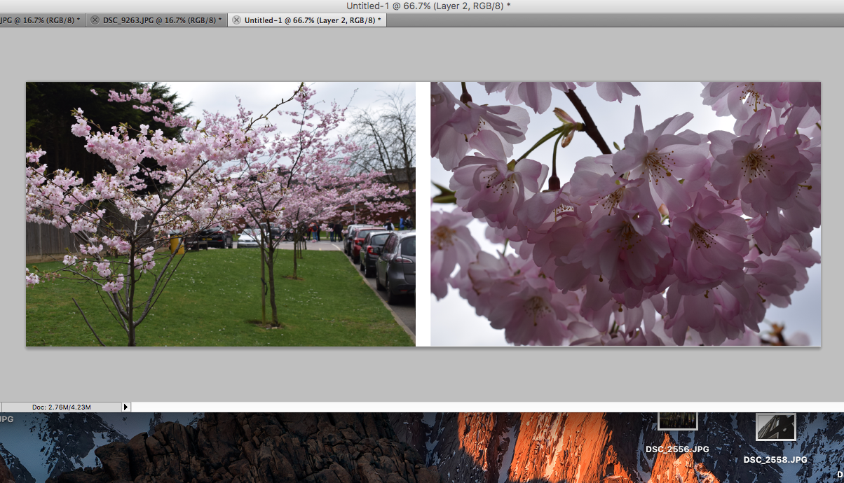
10. Place both photos and make sure there is a gap in the middle for a colour.
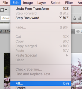
12. to set the colour to the background (the line between the two photos) press Edit then Fill.
|
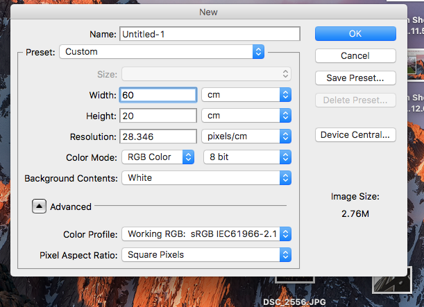
7. Set the hight to 20cm and the width to the combined widths of the two photos.
9. Place it on your base and line it up.
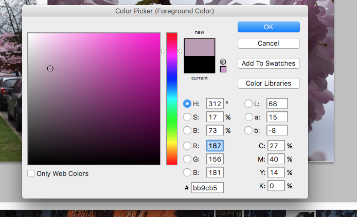
11. Select a colour from an image with the picker tool.
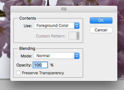
13. Press ok.
|
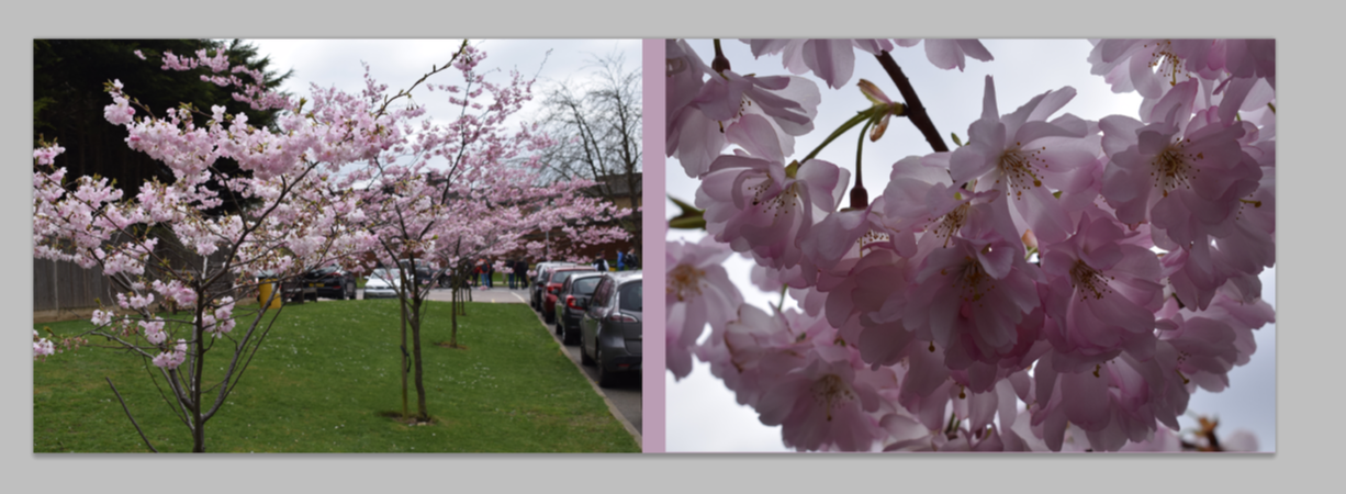
14. done, you can now save it as a JPG.
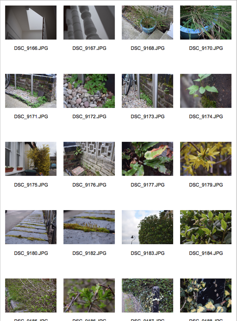
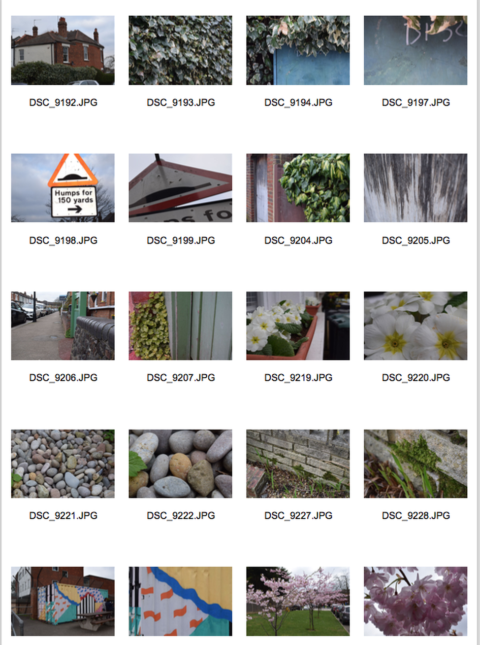
Home photos.
Edit
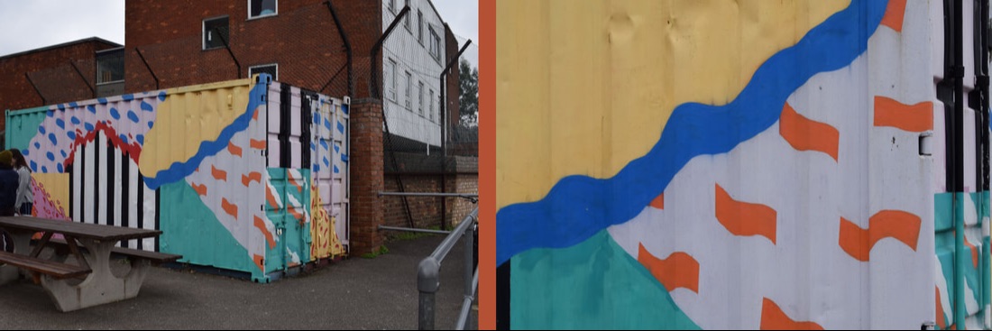
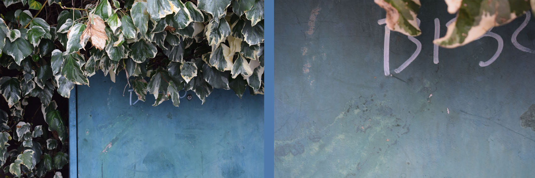
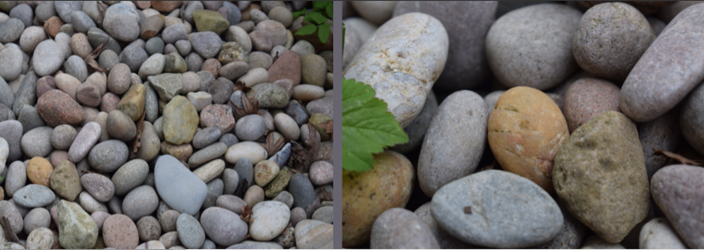
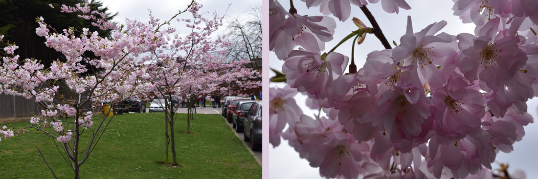
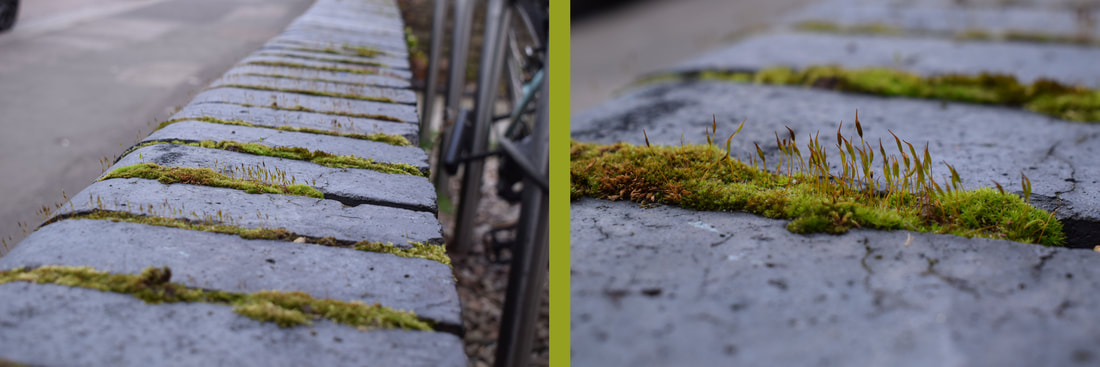
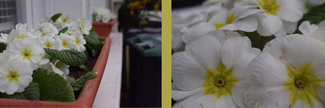
www: I like the use of colour in my photos and the framing of the images.
ebi: I think I could make the width of all of the colour lines the same.
ebi: I think I could make the width of all of the colour lines the same.
