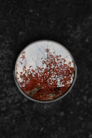
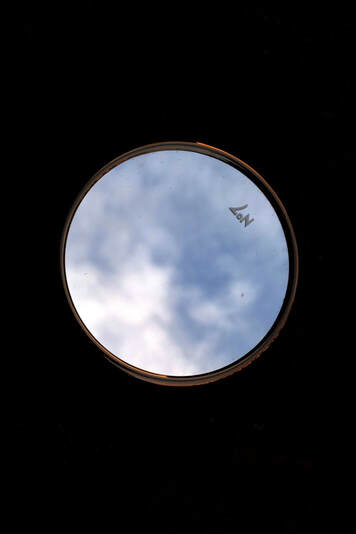
Sebastian Magnani

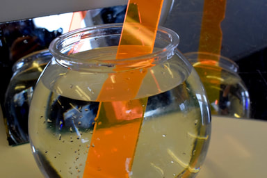
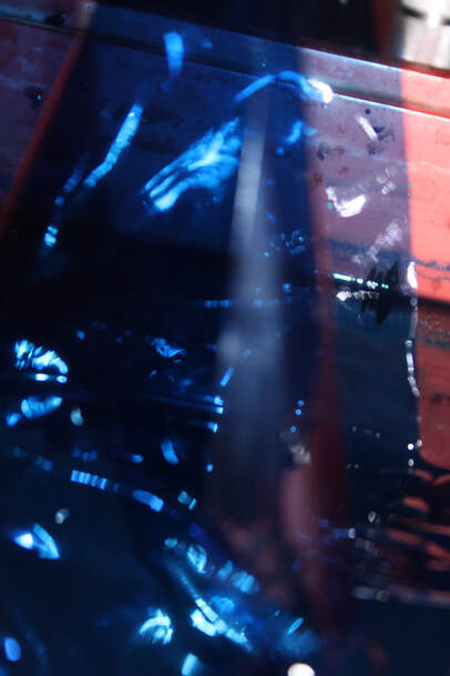
This image instantly captures my attention due to the use of beautiful colour and contrast with the bleak background. The reflection isn't the sky in this image it's a new world for us to fall into it out of our boring everyday life
|
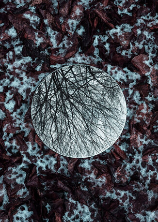
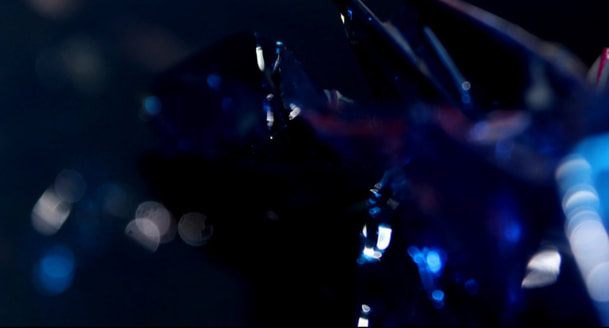
This image flips the previous the background is a magnificent mix of dark reds and the lightest blue which draws the eye. Then in the centre is a cold entwining branch of a dead tree contrasting the cool sky.
|
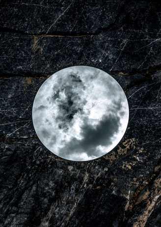
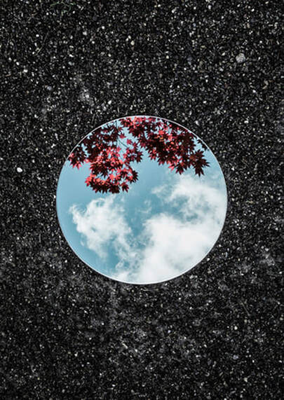
This image is a beautiful mystery, it transports me to a night sky with a looming mood and leering darkness jumping at me through the night, however in reality this is the reflection of clouds at daytime on a forest floor.
|
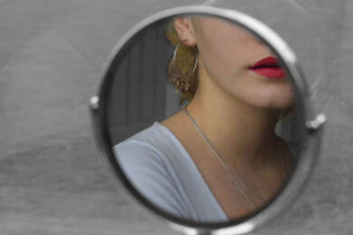
He was born in Switzerland in a small town in 1984 he trained as a media designer in 2006 and worked in a creative advertising agency later. In 2011 he made photography his full time job and has worked on many subjects and also projects he chooses to do. probably his most famous pieces is his series titled 'Underdogs' and 'undercats' however we are focusing on his series where he captures reflection on circular mirrors. This series is eye catching and whimsical but also makes the viewer wonder what we miss when we don't look up.
Artist and Me
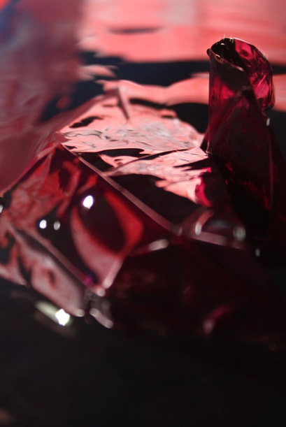
In my image I focused on the red leaves of a tree in fall. I pulled out the colour by editing y image so the background was black and whitened I positioned it so you can still see the sky peaking out behind the tree.
|
This image of Sebastian Magnani is really striking the maroon and the blue really complement each other and the textures of the background are really interesting and make the image more interesting.
|
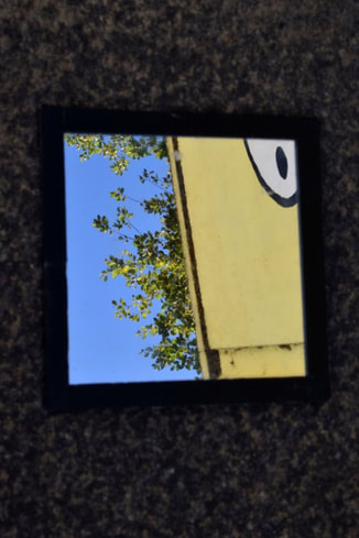
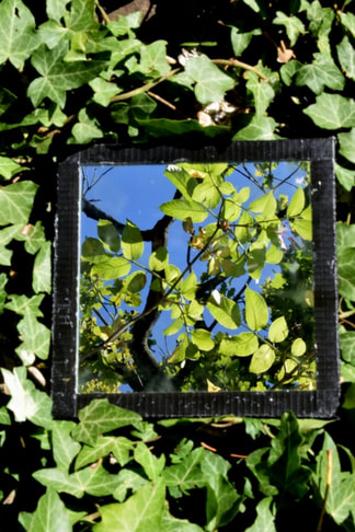
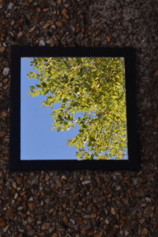
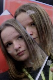
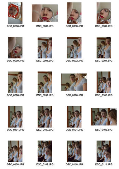
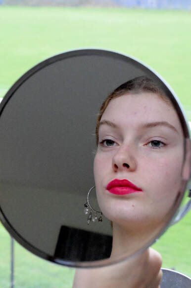
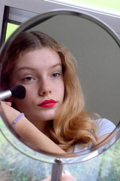
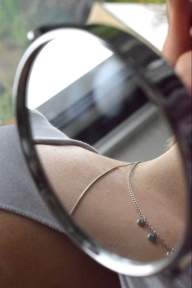
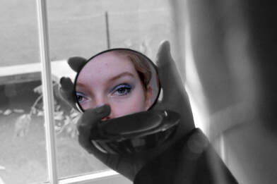
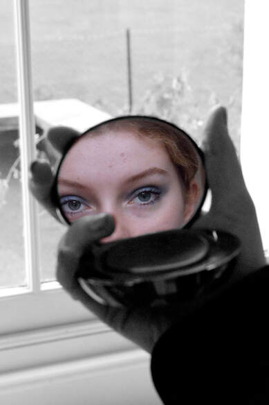
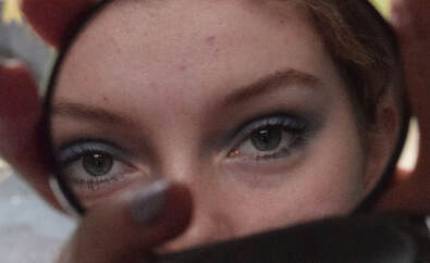
1st Response
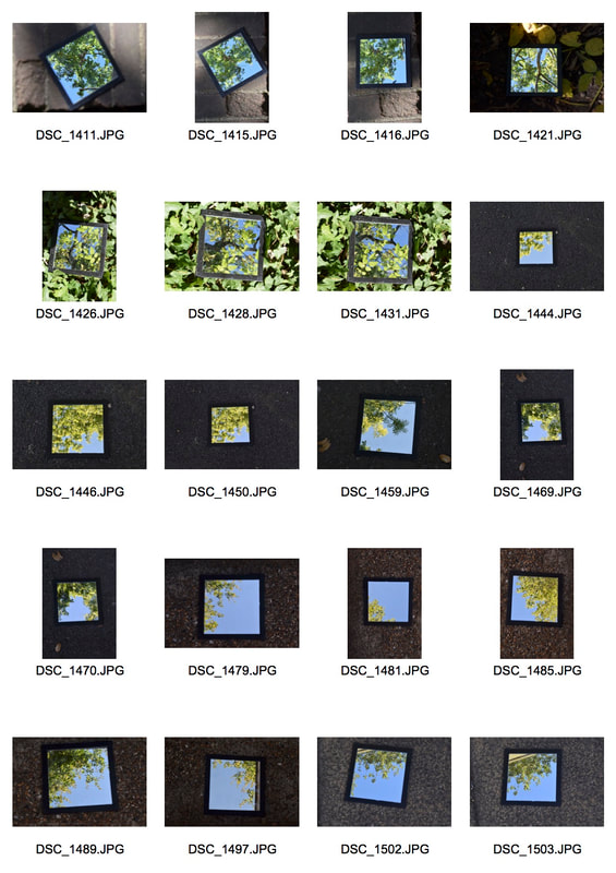
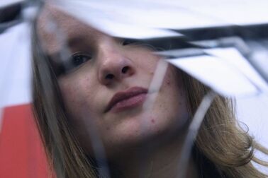
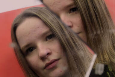
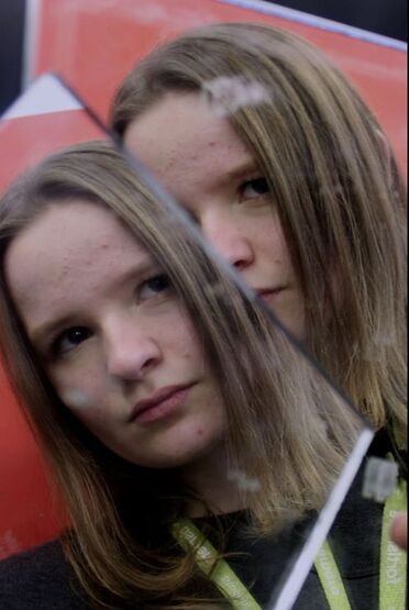
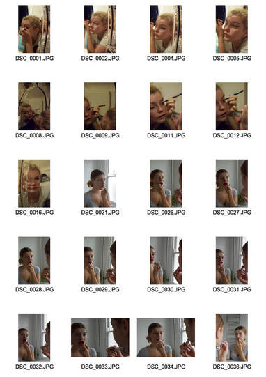
In this task I was required to take a photo of the ground with a square shaped mirror on it. The aim was to create a harsh contrast between the ground and reflection. This links to the theme of reflection because it reflects the word around us in a mirror.
|
|
Edits
|
|
|
www: I chose to focus on the contras of colours in these photos, I tried to compose the pieces with interesting elements such as trees or buildings. My aperture settings were very low so that the camera could focus on the mirror in the foreground not the background of the ground.
ebi: Next time I should use a tripod so that my images are more centred and I can focus on composition.
ebi: Next time I should use a tripod so that my images are more centred and I can focus on composition.
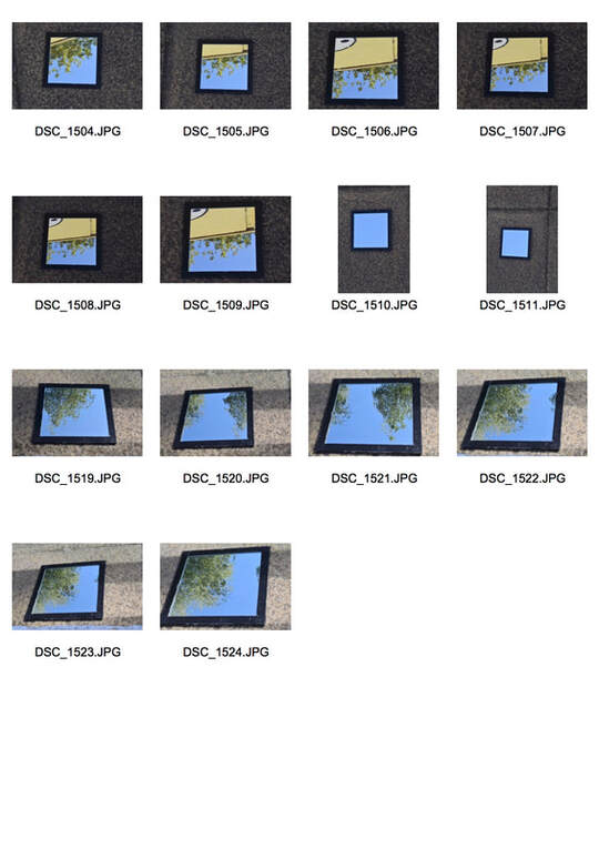
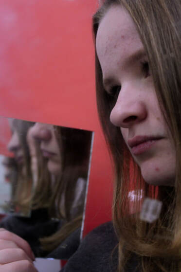
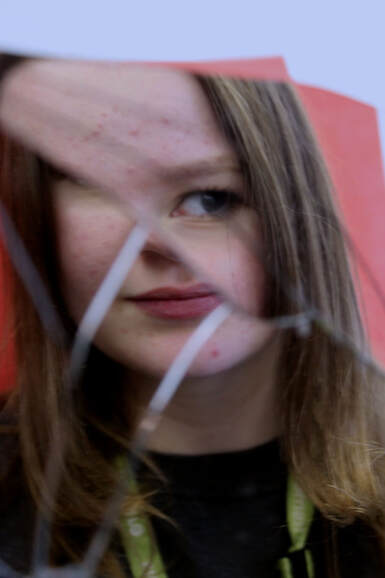
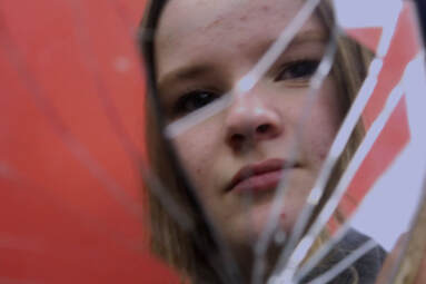
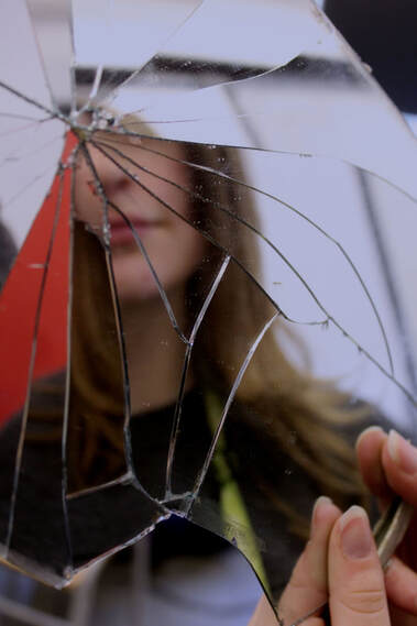
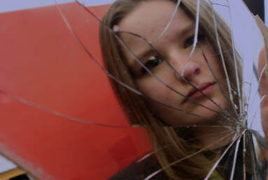
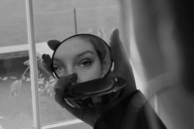
2nd Response
Edits
|

|
www: I like the colours in the mirrors in this shoot and the contrast with the background.
Ebi: I would like to have taken more photos at a variety of different places.
Ebi: I would like to have taken more photos at a variety of different places.
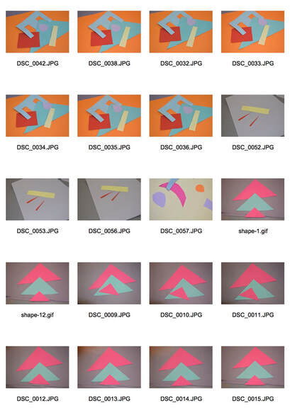
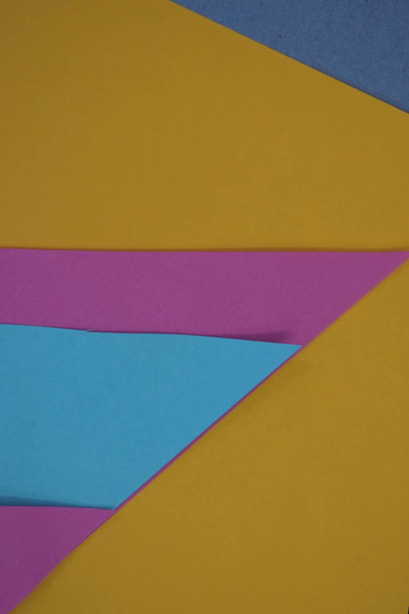
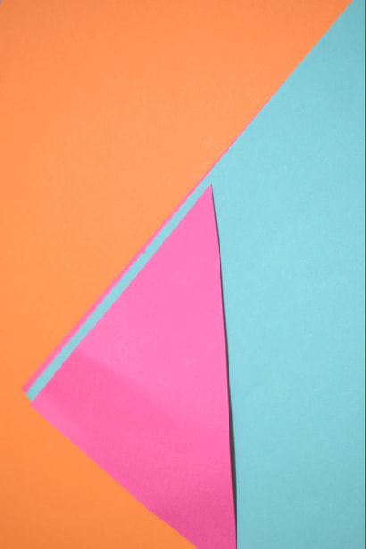
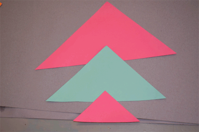
Reflection in Colour
Tamara Lorenz
|
|

|
This German artist uses colour to create abstract images with reflections from the world around us. She uses hard expanses of pure colour in contrast to sharp lines and harsh cuts of card and paper. These are not photographs they become worlds into which you can fall and experience all these colours as if you have never seen them before. This is where her fascination stems the insane connection between these photographs and reality and the contrast between them. These images attempt to connect a dream of Lorenz's and our reality.
1st Response
In this task I was required to make images and gifs that were interesting to look at by using cut out coloured paper.
|
|
|
|

|
|
www: I like the shapes I choose and the colour combinations I used
obi: I think that they are pretty boring and I was to work on how to create more depth
obi: I think that they are pretty boring and I was to work on how to create more depth
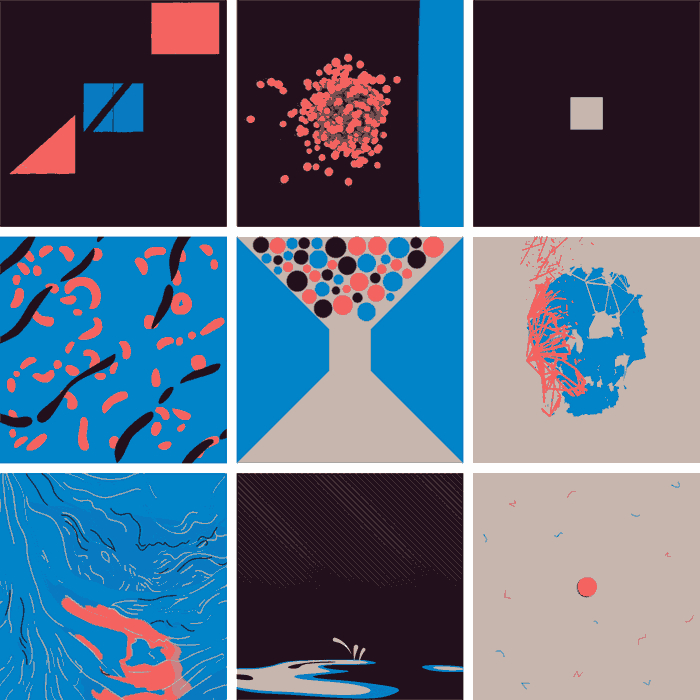
9 Squares

|

|
|
These 9 square Gifs were a collective motion project. Each gif contains moving art from 9 different artists with the same colour palette. The end result is very eye catching and slightly confusing, although the colours join the 9 gifs it also is very confusing to keep track off. The gifs are arranged by Skip Dolphin Hursh, David Stanfield, and Al Boardman They posted collaborations every two weeks but have since stopped as of March 2017.
GIFs
|
|
|
|
Distorted Reflection
Antonio Gutierrez

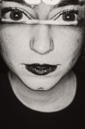
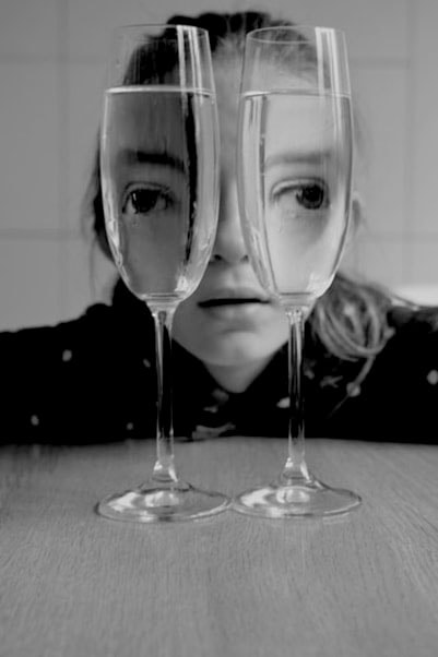
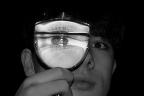
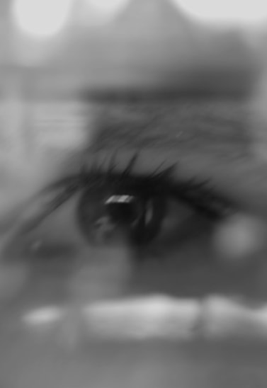
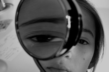
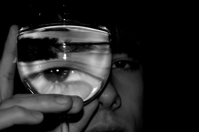
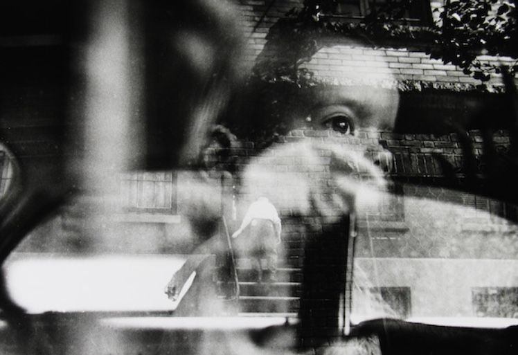
I like this image because the eyes on this woman remind me of a animalistic quality, almost bug-like. I also like the stretch of the shadows of the glass.
|
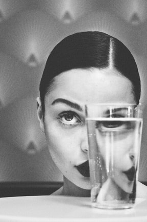
This image is strongly perfect in the way it is not. I love the way that the line of water is not completely straight and the line of her face is not lined perpendicular.
|
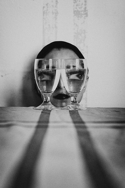
What I like about these images is the exaggerated curved lines in the image. I like the way the line of her lips and eye is exaggerated in an interesting way.
|
Gutierrez uses refraction of light through water to capture odd but interesting images of faces distorted. He enlarges parts of the models face to create a brooding image. He lives in Spain and is a professional photographer. I like his use of contrast and harsh lighting in these images to draw out the confusing nature of these images. I like the alien connotations that these images create when I look at them and I also like the facts that the images are made to be beautiful art not beautiful people.
The use of grayscale and black and white creates a sinister and brooding mood and the stretch of the body parts are enhanced by the harsh lighting and the hight contrast.
The use of grayscale and black and white creates a sinister and brooding mood and the stretch of the body parts are enhanced by the harsh lighting and the hight contrast.
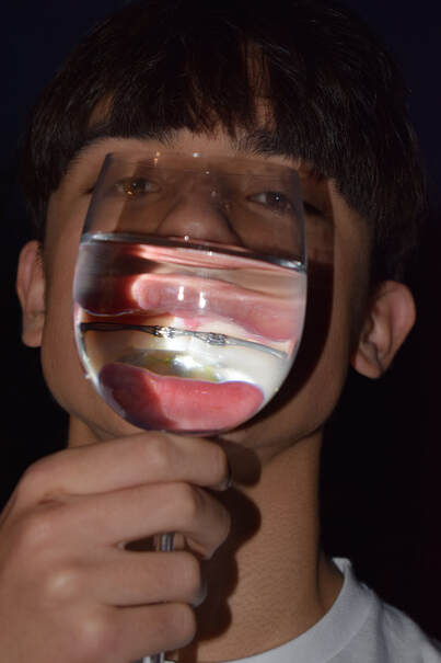
Artist and Me
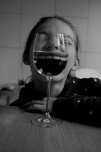
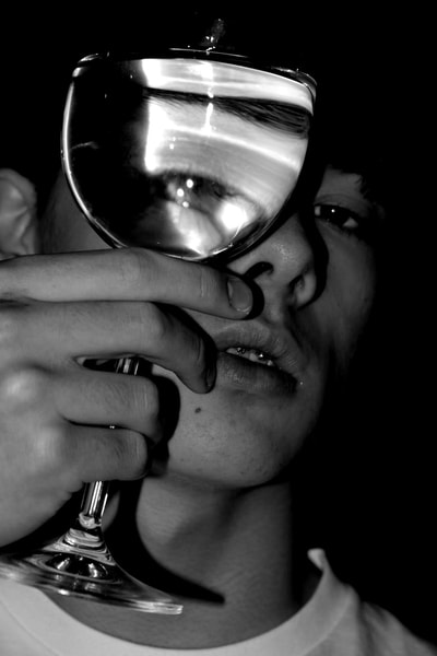
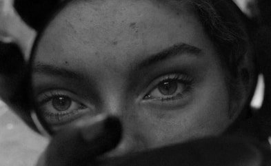
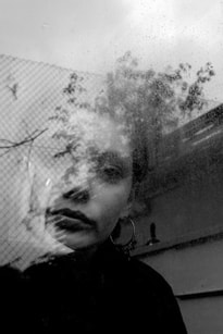
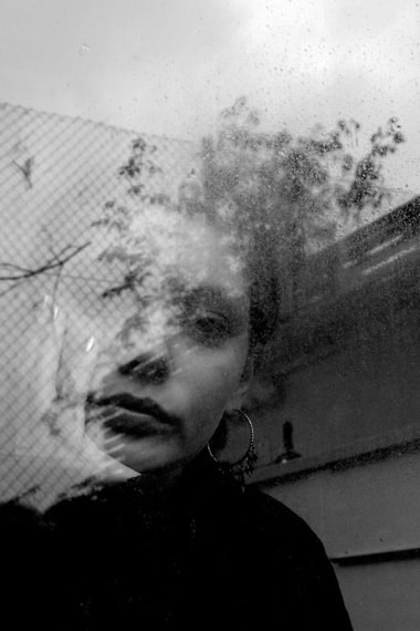
This image has a very strange vibe. It seems at once both alien and like something from the cover of vogue. I love the bug eyed effect the distortion in the glass creates and the stretching shadows towards the camera.
|
I used the artist image as inspiration for this image. I tried to create a flipping of the models eyes and stretch and distort her face. I also turned the image black and white so it was more shocking.
|
Visual Brainstorm Development

|

|
|

|

|

|

|
|
|

|
|

|

|
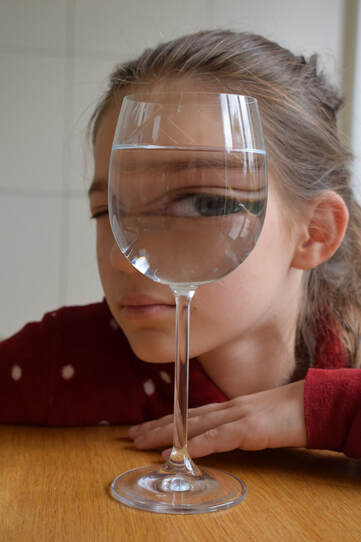
1st Response
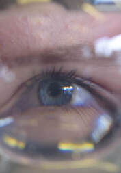
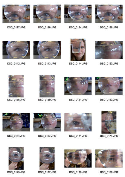
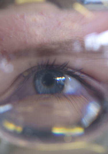
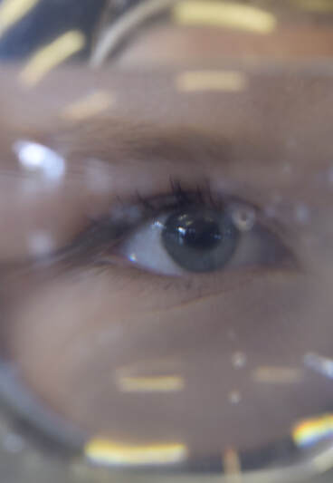
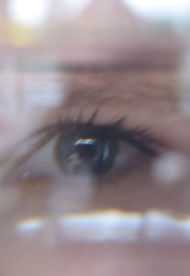
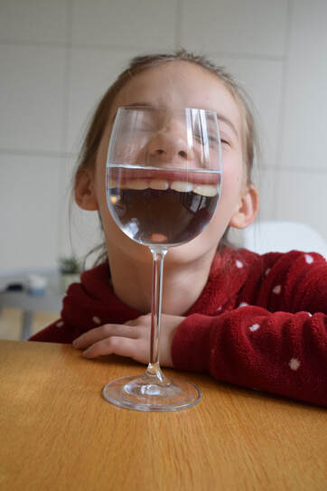
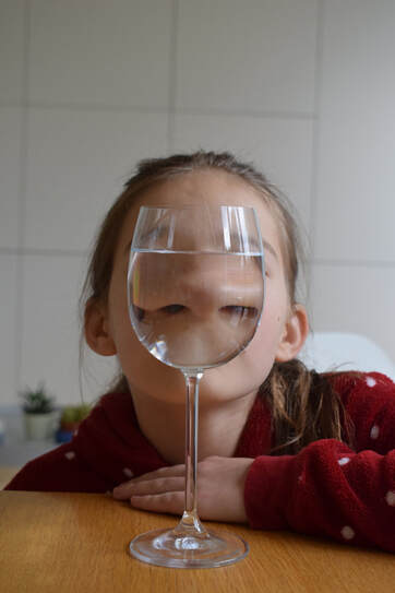
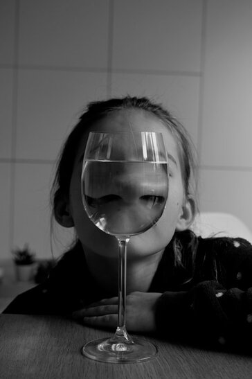
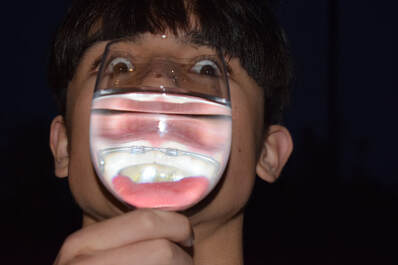
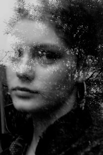
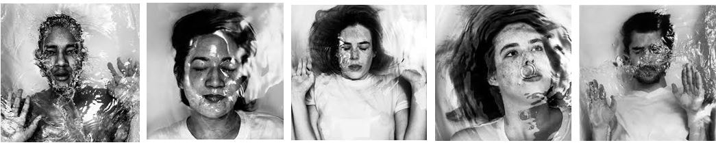
In this task I tried to distort faces and parts of faces using water. I wanted to focus on the eyes as they are usually an interesting focal point of the face. I also wanted to get colours reflecting and refracting in the water to bring out the natural colours of the eyes. I anted to do extreme close ups so that I could really focus on one aspect of a face and create an image out of extreme magnification of that one aspect of the persons face.
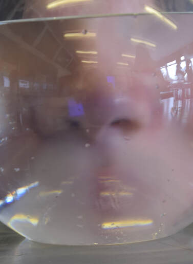
|

|
www: I like the colour and reflection of colour in my first images and I like the depth of the eyes in the edited photos in black and white. I also like how the distortion isn't obvious but almost a magnified images
Ebi: next time I will try and create more abstract distortions and create a more interesting image.
Ebi: next time I will try and create more abstract distortions and create a more interesting image.
2nd Response
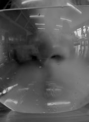
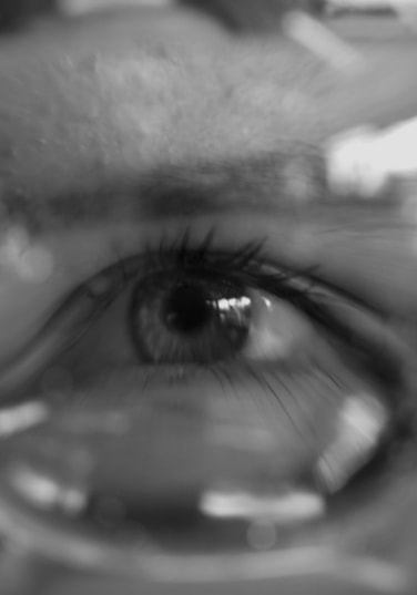
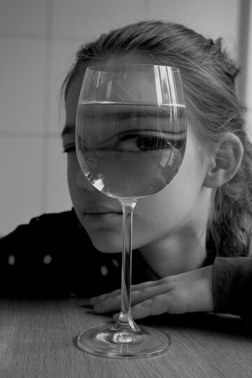
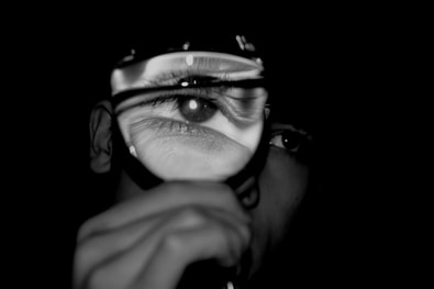
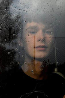
In this response I was trying to create a more abstract image and create even more distorted images.
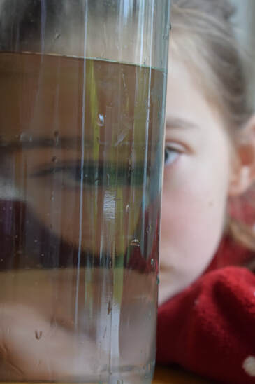
|

|
www: I like the distortion in all the images and the use of framing and magnification.
Ebi: I wish i created a more classically beautiful image with more varied colour range.
Ebi: I wish i created a more classically beautiful image with more varied colour range.
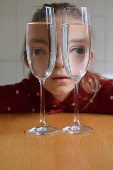
Reflection Distortion - Halfterm Homework
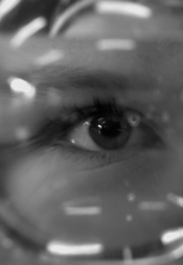
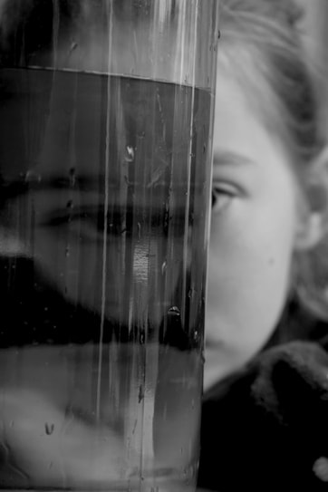
In this Homework I was aiming to extend the piece I did previously on distorting portraits through the refraction of light through water. I really wanted to create more obscure images that played on the original idea of strangeness.

|
|
www: I got more distortion in these images and I like the weirdness I think I created
Ebi: I would have liked to use more models and different vessels for water.
Ebi: I would have liked to use more models and different vessels for water.
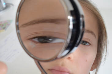
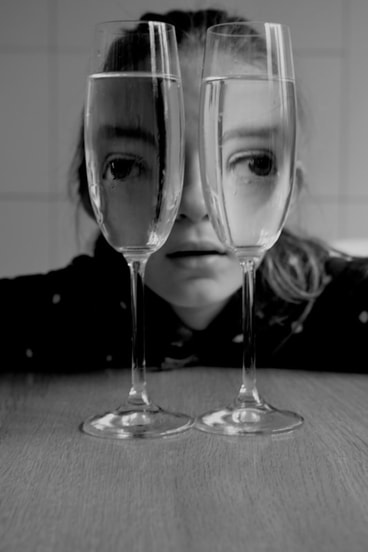
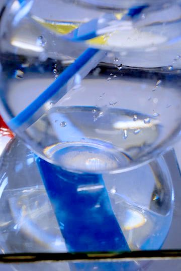
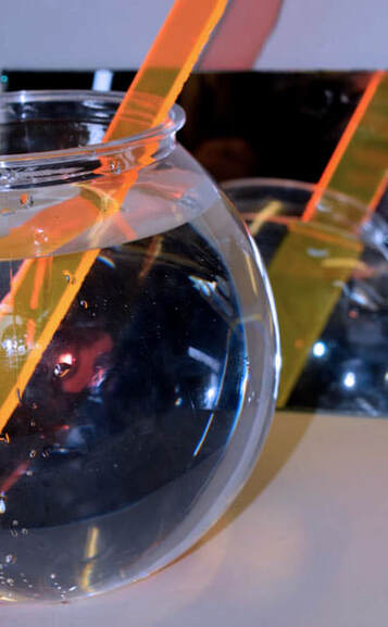
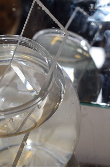
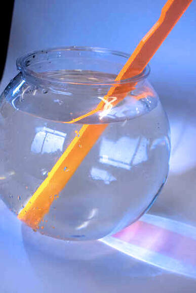
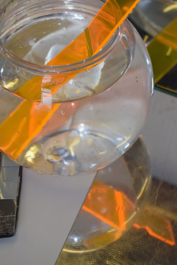
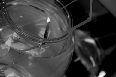
Refraction
In this task I was required to refract the light through water to create a distorted image of coloured plastic. I aim to create distorted an colourful Images that are interesting to the eye.
|
|
|
|
WWW: I like the colour in these images. I like the cold white contrasted by the pops of colour distorted by the different densities of fluids.
EBI: I want to incorporate more mirrors into my images because I think that is a really interesting idea to expand on.
EBI: I want to incorporate more mirrors into my images because I think that is a really interesting idea to expand on.
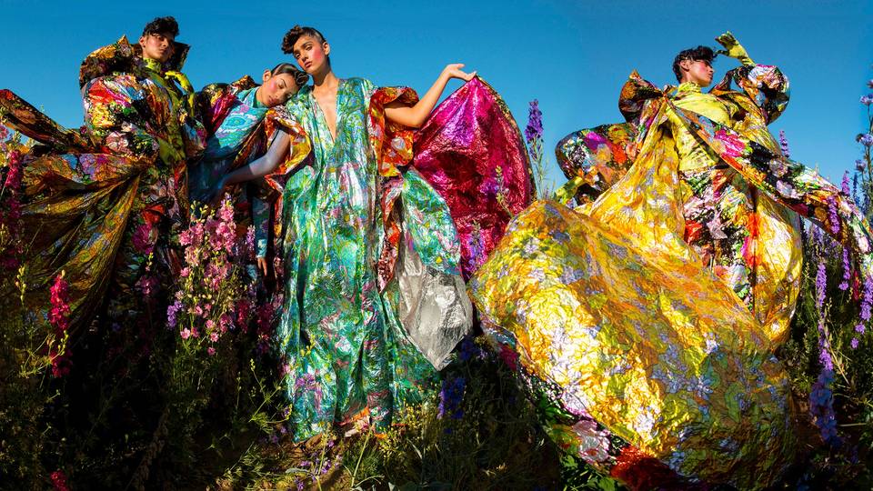
Trip to Wonderful Things by Tim Walker
Tim walker has felt inspired for a very long time, his obsession truly seems to run deep. this collection is strange in its insane childish nature and endless magic. His aim in this collection was to make the person touring tour their own imagination; in this he obviously absolutely, passionately and firmly believes. He uses the camera to explore these crazy ideas. he proclaims that 'the camera is a state of mind'. The simple fact that if you are feeling chaotic your photo will be chaos, if your feeling sinister the photo will reflect this, the same with romance, mystery and mystery. It is a pure manifestation of your psyche.
|
First Room- Stained Glass
In the first room of the exhibition, the inspiration was taken from stained glass. Around the 1520's there was a lot of unhappiness peasants and land owners often had problems with each other. Religion was an area of a lot of problems in society. This was after the Black Death which wiped out a large section of the population and undoubtedly created a lot of sadness. The stained glass itself is something amazing, like a slideshow of colour. the colours were vibrant despite only being created by natural sources. The stained glass on show was from some French cathedrals and Canterbury. These would likely have been used associated with a saint or virtue. Tim took this inspiration in making the idea for the images in the first room, for example the on on the left. |
|
|
Second Room- Pen and ink
The inspiration from this room came from the paper conservation studio at the V and A, largely by Aubrey Beardsley in the 1890's. some of the inspiration is depicted the images through shoes. in many of the Beardsley drawings the shoes are very pointed, and so in the Walker images also. The exaggeration of graphic black in these images are really what make them pop. The monochrome of the images was strictly enforced, dense clack clothes and accessories and stark cold white backgrounds. The pictures of Beardsley were created during a repressed period of society and the restraint in the images reflect this beautifully. The art were aggressively 2D but Walkers translations are created into a fantastic 3D image with textures of movement and props. |
|
Third Room - Cloud 9
This shoot was for British Vouge, inspired by some beautiful V and A objects from India. These images were taken in Britain and Tim Walker was proud of the multiculturalism of Britain. Thinking of London as a melting pot of culture, travelling through the world simply by stepping out into the streets. He used models with heritage from India, Pakistan and Bangladesh, dealing with another culture in a shoot with such political unrest. I think the colours in this shoot are really where the magic comes to life. This image (on the left) was used for many adverts for the Wonderful Things exhibition and was very successful. Tim looked at historic paintings from South Asia and the bright pinks, blues, yellows and orange. |
|
Room Five - Lil' Dragon
The inspiration for this room came from a suffbox from 1745, Walker saw the box and imagined a story of a emperor or empress walking a dragon in the night. He describes them picking a flower that only blooms on a full moon. This idea spread into two empresses with UV lighting and a weird world. Clothes played a large part in this set. Gold with intranet design and precious stones. On f the ideas was using exaggerated shapes and volume, which is also used in many of Walkers other shoots. The idea was also impact, nothing that could get lost into the shadows and everything that would pop under the Uv lighting. The aesthetic is very luminescent when it translates onto photography, clothes and women that look to be glowing. 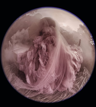
|
Fourth Room - Box of Delights
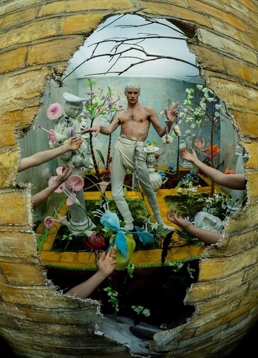
This is another magical room for me. The inspiration was taken from a little embroidered box from the V and A. Tim explained it as " it made me think of how we, as human beings, need to build a private world that we love. In this case, a magical inner garden". It reminded him of the London club scene which is strange but I think fitting. The props were old and new, drab grey statues and colourful florals. This helped add to the magic of the images. In the photo on the left the arms reaching inwards to the model are emphasised by the distorted camera used to take the image. By doing this Walker creates a captivation with the contents in the centre of the image and draws the eyes into the centre. In the exhibition the images taken by Walker surrounded a glass section of the wall. Behind this glass was a recreation of the set which was beautiful. It had all the props and the blue wallpaper and plants. The only thing missing was the model. The room outside the glass was also remarkable, pink was the dominant colour. It was in the wallpaper, dolls house, tiny chairs and sofa and the mini square tv. 
Room six - Land of the Living Men
In this room Walker focused on his fascination with the male body. In my opinion it was one of the most beautiful room he made. He focused on the beauty that has not yet been explored as openly in media and the images reflect how enchanting that can be. The distortion in many of these images was beautiful and paired beautifully with the flowing pastel colours and wardrobe. In the image on the left I love the dusty pink monochrome, I think the textures of the flowing veil and feathered dress pair beautifully with the smoke blowing around the model and the texture of the fabric on the ground.I really like how you can't quite place much about the image, there is no face to focus on so you appreciate everything else that creates this image more. |
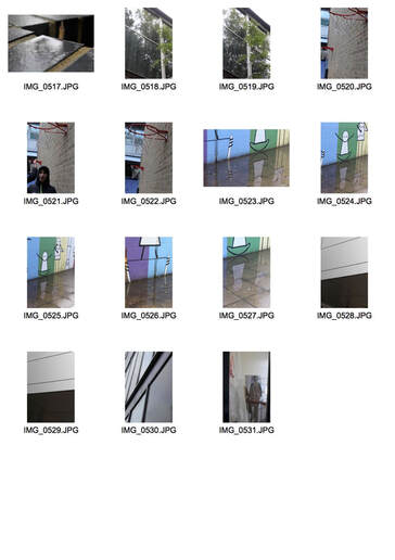
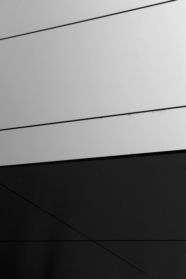
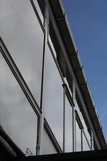
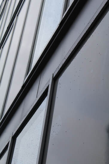
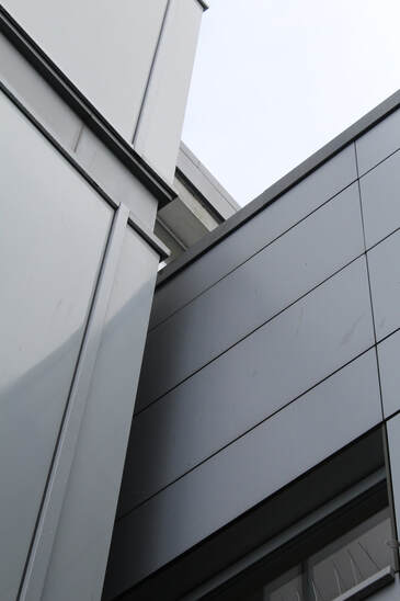
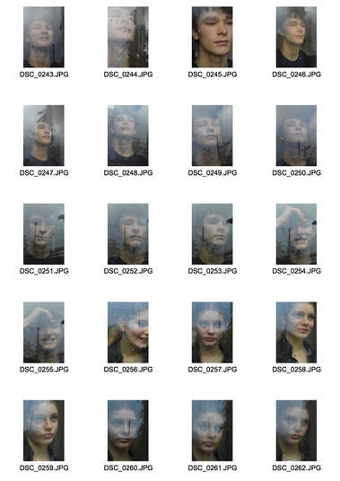
Patterns, Structure and Reflections
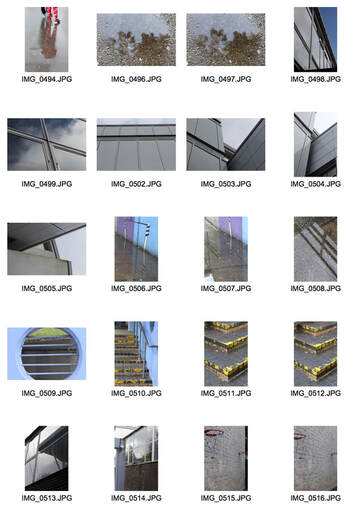
In this task I was aiming to capture refections and distortions in real life and man made structures. I really wanted to take a scene that I see every day and choose parts of it that would be interesting, even to me.
|
|
Edits
|
|
WWW: I like the harsh lines in these images and how they flow.
EBI: honestly I think that these photos did not meet my expectations, they are a lot more boing then I thought they would turn out and next time I will try and use some different techniques and ideas.
EBI: honestly I think that these photos did not meet my expectations, they are a lot more boing then I thought they would turn out and next time I will try and use some different techniques and ideas.
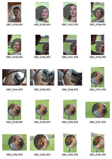
Reflections in water
Slava Semeniuta
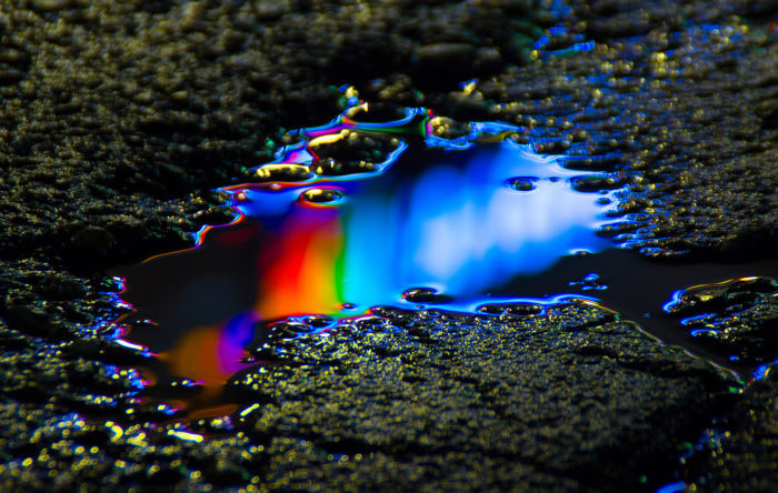
I really like the colour in this image and the way it looks like molten light, magical.
|
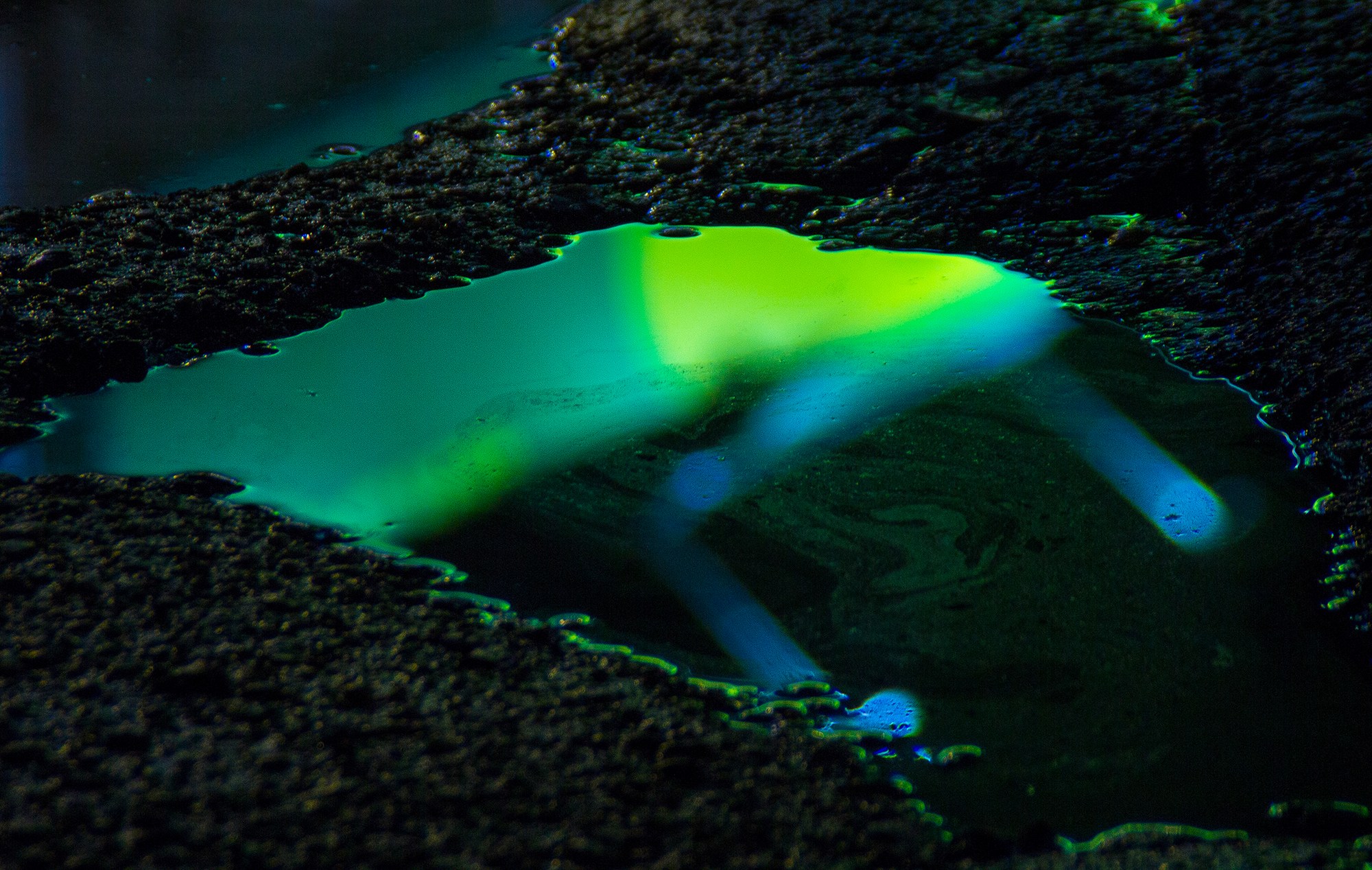
I like the green in this image, it reminds me of a radioactive substance.
|
Semeniuta is a Siberian artist and photographer he creates images from the reflections of artificial light on puddles in urban areas. His photos are whimsical and reflect natural colours but make them look like melted light. He likes natural and neon colours that you can't find in the natural world. He takes inspiration from science fiction and outer space. His photos are especially interesting to see because of the juxtaposition between the smooth liquid and the grainy, rough gravel of the tarmac. He has taken these photos fairly close up and enhanced the colour saturation so that it jumps out at you from the first glance. He effectively uses the artificial light to light his dark images.
|
|
www: I really love the colour in these images they look to me almost futuristic in the way they reflect and shine the pink light of the black surface.
Ebi: I would have liked to use more colours and different places.
Ebi: I would have liked to use more colours and different places.
Edits 2.0
|
|
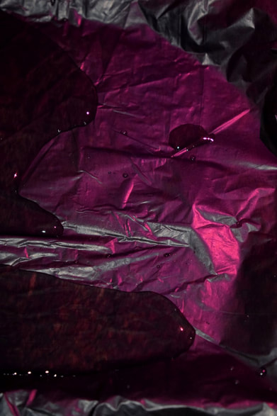
Three strands
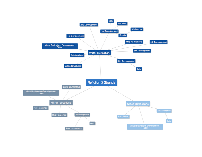
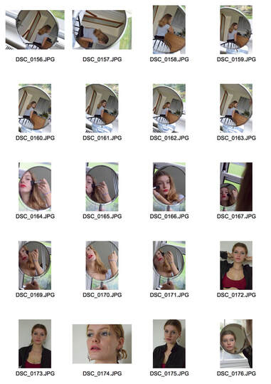
1st strand // Erwin Blumenfeld
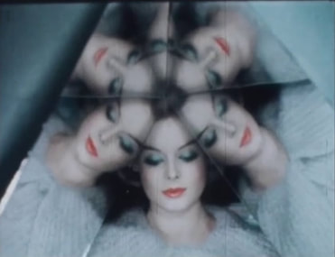
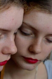
I really like this image because of the colours in it, the cool blue and warm orange lips contrast well. Also the way the woman face is reflected is enticing and draws more attention to the image.
|
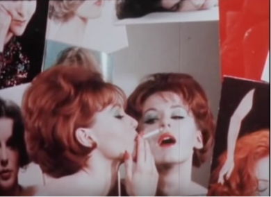
I like this image because of the red through the piece, as it is reflected in the mirror and through the image it draws the eye and catches attention to the models hair and lips.
|
Blumenfeld wa san American photographer born in Berlin in 1897 was a fashion photographer for most of his working life he was very successful and ended up working in Harpers Bazaar. This set of images is actually from his fashion film of photography and uses a lot of mirrors through the work. I really like the way he approaches portraits, the way he uses colour to connect the photos ad make them stand out. I also like how I feel as if I could stare at the images for hours and I wanted to mirror the level of interest I have in his photos, in something I could create.
Visual Brainstorm Development Table
|

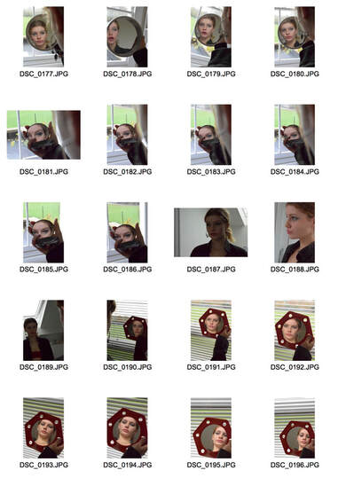
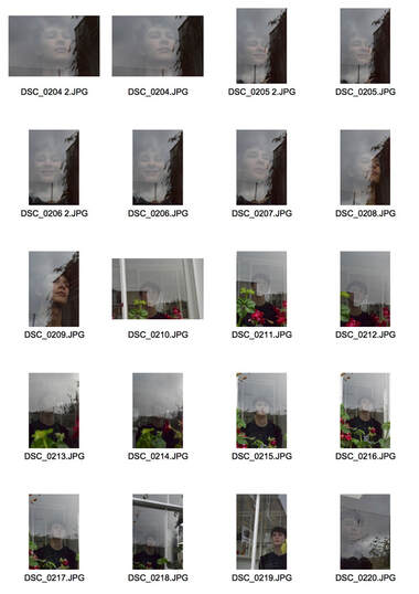
First I took the original image from Erwin Blumenfeld and started too unpick what I wanted to take inspiration from
|
|

Then I started to explore how I could make my mages more interesting by using broken mirrors
|

|
Then I started to putt out the colours I wanted to use more and I started to change the idea slightly to create a more beautiful image.

|
|
Then I started to use photoshop to complement end exaggerate parts of the images.

|
|

I wanted to introduce more open lighting to complement the light blue in the images and make the contrast of there'd more vibrant.
|
|

Then I started using more mirrors to create more reflections.
|

|
|

Here I used photoshop to edit the image further to draw out the blues.
|

|

Finally I created my own, different take on the strand originating from Erwin Blumenfeld but my own take on the idea.
|
|
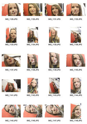
1st Response
|
|
|
|
|
www: I really like the colour in these images, the harsh red and the pale blue. I like that the shapes and textures are interesting and really draw the eye.
EBI: I think that these images could be greatly improved. I lost some of the focus in some of the images and they are not as fluid as I would have liked them to be.
EBI: I think that these images could be greatly improved. I lost some of the focus in some of the images and they are not as fluid as I would have liked them to be.
2nd Response
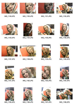
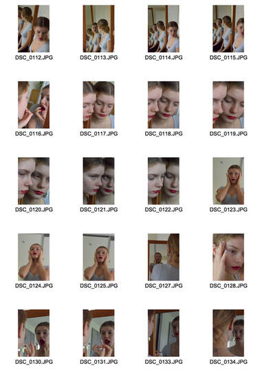
In this response I wanted to focus more on pulling out colours. Specifically the colours Erwin Blumenfeld used in this images, red and blue. I really liked the way the portraits were captured in a way that was both vain and self aware.
|
|

|


|
WWW: I really like the way these photos turned out. I like the colours I used and how they turned out. The red with the blue and green really makes the images more interesting and draws your eye to multiple parts of the image.
EBI: I think I cold have made these images more loud and somehow more interesting and eye catching.
EBI: I think I cold have made these images more loud and somehow more interesting and eye catching.
3rd Response
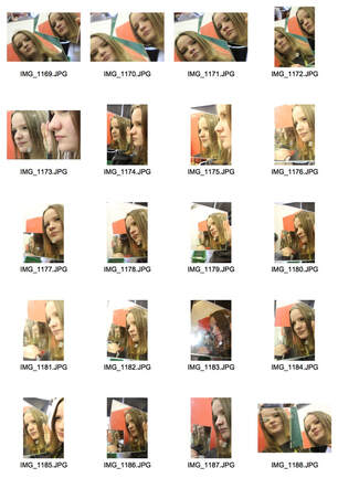
In this response I wanted to extend my previous response and start editing the photos more so that I can create points of interest in the photos. I also did this to focus on just one colour in the image without other distractions.
Steps on Photoshop

|

|
I like these edits because of the contrasts and the attention drawn to the eyes and the blue and green in them.
EBI: I would have liked to have more photos and more types of image.
EBI: I would have liked to have more photos and more types of image.
A more focused image?
|
|
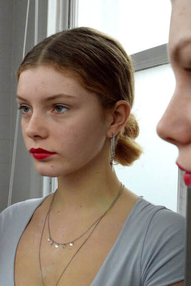
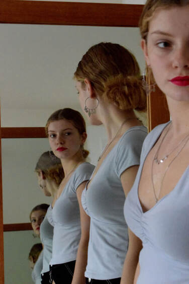
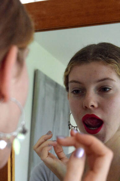
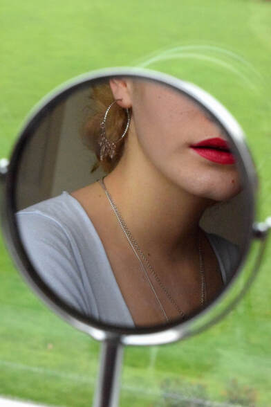
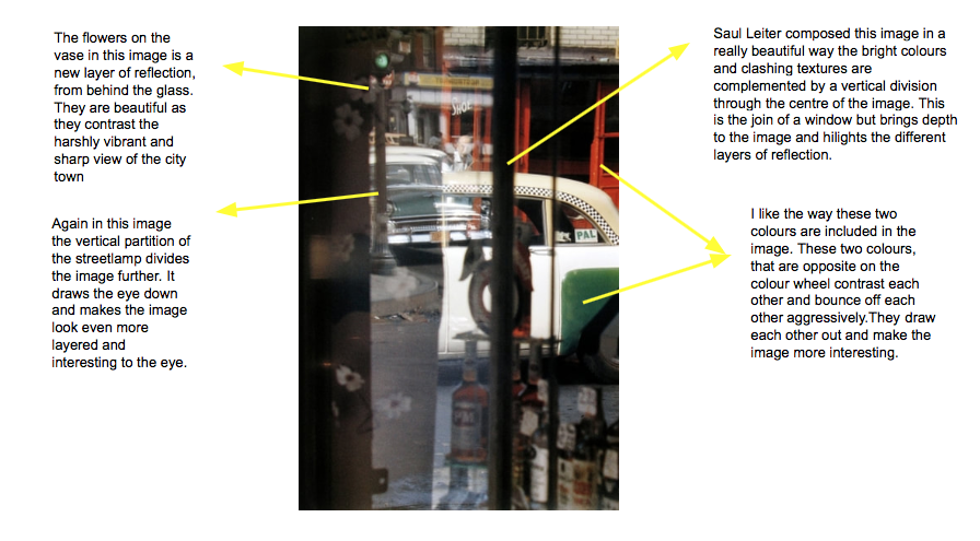
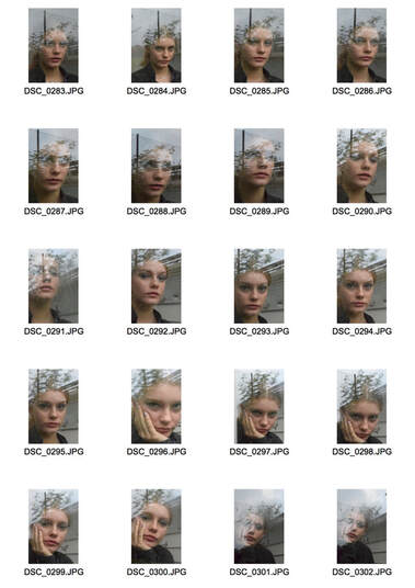
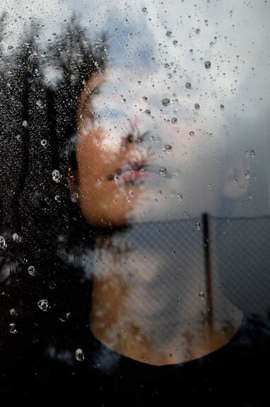
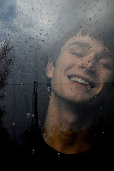
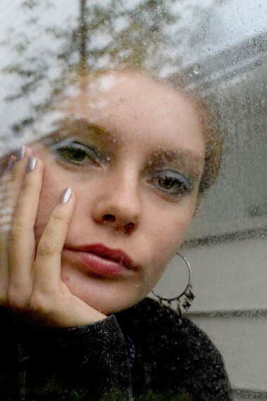
2nd strand // Saul Leiter
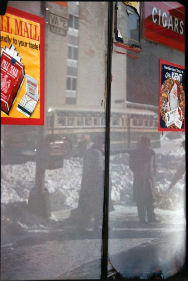
I like this image because of the duality that it reflects.. I like the contrast the photographer has made with both the colours and construction of this image. I love the harsh, man made red contrasting the clean white of the snow.
|
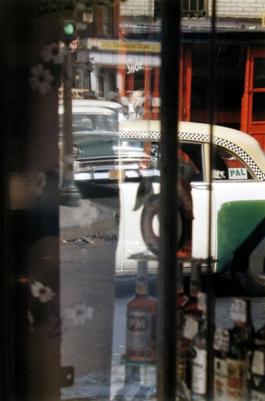
Two clashing images layered through the reflections of the glass. This image is tied together only by colour. I love the multitude of confusion this image creates, the only thing I can pick out as real is the green taxi on the left of the image. The bright red behind this complements the green and draws it forward.
|
Saul Leiter was born in America, Pittsburgh. He was an artist and a photographer and started taking photos in black and white and progressed to colour later. He created a huge colour image catalog and ended up having many many exhibitions of his work. The beautiful thing about his images are the colours they give the photographs a painters touch and really make them special.
Visual Brainstorm Development Table
|

First I analysed
|
|

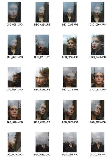
I then decide to experiment with harsher contrasts and more extreme and complicated reflections on the glass.
|
|
|

In this image I started using softer lights and I softened the colours I was using. I think it really works with the droplets of water on the glass .
|

|

This is when I started to branch out from Saul Leiter's work. I started using more colours, in this image I liked quite an oversaturated idea with the blues and pinks pulled out with an orange of her hair.
|
1st Response
In this response I was aiming to capture two reflections without extra editing. I put my models behind glass and photographed them layered with the reflections of the outside world. I wanted to put the faces in the spotlight even though they were behind a screen.
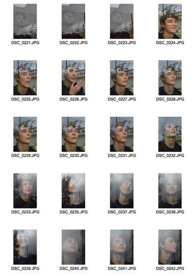
|
|
|
Edits


|
|
WWW: I like how I got the reflections of the glass to stand out.I also like the colours in some of the images and the harsh contrast in the black and whit images.
EBI: Some of the images look a little bit messy and I would have liked the series of images to flow together more.
EBI: Some of the images look a little bit messy and I would have liked the series of images to flow together more.
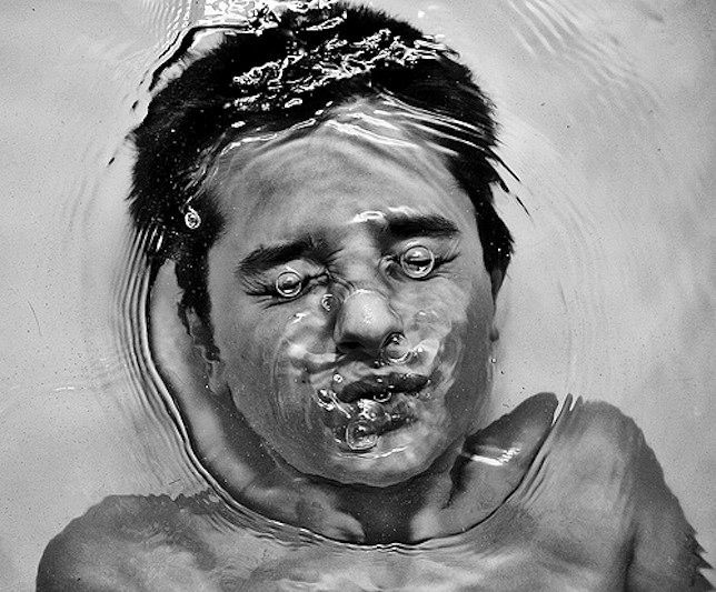
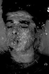
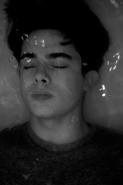
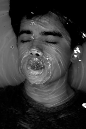
3rd strand //Alban Grosdidier
I like Grosdidier's work because even though he photographs the same idea in his whole project the emotions it creates in the viewer range greatly. I also like his use of harsh lighting and dramatic contrast when he works with water because it changes the way the water responds to light.

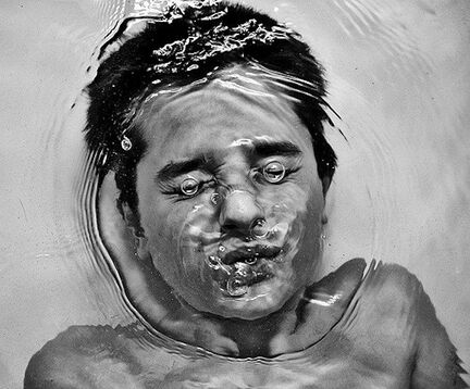
I love the photo because of the playfulness throughout it; the expression on the boys face paired with the comical bubbles captured perfectly above his eyes almost winking at the viewer.
|
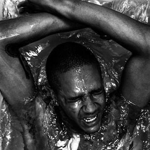
This image reflects struggle the pained expression on the models face paired with the crashing water and defensive arm position creates an emotive image.
|
Artist and Me

My image interests me in similar ways, the many consecutive rings draw my eye. Also the high contrast black and white makes the image seem calm and brooding act the same time. I like the bright white reflections of light on the water in front of his face.
|
I like the symmetry in this image, I like the way the circular ripple engulfs his face and the playfulness of the image in general. The bubbles over both his eyes interest my mind and this is enhanced by the high contrast in the image.
|
Visual Brainstorm Development Table
|

First I took the images of Alban Grosdidier and I tried to recreate his style. I liked the interesting texture of his images and I tried to recreate that in my images.
|
|
I liked the images I had captured however I thought a slight change would create a much better mage. I wanted something more interesting.

|
|

I started from the idea of the painting ophelia and the ancient Egyptian milk baths. I thought the white would complement the bright colours of the flowers and dress.
|
|
1st Development
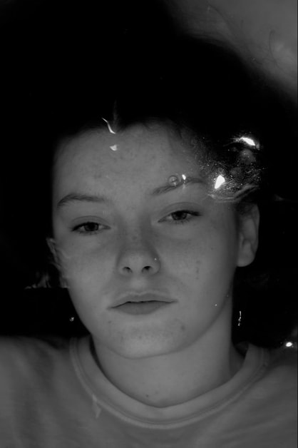
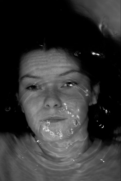
In my first response I was hoping to just figure out how water interacted with the people I put in it. I wanted to play with the ideas of both calm water reflecting peace and tranquility in the model, and ripples and waves that could create a more interesting image.
|
|
|
|
|

|
|
www: I really like the photos I captured especially for a first response. I like the patterns in the water and the ripples but also the tranquility when you can almost not tell that they are alive. I also like the sharpness I achieved in the black and white.
Ebi: I want to explore more interesting ways of using the water and the way I can get the people to move through it in the future. I also want to use more colour in my next shoots.
Ebi: I want to explore more interesting ways of using the water and the way I can get the people to move through it in the future. I also want to use more colour in my next shoots.
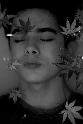
2nd development -Then I added leaves
Here I wanted to change something in my photos so they were more interesting to the eye and slightly more whimsical.
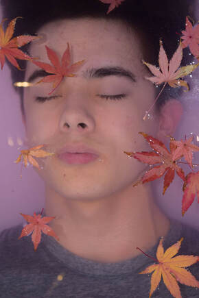
|
|
http://beacox.weebly.com/force.html#
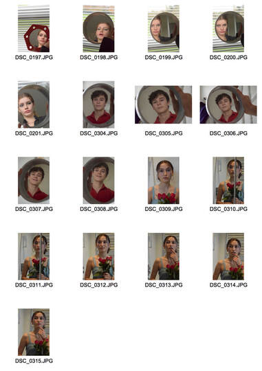
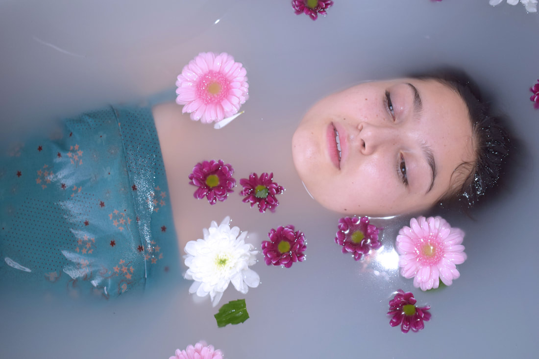
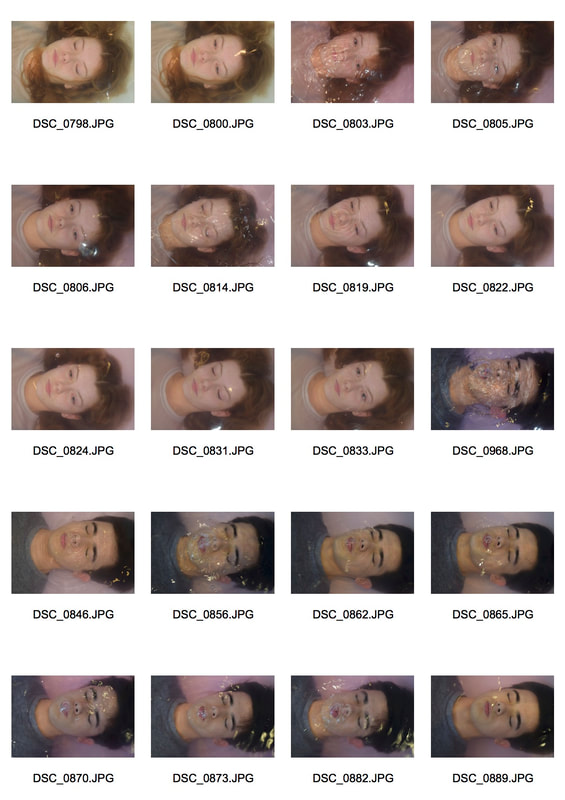
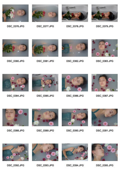
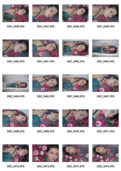
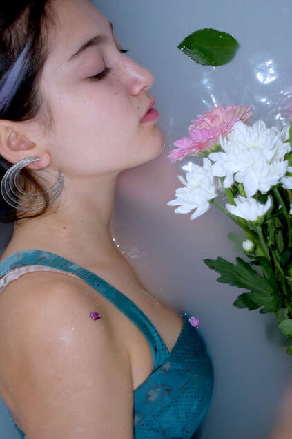
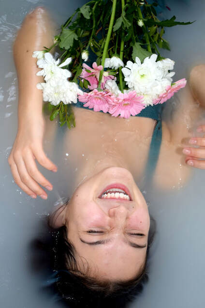
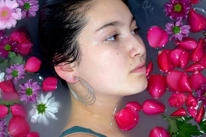
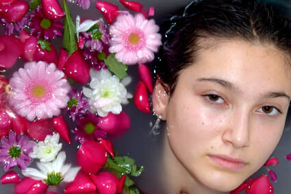
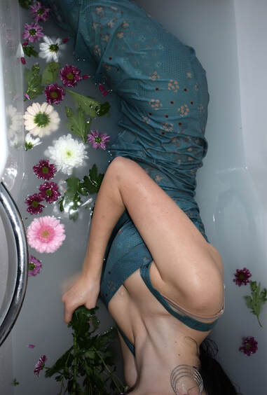
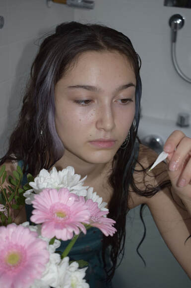
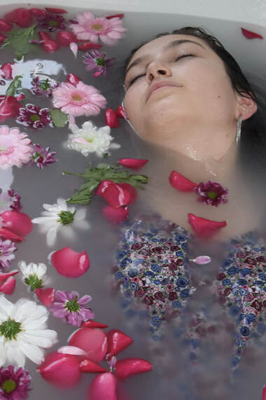
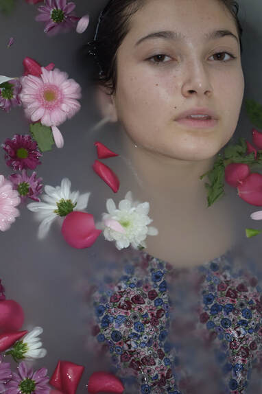
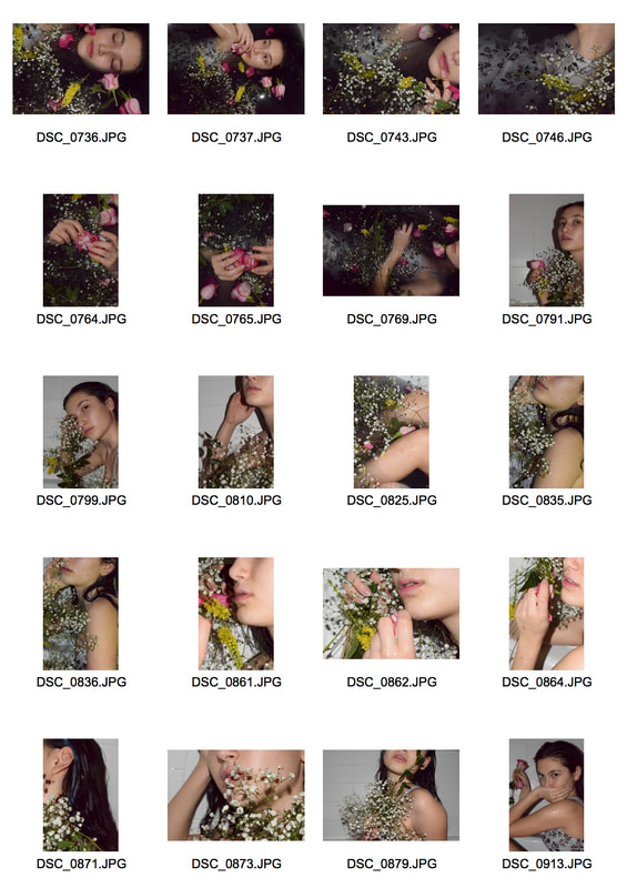
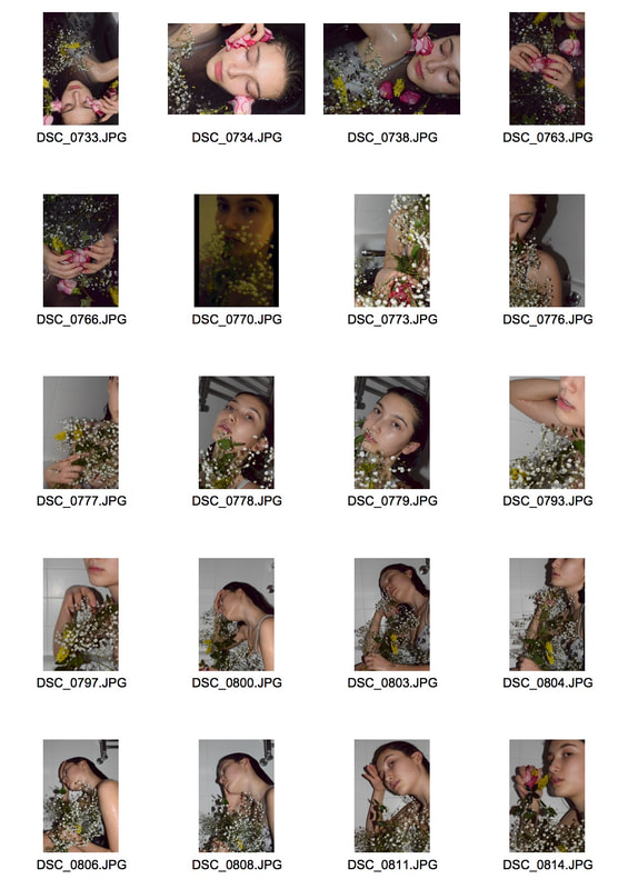
3rd Development // Milk Baths
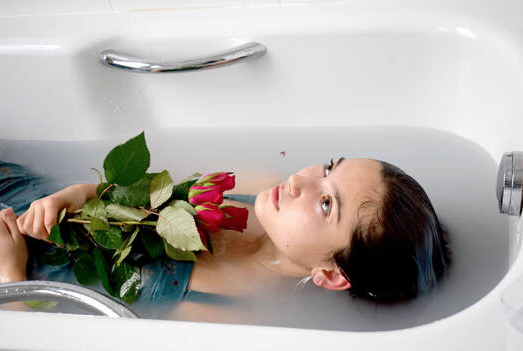
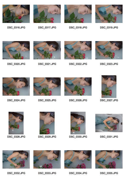
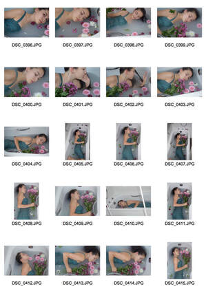
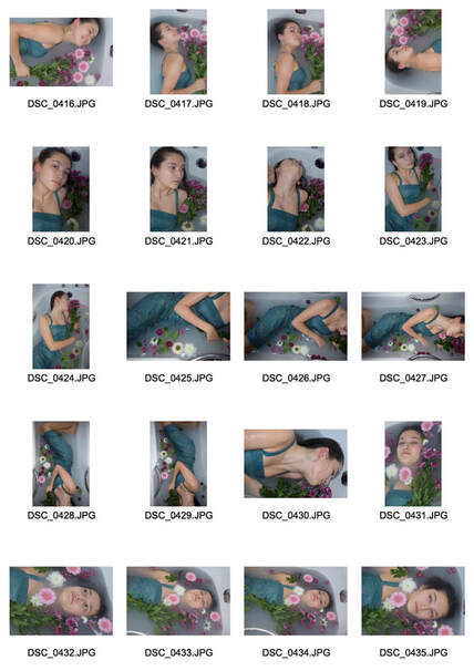
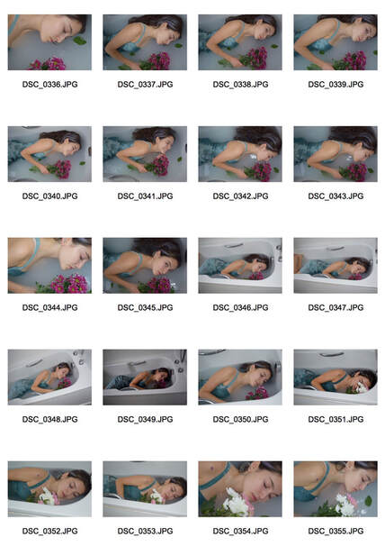
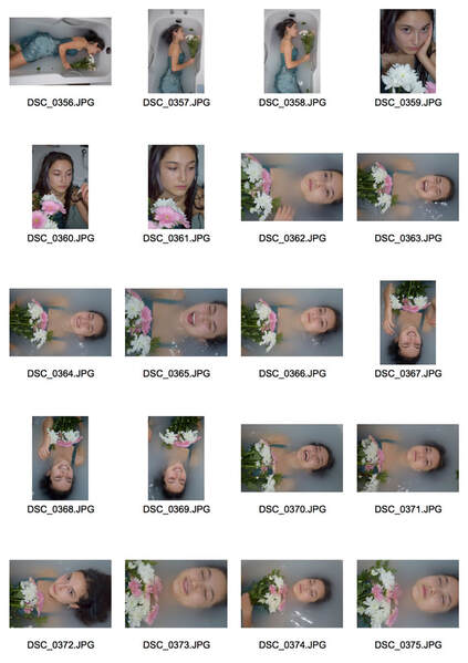
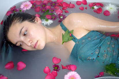
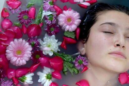
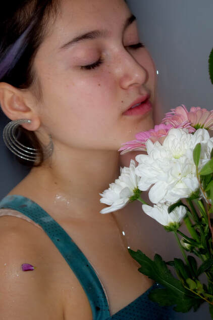
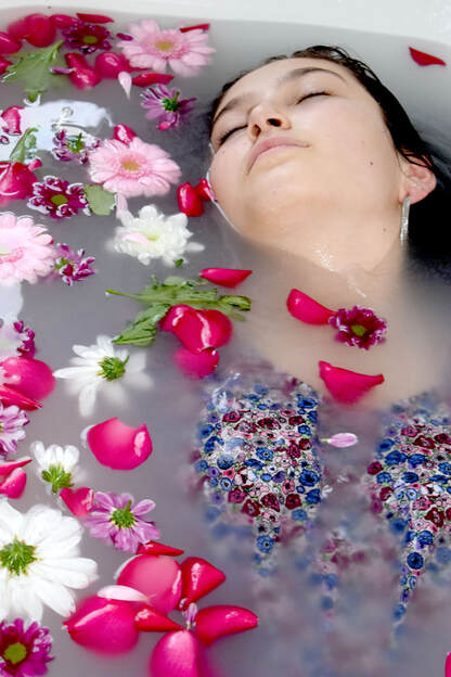
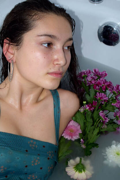
I liked the idea o developing my water strand further to encompass more. Milk baths are an age old tradition that brings my mind right back to Queen Cleopatra to preserve her god like beauty. The practice has always seemed magical and luxurious to me and defiantly would make for a very interesting photograph. I like the way that any colour in the image is then exaggerated and made to stand out more against the pale water. This is why I decided to add flowers and floral patterns to my image.
I created my "Milk Bath" with bath oils that turned white in contact with water and I suspended the model with different arrangements of flowers. Also I used bright lighting to exaggerate the water and pull out the bright colours of the flowers, the dress and her hair. I also made the decision to use flash to get the bright reflections of the water to create another layer to my image and create more interest.
I created my "Milk Bath" with bath oils that turned white in contact with water and I suspended the model with different arrangements of flowers. Also I used bright lighting to exaggerate the water and pull out the bright colours of the flowers, the dress and her hair. I also made the decision to use flash to get the bright reflections of the water to create another layer to my image and create more interest.

|
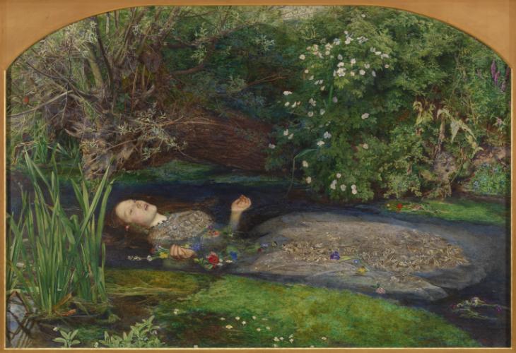
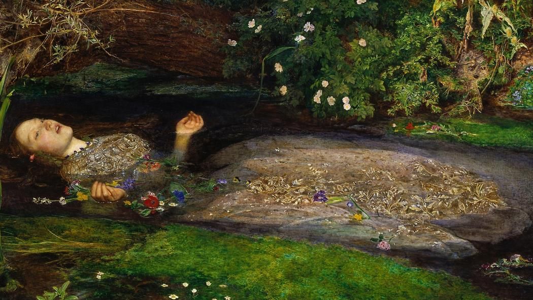
I also took inspiration from this painting. It is called Ophelia and was painted by British artist
in 1851-52, and depicts a beautiful woman floating in lake surrounded by brightly coloured flowers. Ophelia is a character from William Shakespeare's play Hamlet. It shows a grieving woman singing before she drowns in this beautiful lake. I love this painting and I really wanted to take inspiration from it and apply it to my idea about milk baths to create my development on my previous strand. So for my images I tried to capture a mix of both these inspirations and create my own unique image to capture the beauty and soft quality of my inspiration in a singular or set of images. |
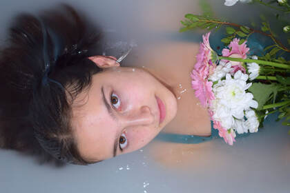
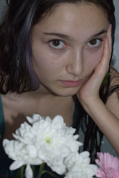
Artist and Me
|
|
In the painting by British artist Sir John Everett Millais ophelia is shown as tranquil and disturbed as she sings to her death. In the painting her face is vacant and sh is surrounded by bright flowers and is dressed in a long flowing dress. In my image I tried to recreate the vibe of British artist Millais' image. I captured the vacant look on her face and the whimsical nature of the art. I also added the flowers to mirror the element of nature in both images.
2nd Response
|
|
Edits
|
|

|
|
|

|
|

|
|
|
|
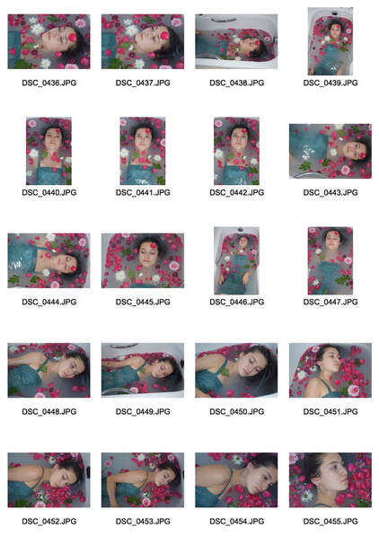
WWW: I love the colours in these images, I really like the way the bright colours contrast with the milky water and create (I hope) quite a striking set of images. I also like the reflections of the water and the lighting in these images.
EBI: As I said, I love these images but I would have liked for them also to have been more clear, if I did this again I would make the bath more harshly white.
EBI: As I said, I love these images but I would have liked for them also to have been more clear, if I did this again I would make the bath more harshly white.
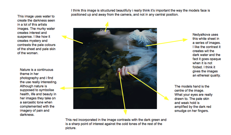
Continuing my third strand - Mira Nedyalkova
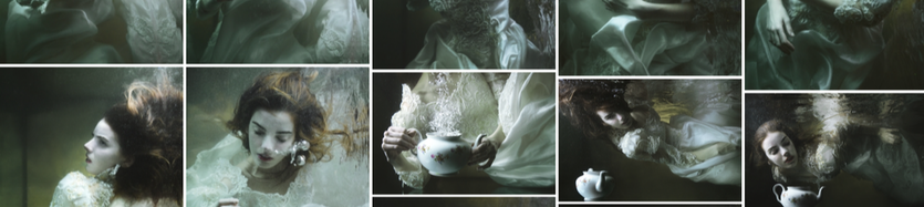
Nedyalkova had a path that led her to photography, she was originally a model and artist. However in 2007 these passions were replaced when she discovered how much she loved photography. Since then it has replaced all other forms of art and she has created hundreds of magical images that really capture her self expression. Many of her pieces follow with the medium of water and there is definitely and interest in nature that carries through her images.
I really love the moody tone her photography creates and the vibrant almost strangled colour that leaks out of the murky water. She has a cold, distant tone and that is intensified by the almost ironic, to me, aggression of reds and greens in her images. This reflects her view of beauty, as the most pure when it is the beauty of pain. Nedyalkova accepts her obsession with water through her photography and confesses that she believes that water is filled with immense power and she is captivated with the importance it has in our lives and also the potential power it has. She likes the idea of threat and risk that is portrayed by water but also the delights of live it helps sustain.
I really love the moody tone her photography creates and the vibrant almost strangled colour that leaks out of the murky water. She has a cold, distant tone and that is intensified by the almost ironic, to me, aggression of reds and greens in her images. This reflects her view of beauty, as the most pure when it is the beauty of pain. Nedyalkova accepts her obsession with water through her photography and confesses that she believes that water is filled with immense power and she is captivated with the importance it has in our lives and also the potential power it has. She likes the idea of threat and risk that is portrayed by water but also the delights of live it helps sustain.
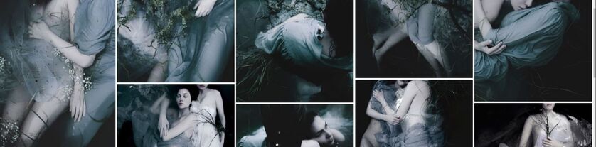
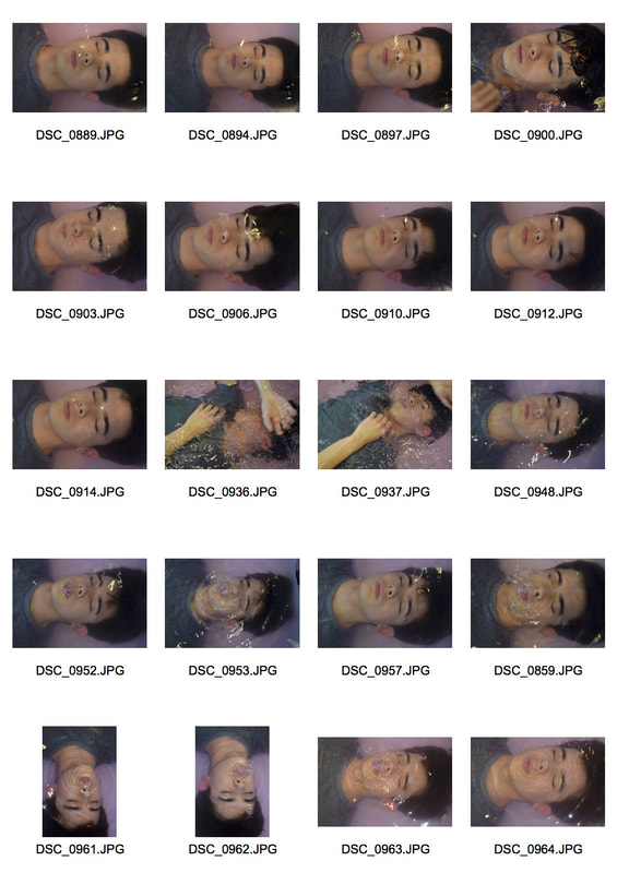
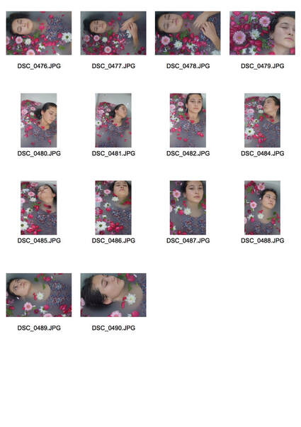
4th Development - Desaturated Edits
In this development I was trying to simplify my idea for this set of images. My aim was to tie in the dull and melancholy emotions from the painting Ophilia with my original Milk bath idea. I also wanted to incorporate the style of Mira Nedyalkova because I thing that her photographs are stunning and also link into the emotions that I am trying to capture from the painting Ophilia. I think this strand started out as reflections in water and has progressed so much. Now I am trying my best to reflect more, I am aiming to reflect he emotions that I was to in not only the. model but also the tone of the image. That includes things like the colours and light used what I take these images.
That is why I made the decision to edit my photos for the second time on Photoshop to dull the saturation, tone down the contrast and create hopefully a more moody image. Although I still like my original images for this strand a lot I think they were not reflective of what I am trying to create from this strand.
That is why I made the decision to edit my photos for the second time on Photoshop to dull the saturation, tone down the contrast and create hopefully a more moody image. Although I still like my original images for this strand a lot I think they were not reflective of what I am trying to create from this strand.
|
|
|
|
|
5th Development - Edits
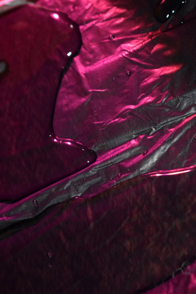
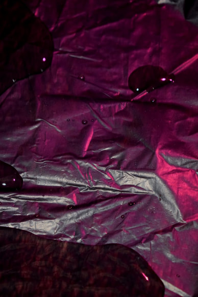
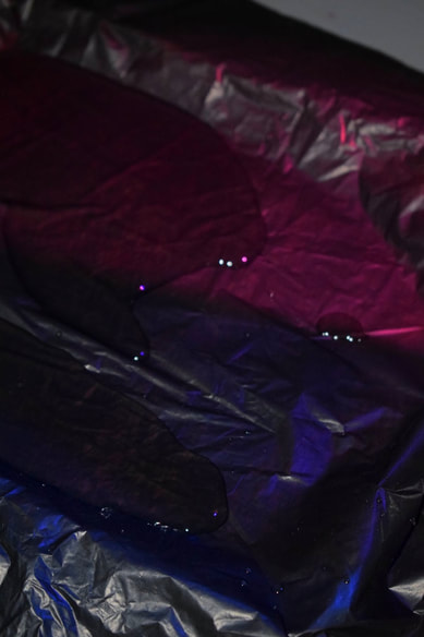
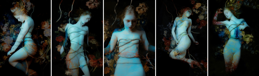
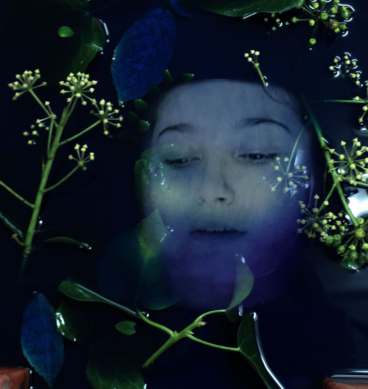
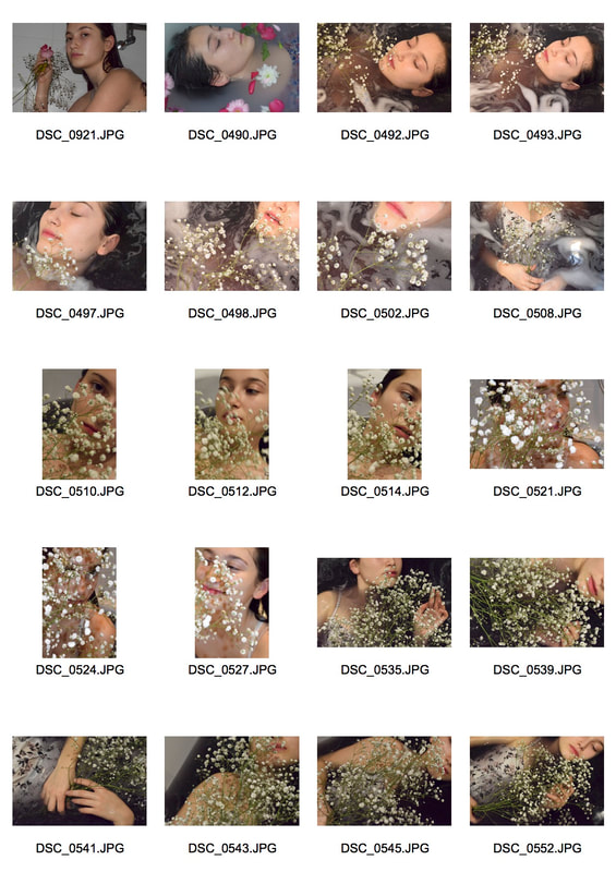
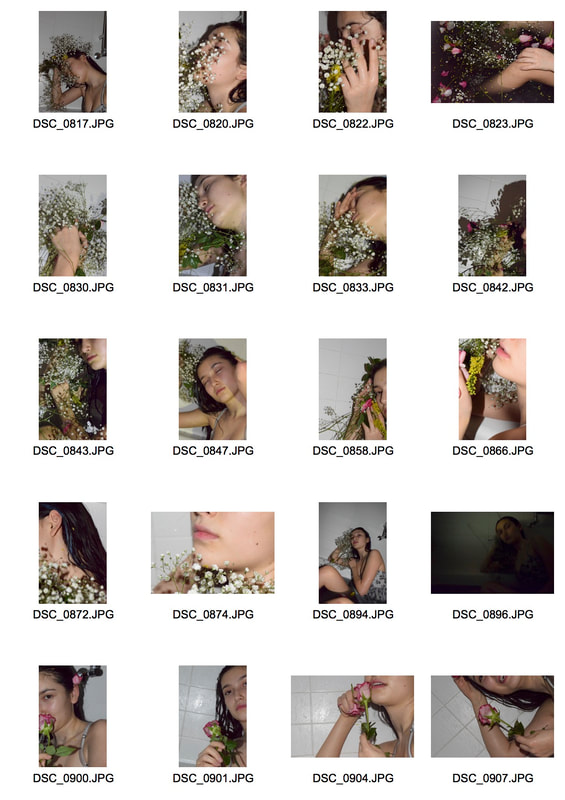
This development I was trying to corporate more of Mira Nedyalkova's style. I took some photos of plants in blue dyed water and them used my old photos to edit and combine. Although these photos don't look very good at all I was the start of a new idea. I wanted a murky theme, almost as if she is underwater. I couldn't decide if I wanted to keep a warm saturated colour in contrast to the blue or lose al the colour and focus on the blues and greens.
|
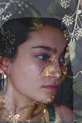
|
|
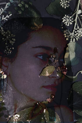
6th Development
|
|
|
|
Final Edits
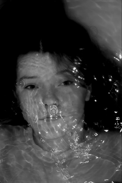
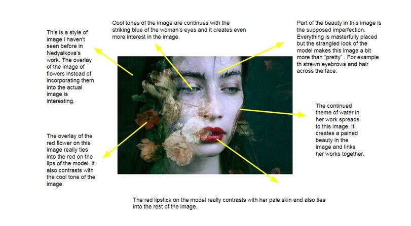
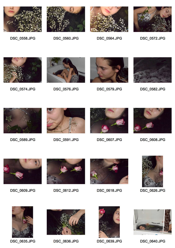
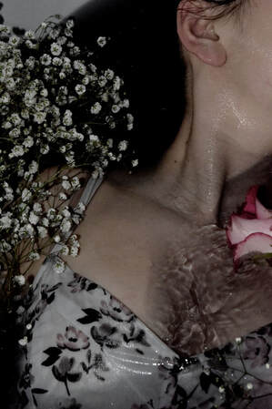
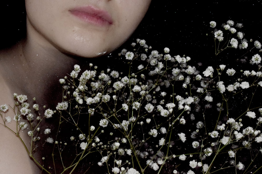
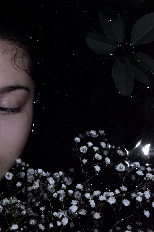
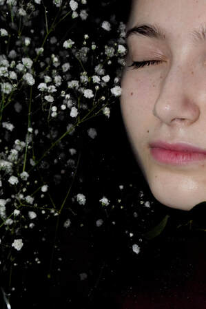
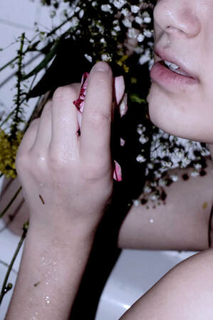
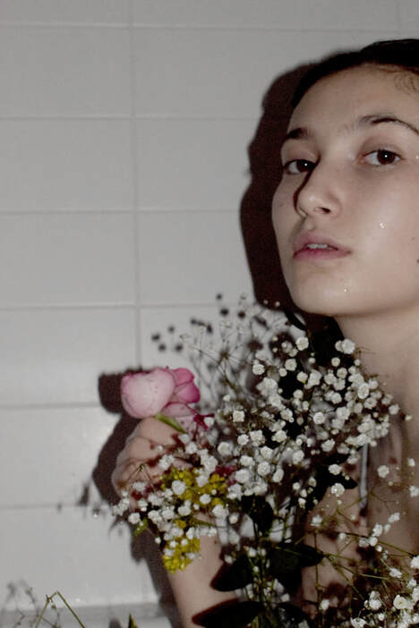
In this shoot I was trying to carry on my plan of incorporating a more melancholy mood in my images and also Mira Nedyalkova's style of images. To do this I used black water instead of white 'Milk' I thought this would increase the contrast in the images. Also in many of Mira Nedyalkova's images she uses white cloudy flowers so I used a similar thing, same with the white dress. So in her images she has flowing white clothing and red flowers I tried to mirror that with a white dress of my own and red lipstick to connect with the dark pink roses in the water.
The aim of editing these images was to dull the saturation of the colours but increase the depth of the dark black water and hair. I also water to create a white in the image which is almost ghostly and pulled out. I wanted to reflect the emotions behind the Ophilia painting in this way. use colours to portray the pain and dull empty emotion shown in the story behind the painting. The drained effect was created by turning down the saturation of the images and enhancing the depth of the shadows in the images, I like the pale and deathly shine of the skin.
Additionally to enhance the darkness of the water I photographed at night when it was dark with the flash on, this created some nice reflections on the surface of the water and enhanced the shadows. Also it made all the lines in the models skin and jaw more defined which paired beautifully with the washed out look of the skin.
|
|


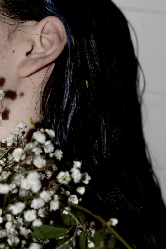
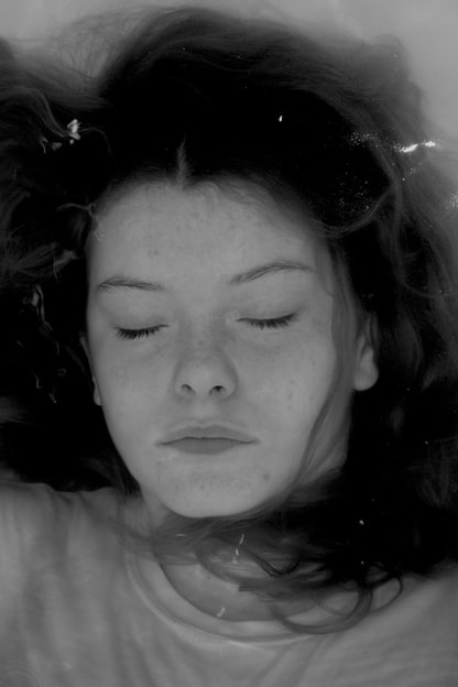
WWW: I really like the lighting in these photos like the cool tone and the contrast of the yellow flowers against the black water. Also the dark pink of the roses and the lips tie the image together. In the images not in the bath I really like the dull colours and de saturated look. I think this makes it tie to the original painting of ophilia and also the link artist Mira Nedyalkova. The white flowers I used also ties into Nedyalkova's photos as a similar flower is used in hers, as well as the white dress which reflects her images also.
EBI: I think some of the images don't tie in with the whole set, the images are nice on their own but don't go with the whole theme. Also I think my images could have been more shocking and contrasted.
EBI: I think some of the images don't tie in with the whole set, the images are nice on their own but don't go with the whole theme. Also I think my images could have been more shocking and contrasted.
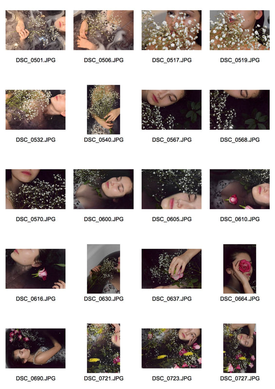
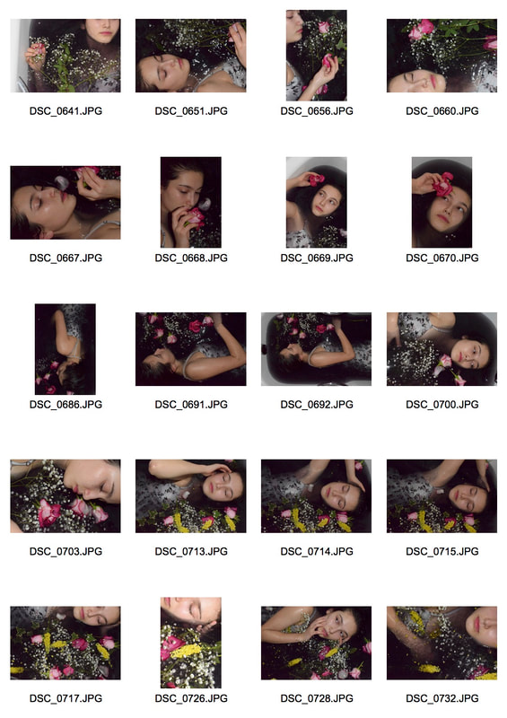
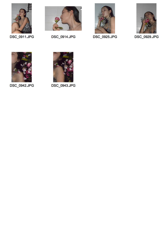
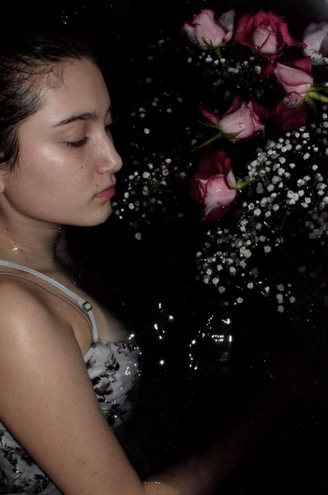
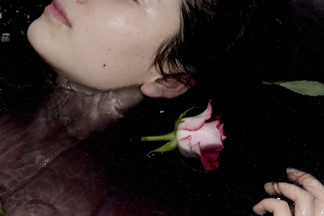
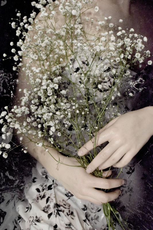
Final Pieces
I chose these images both because they relate the best to the original painting and because they go the best as a set, so they were the perfect choice for my final pieces. I wanted to pick the photos that I found most beautiful and reminded me most of the emotions being portrayed in the original Ophelia shoot.


|

|
