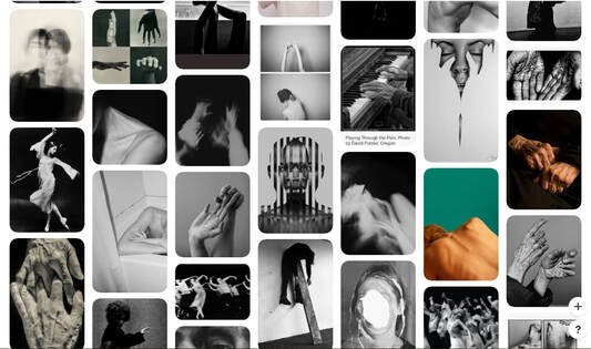
I chose for my exam piece to chose the theme of Extreme contrast. I did this because I believe there are the most avenues I can explore with this idea, I also liked the ideas of contasting social constructs, lighting, colour and emotion in photography. I also thought that by choosing this topic to focus on I can expand my knowledge of using Photoshop and also develop different art styles. Another aim for this piece of work is to start learning about film photography and maybe using that form in my own photography.
Another way I decided on this theme was through research of artists and on Pinterest. I created sections for each theme given but by far my favorite and most inspiring was Extreme Contrast.
Another way I decided on this theme was through research of artists and on Pinterest. I created sections for each theme given but by far my favorite and most inspiring was Extreme Contrast.
|
|
|
|
|
The definition of Contrast in photography is:
Contrast is the scale of difference between black and white in your images. Without contrast you wouldn't have an image because there wouldn't be any differentiation between light and dark; everything would be black, white, or a single shade of grey somewhere in between. An image with high contrast will exhibit a full range of tones from black to white, with dark shadows and bright highlights. A low contrast image, on the other hand, won't exhibit a great deal of difference between its lights and darks, and as a consequence, it might appear flat or dull. |
The Photographer's Gallery
Shot In Soho
|
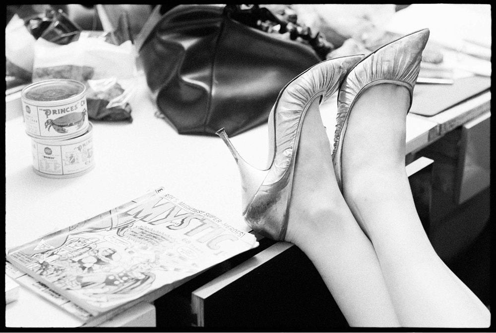
John Goldblatt - The Undressing Room
The images in this set were taken by Goldbaltt in a strip club in Soho. He took them only because he thought they would sell, unfortunately they were trending the Line between the expensive fashion magazines and the sex magazines. It was relatively easy to get into the girls dressing room as a photographer, he was treated as a guest of honour and the managers were welcoming. |
|
|
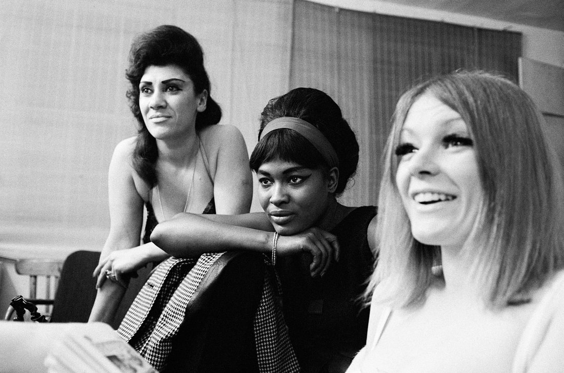
Corinne Day
These images were captured by Day in her small Soho apartment. She mainly photographed her friends, many, the likes of Kate moss, Rosemary Ferguson, George Clements, Georgina Cooper and Sarah Murray. Her images showed the relaxed side of life, it took the faces and body of the most beautiful people in fashion and photographed them in a relaxed and intimate way. She was Britishand is said to have a huge influence on photography from the 1990's. Her style came to be known as grunge. It grew from her and London into an international movement of fashion. However after her large rise to fame and her shoot for the 1993 British Vogue cover she took a lingerie shoot of Moss she caused a scandal. The media labelled her as using Moss and creating child pornography as she was 19 at the time. She also was labelled to carry the 'Heroine Chic' aesthetic. |
|
|
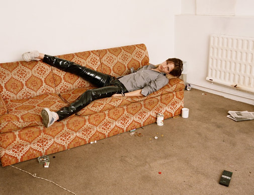
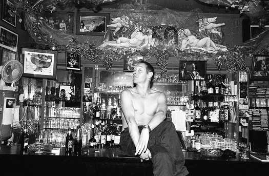
The Colony Room -Clancy Gebler Davies
This set of images were taken in the famous Colony Club. A crazy party scene was found there, but only by invite. To take photographs in there was a rare feat. The club was for the elite, smoking and drinking was industrial. The room was only licenced to sell alcohol until 11pm so the day started at 3pm when the blinds were closed and drinks were had with the light was ribbon in. Fame was so common that the best commodity was an interesting personality. Scandal was avoided but not scandalous acts, the photos were likely only allowed Davies said as they believed they would be rubbish. This scene seemed to have a sell by date, the drinks were overpriced and not very good. |
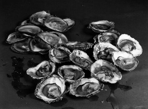
Feast For The Eyes
This floor was created to explore the art you can create with food. Many aspects included creating disgust with the framing and textures to contrast the obvious need for food to survive. In addition food was presented In the exaggeration of that desire. Creating a sexual theme surrounding the images and using food as a way of exploring sexuality. Many of the artists and photographers who explore sexuality though food are females and it is a way of exploring sex in a more interesting and feminine way. I found that these themes of the exhibition: disgust and sex were very interesting when paired.
|
Hannah Collins - Sex 2 Pural/Wet
This image was continuing to examine food as art. The attraction to food to stay alive is and interesting thing to explore when you light it in a not a commercial way. The main focus of food in the media is hunger and when I saw it in a different light at this exhibition were really beautiful. Hannah Collins, born in 1956 is a British contemporary artist and film maker who studied in the Slade School of Fine arts in London. In 1993 she was nominated for the Turner prize and she has made artistic films in Russia and Spain. She has also written many books and is instrumental in photographic history for expanding the art. Her work is shown in places such as the Pompidou Centre, Tate Modern, Walker Art Center, Dallas Art Museum, Sprengel Museum and Reina Sofia Museum. |
|
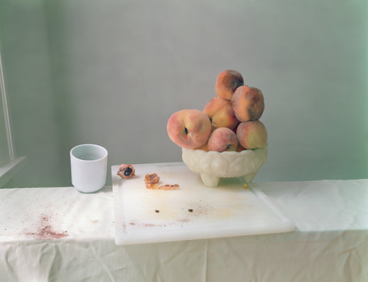
Laura Letinsky - Untitled no. 49
This image caught my eye by the use of colour. The warm pink and orange tones contrast the cool lighting and light blue paint. I think the placing of the bowl of peaches and china cup are quite beautiful. the idea of the image is after a family gathering, The single peach pip and peeled skin contrast the white of the board. Additionally the splash of dar red on the white cloth distracts the eye and contrasts the colour scheme of the images. Letinsky was born in 1962 in Canada is mainly interested in still life photography. The suggestion of a human presence in every photo is enticing without acutely including and figures in her images. In many of them the subjects are rubbish turned into artwork that defiantly hold worth. Paper cups and smashed glass appear in her images, placed perfectly to tell the story and create beautiful images. |
|
|
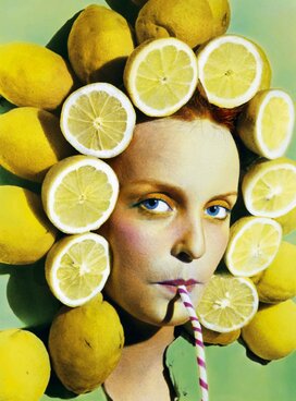
Ouka Leele
In these images created in the Surreal Pop style colour is emphasised. The images came about after the end of Franco's facist dictatorship in Spain and reflect the new freedom of the population. The image uses the bright but sour lemons to show the feelings of the Nation. The sour side of happiness that is felt by the freedom from a controlled society. I think this imagery is very intelligent and portrays the political contexts well whist still remaining fun and interesting as art. I think the faming shows the busyness of the image and the bright blue of the makeup and eyes and the magenta of the cheeks, lips and straw contrast the aggressive yellow and green of the rest of the image. The impact of Franco's death effect the use of surrealism of the image and helped the new, fresh ideas and images of Leele. |
title Artists
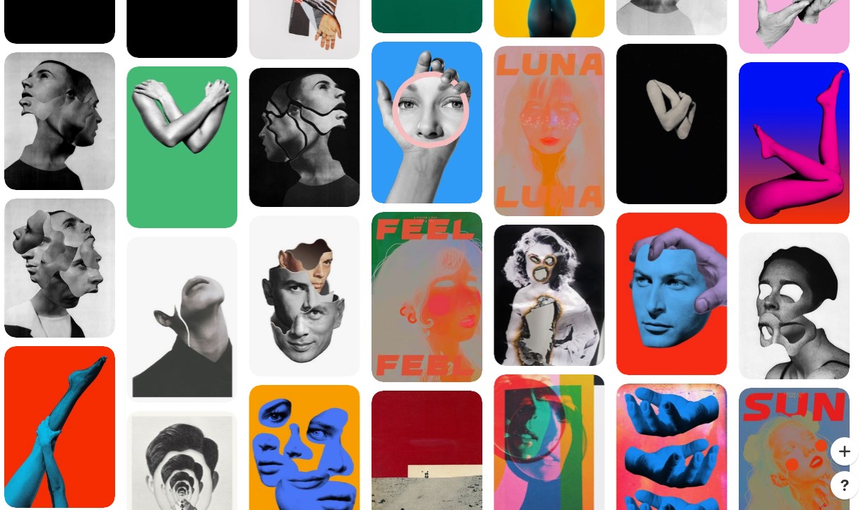
Tyler Spangler
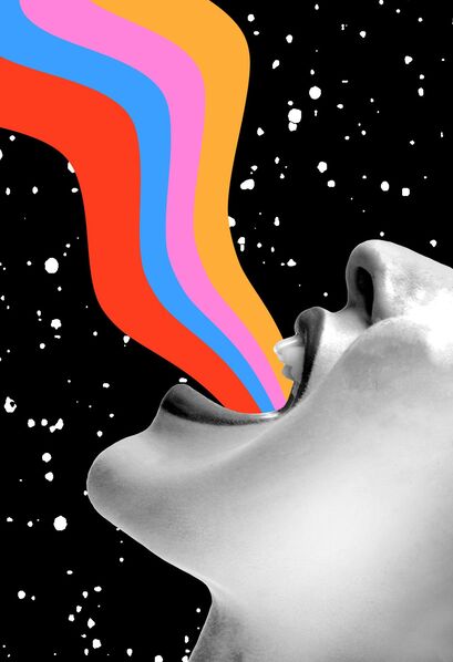
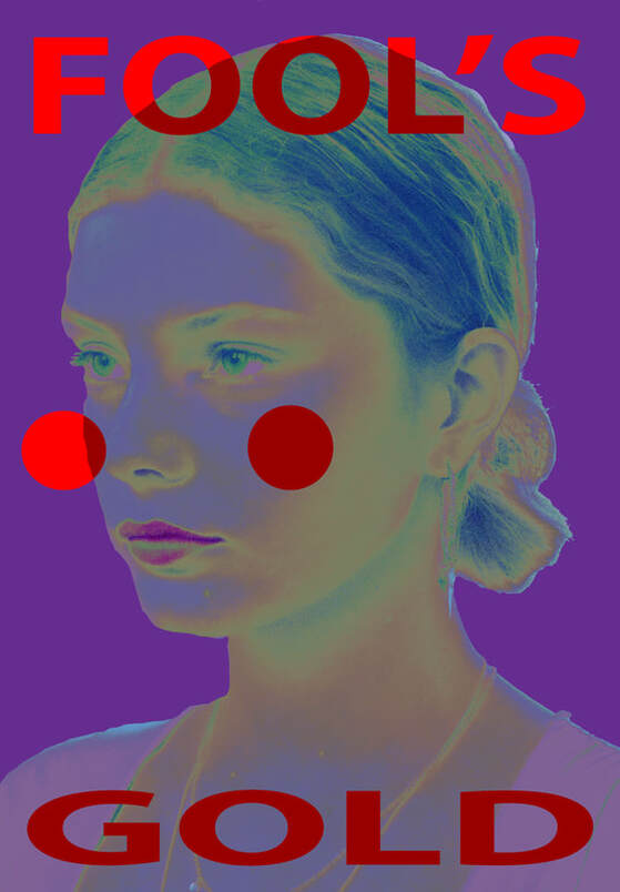
I think the alignment of this photo is important, the position of the photograph tells the story. Additionally the position and shape of the colour flowing from the mouth appears to be either a scream or a shout. On one hand the joyful colours and flowing shapes can suggest happiness. But this contrasts with the positioning of the face as it seems to be a powerful shout in the way her head is thrown back. Additionally the deep black background reminds me of space with the sharp white spots .
|
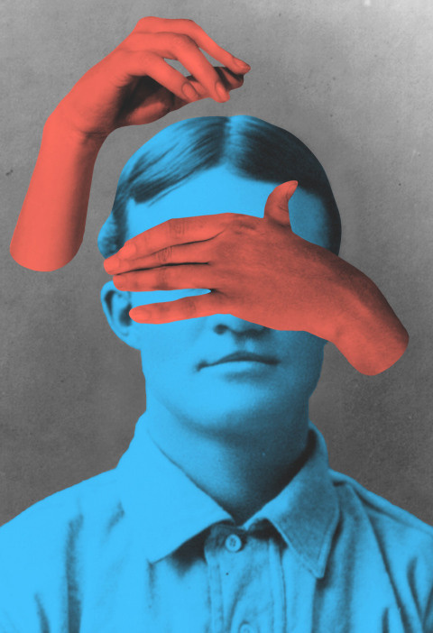
In this image no block colour is used. This is very unusual for Sprangler, instead in this image he just adjust the colour in the originally back and white image to be a shaded primary colour. The red and blue are primary colours and very simplistic. But the positioning of the two cut out hands are interesting. They are not from the original image but they do fit in, The positioning suggest a concealed emotion and the colour used, red, connects to anger.
|
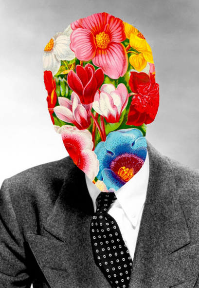
This image does not use any single colour. Instead a floral pattern is used, again with the bright, vibrant colours that are signature for Sprangler. Instead of as a background this time the collage consumes the man. He is the pattern or maybe is masked by it, either way the aggression of the bright colours link with the concealment of the face, in a ironic way, given the colour choices. This image can both be seen as too obvious and simplistic but also incredibly intelligent in the way it says a lot with very little.
|
Tyler is a digital collage artist from California who uses editing tools to collage bright vivid colours into old black and white images. The images are bright and lively, the contrast between the two styles: grayscale and colour, is beautiful. Additionally the contrast between old and new is eye catching. The faded film photography contrasts with the process of editing the images with now largly advanced technology and creates a sort of whimsical and playful art. Sprangler is a 30 year old artist from the USA and creates a huge number of art pieces. One year he created 2,000 pieces.
He descibes his work as based on very intense themes such as anxiety, vibrance, harmony and contemplation. Before i knew anxiety was a theme for him i wouldn't have guessed but now it seems extreamly clear. The extreme colours stress the mind and the intensity also can show this. The reason he enjoys digital art is both the clean cut of colour and the quickness of it all. With technology the ideas can come to light very quickly. He also describes artwork as a healthy outlet for most disorders. He studied phycology in collage and intended on finishing and working in a mental hospital but then got involved in this art.
He descibes his work as based on very intense themes such as anxiety, vibrance, harmony and contemplation. Before i knew anxiety was a theme for him i wouldn't have guessed but now it seems extreamly clear. The extreme colours stress the mind and the intensity also can show this. The reason he enjoys digital art is both the clean cut of colour and the quickness of it all. With technology the ideas can come to light very quickly. He also describes artwork as a healthy outlet for most disorders. He studied phycology in collage and intended on finishing and working in a mental hospital but then got involved in this art.
1st Response
|
|
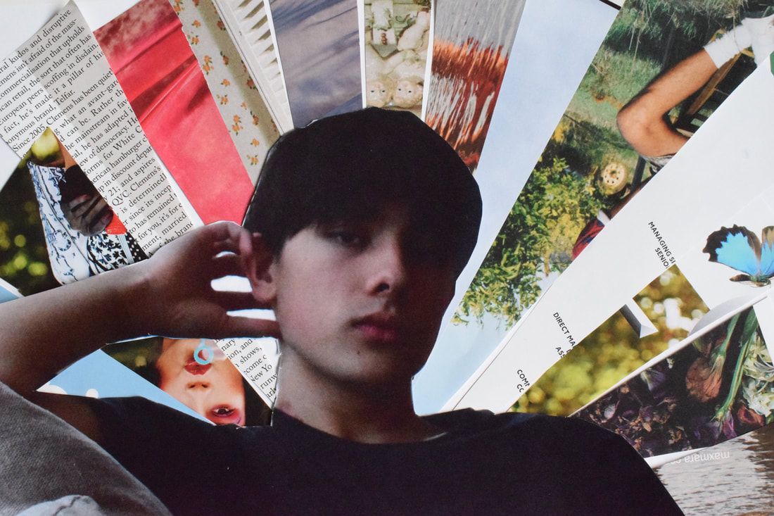
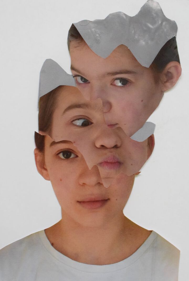
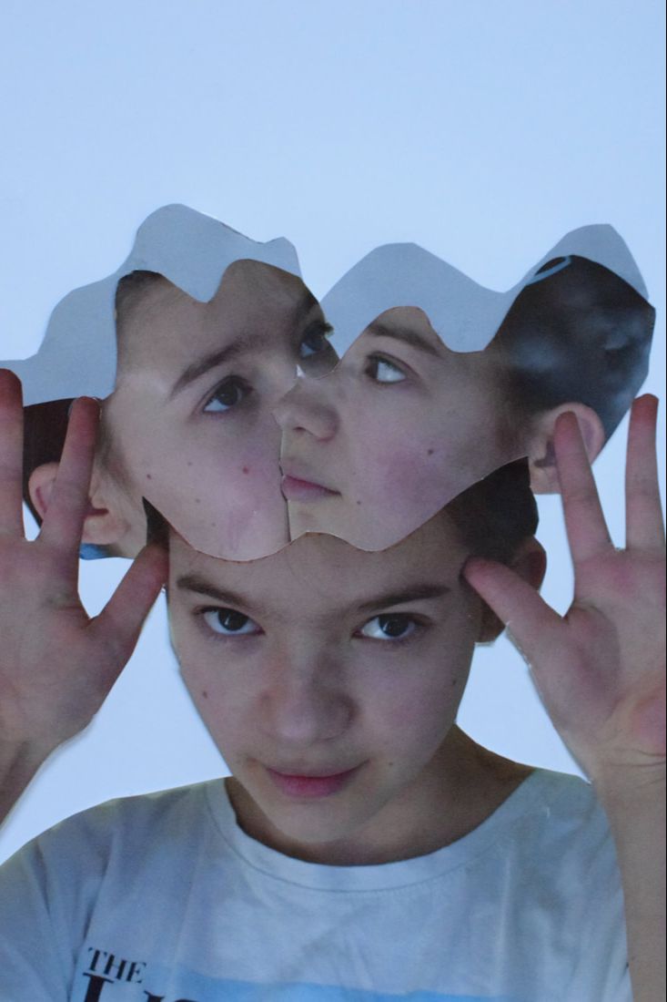
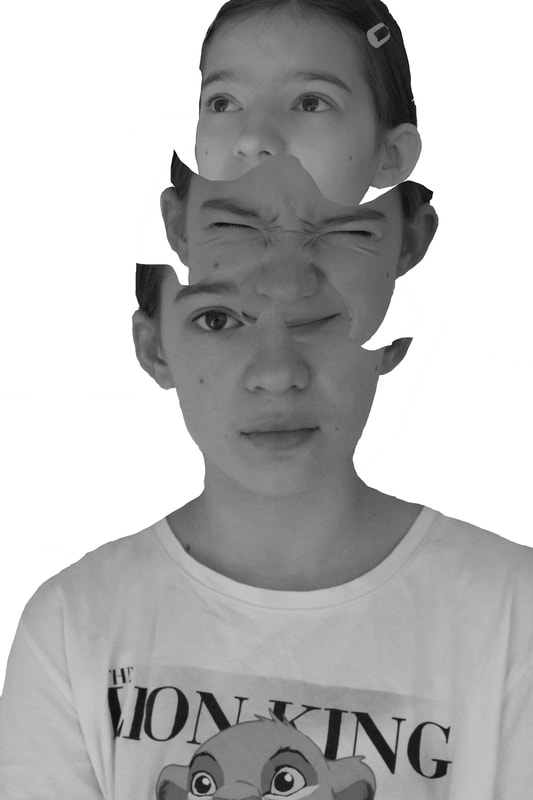
WWW: I like the contrasts in the images and i think it is a good idea to develop on
EBI: I think they could be a lot more precise maybe if i figure out how to do the solely on Photoshop and not on paper they would be be better.
EBI: I think they could be a lot more precise maybe if i figure out how to do the solely on Photoshop and not on paper they would be be better.
2nd response
THE MOODY MIMO
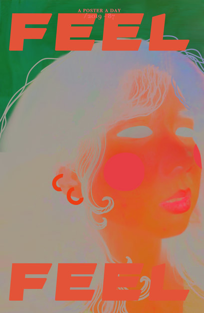
No. 87 - I like how distorted this image has become, the fact that you can tell the shading only in the neck area. The face in the image is almost flattened with a slight outline of the pink lips and a hash contrast of the baby blue eyes ans hair. The choice of the orange, green and baby blue create a beautiful sunset. The block colour of the drawn on piercings and the amplified perfection of the hair draw my eyes and they contrast the subtlety of the lips and photographic aspects.
|
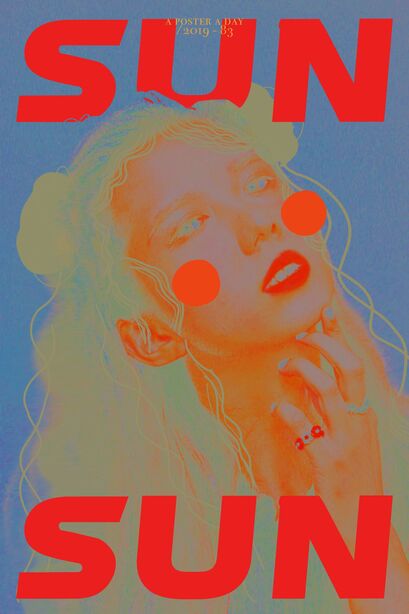
No. 83 - One thing that is consistent in these three images is the circular block colour on the cheeks of the women. In this image I think it is most effective. To begin the blue of the background that bleeds into the shading of her hair, the blue is beautifully cool and travels also to her nails and rings. In contrast the red-orange of the lips is mirrored in the lettering of the image. These colours brings attention to the lips of the woman and the drawn on strands of hair around her neck.
|
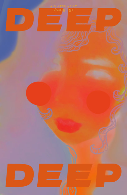
No. 91 - The positioning and closeness of this image is a pivot point of this image. Additionally the use of only two vivid shades creates contrast with reality but also flattens the images. The colours of the skin remind me of In fared lighting images and whilst dong that, entices a feeling of bright hot heat in the editing of this image. This heat is centred around specific parts of the image: lips, cheeks and nose and so draw attention to these sections.
|
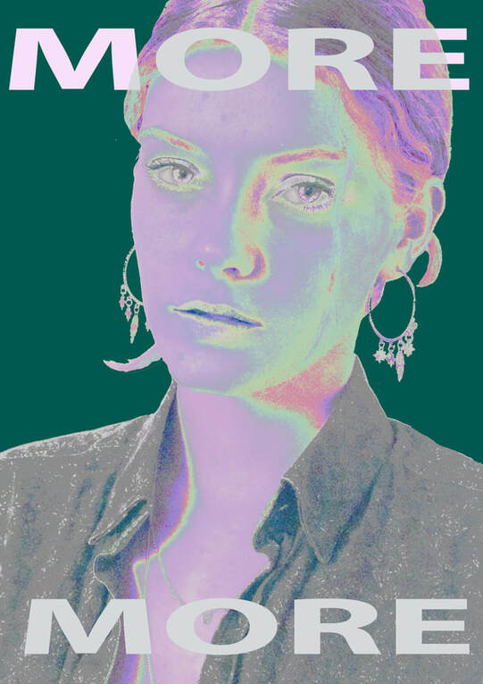
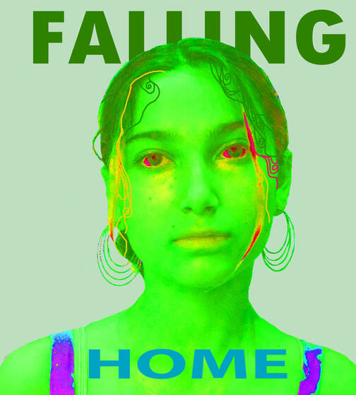
These pieces of digital photography were created by Tom Mimo. She creates a new image every day using editing techniques and images to create posters and magasine covers using extreme colours and contrast. She uses photographs, art techniques and digital editing to create these beautiful images. She is a Japanise-Filipino multimedia artist who describes her work as phychedelic and indie. She seems to have started in 2010 but has continued until 2020.
The extreme levels o colour in her images caught my eye and i love the way they contrast electrically and also go so well together. The effect of combining a highly edited but definatly real photographs and also digital pens and colours that create block colour in contrast to the shading. Additionally the lettering amplaphies the colour contrasts and ties the artwork together.
The extreme levels o colour in her images caught my eye and i love the way they contrast electrically and also go so well together. The effect of combining a highly edited but definatly real photographs and also digital pens and colours that create block colour in contrast to the shading. Additionally the lettering amplaphies the colour contrasts and ties the artwork together.
|
|
|
|
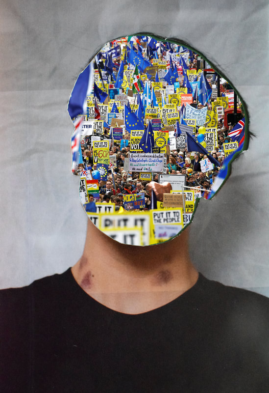
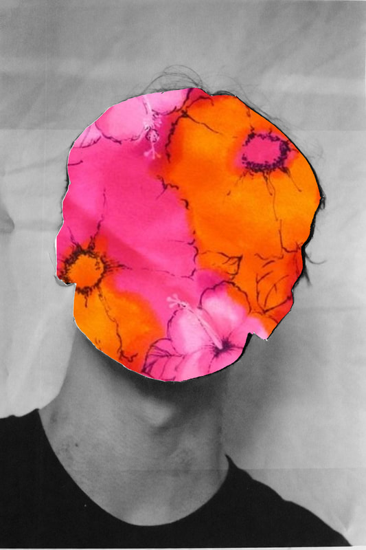
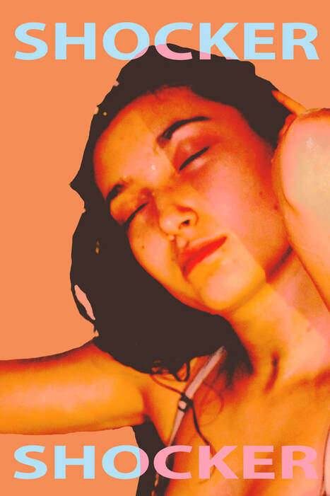
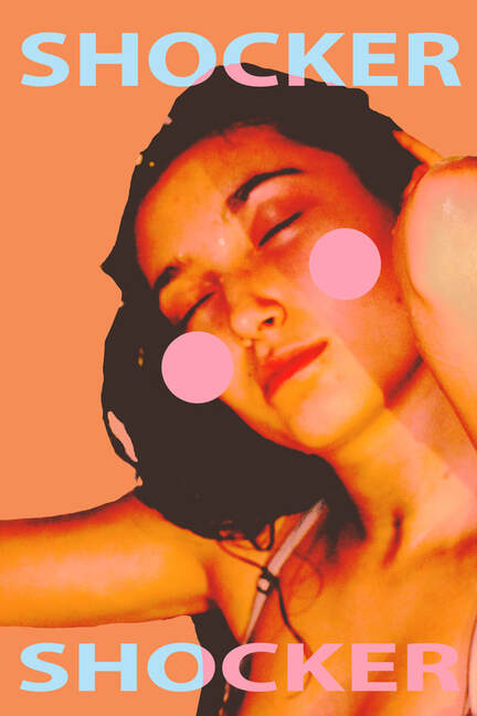
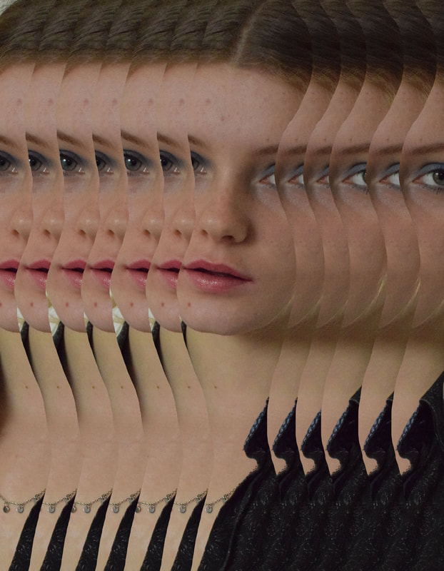
WWW: I like the extreme nature of these images, I have never really done anything like this and they ended up quite well. They are quite striking in a poster type way and i learnt a lot about Photoshop while making them.
EBI: Sometimes the look a little bit basic and not as whimsical as the link artists work.
EBI: Sometimes the look a little bit basic and not as whimsical as the link artists work.
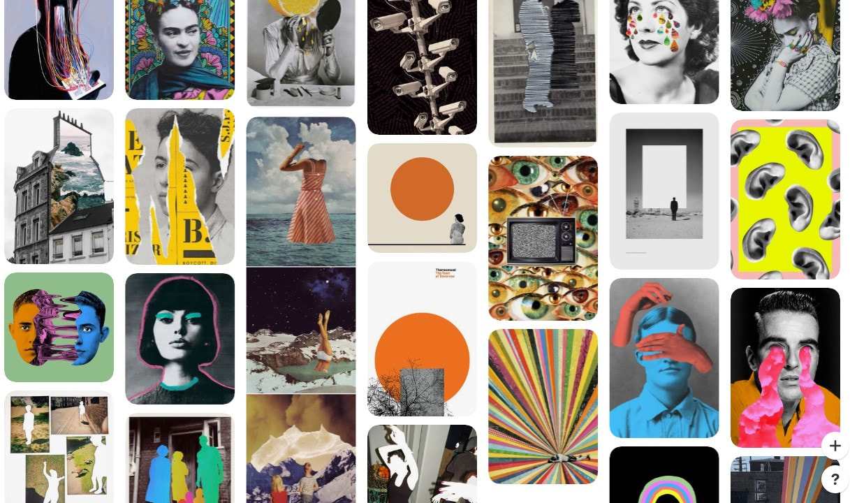
Matthieu Bourel
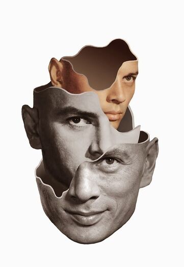
In this image thew focal point is definitely the eyes. In the three collaged portraits the eyes are positioned to meet the viewer in the eye, And it is one part of the face that is not concealed in every photograph. The addition of a gray rim on the edge of each piece adds a 3d element into the art which adds surrealism. Also the change from black and white to colour photography shows progression and the intense shadows and contrast of the middle head creates depth.
|
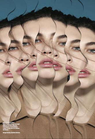
This piece of work is more for commercial or fashion photography. It may be due to this that colour is used, this draws the eye. The layering in this image is beautiful. the flow of the strands of hair, although imperfect, make the eyes travel across the image. Additionally the enlightenment and rosy colour of the models lips create an almost geometric pattern to the image. It carries on Bourel's style of surrealism and collage but with a perpous other then art.
|
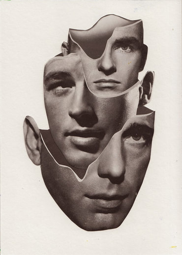
This image has much softer lighting then the other two this creates a dull smooth texture to the layers of images. In addition to the same levels of contrast and black and white ties all three portraits together effectively. The positioning of these images reminds me of a Russian doll of heads and it is both strange and interesting. Also the choice of every set of eyes pointing a different way creates the idea of three minds working together.
|
Bourel is a German artist who creates beautiful images by collaging vintage portraits into artwork. These images although reality cast a surrealist theme in the art, they don't create a clear portrait but instead each curve of an eye or eyebrow or nose fits into a similar shape. This creates an eerie feel in these portraits like something out of a dream. The puzzel pieces are fitted together so perfectly, so they flow effortlessly and it is hard to imagine them being appart, or full.
His collages are created in a number of ways: traditional, digital and editing animations that tell the story. The power of these images and combinations create the surrealist image and twist the past and the reality. The elements fall together in an ironic way as to still convay to origenal meaning and flow of the images but also not ever showing the full picture.
His collages are created in a number of ways: traditional, digital and editing animations that tell the story. The power of these images and combinations create the surrealist image and twist the past and the reality. The elements fall together in an ironic way as to still convay to origenal meaning and flow of the images but also not ever showing the full picture.
1st Response
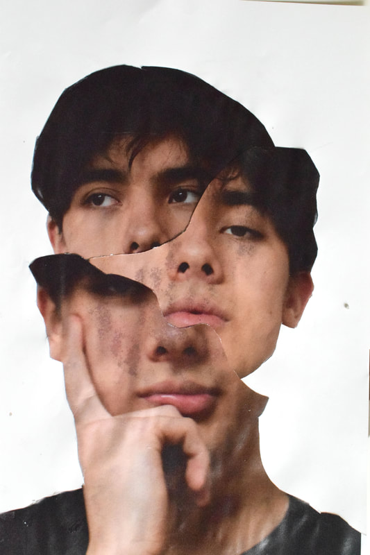
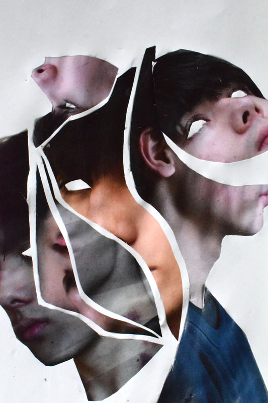
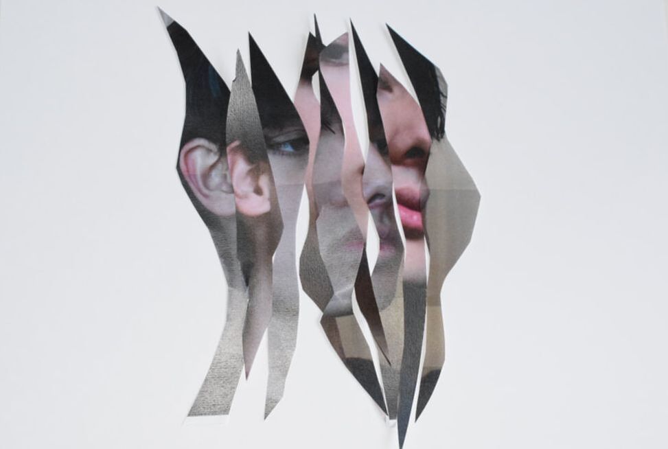
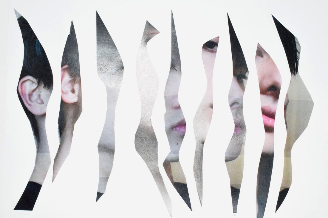
My first idea was to use portraits and cut out the images to take the photos and arrange them.
|
|
|
|
WWW:
EBI:
EBI:
2nd Response
|
|
|
|
|
WWW:
EBI:
EBI:
Elena Oganesyan
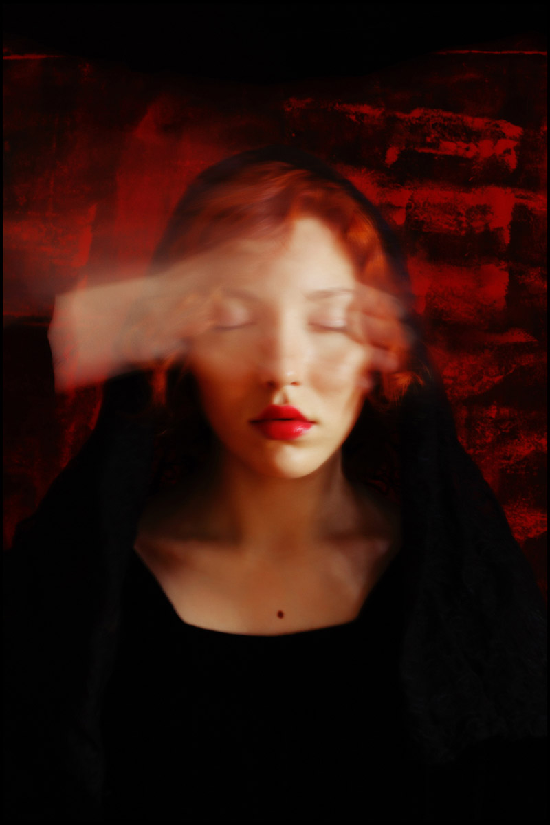
In this image she uses colour to show the intensity of this image. It is bathed in warm light unlike many of her works and red is a very prominent colour in the image. The intensity of the red in the lips, hair and background connotes anger and love. The translucency of the hand shows an attempt to hide her face and creates a wispy veil over her eyes. She is dressed in black, which contrasts the red as both being very passionate and intense colours with lots of depth.
|
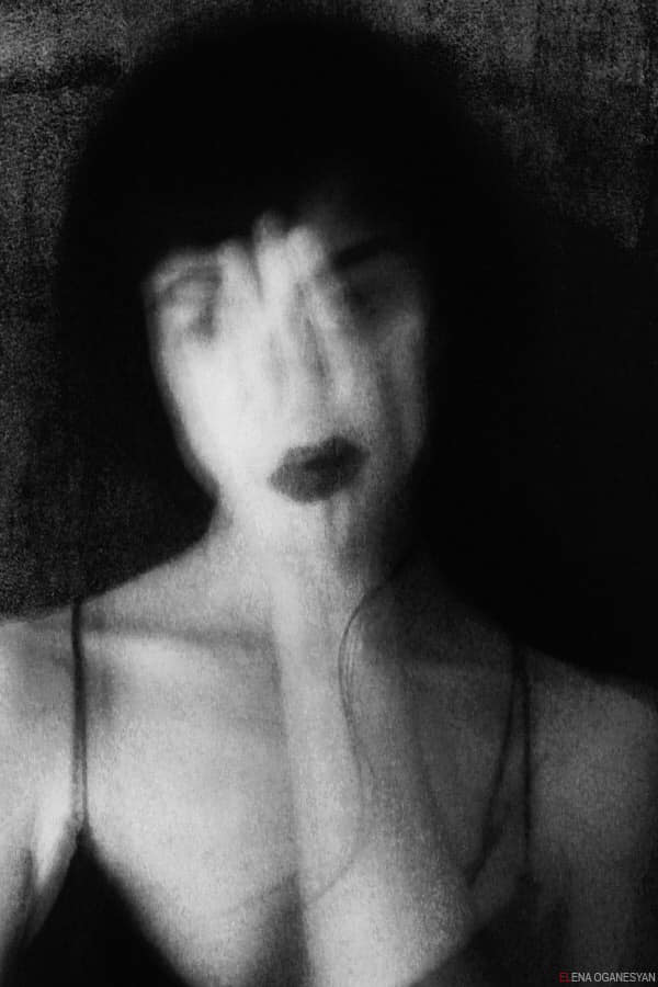
This image is part of the Venus Garden series and is called Nameless. The contrast in this image draws my eye, by the colours being removed it really defines the contrast in the pale almost translucent skin and ark vest, lips and hair. The image is slightly surreal as the hand placed over her face obscures everything but the outline of dark lips that are above. A whisper of the eyes and eyebrows can be see that just elude to the face behind the image. The use of long exposure in this image tells the emotive story and also creates texture in the images.
|
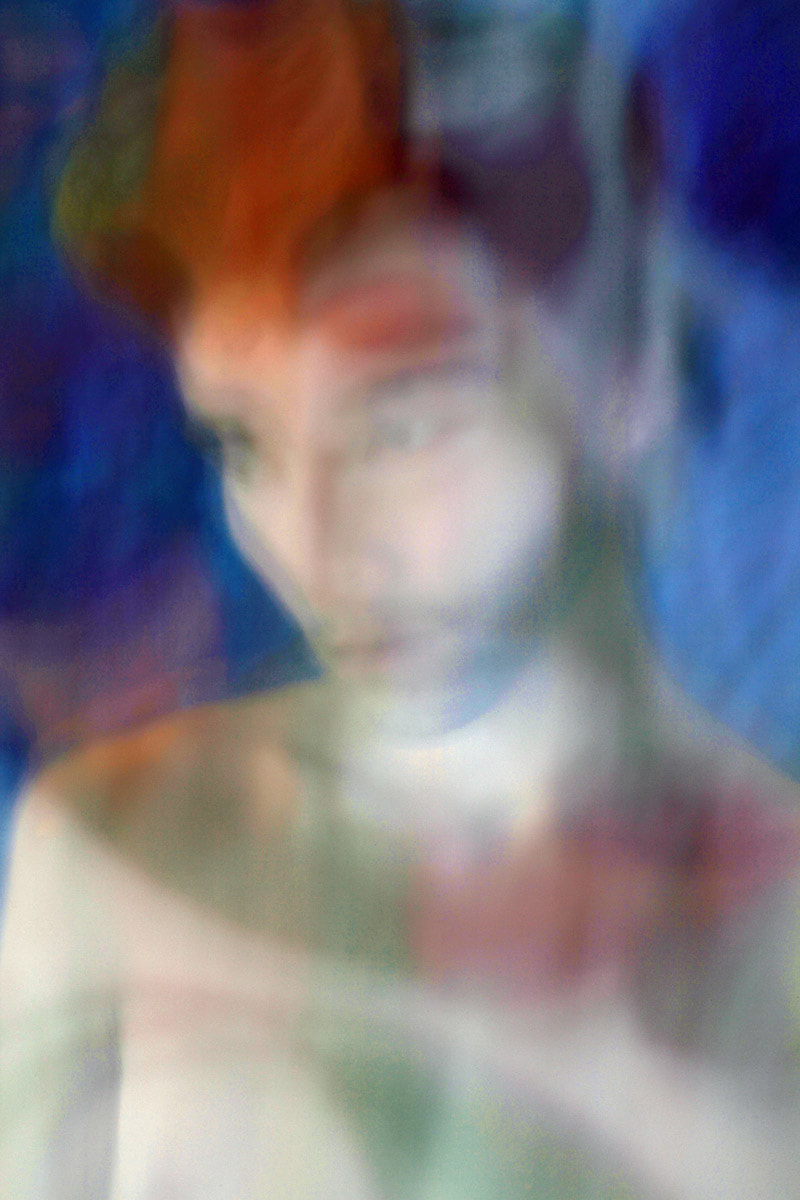
This image is from the Obsessed with the Moon series. The movement in this image creates a glow for the man. The vibrant reds, greens and blues are very surreal and almost alien to me. The colours and soft veil of past movements reminds me of the light streaming out of stained glass. The long exposure and low contrast create an ethereal image. The placing of the eyes could put them in the centre of attention however the mist of past movement hides them partially and creates mystery in the image.
|
Oganesyan was born in 1979 in Moscow, she uses her artwork to talk about fear and desire, two subjects that are not readily talked about. She uses photography and long exposure to express this instead of telling a more literal story. She lights her work with natural daylight and only uses a digital camera.
She likes to think of her images as capturing the moment that light hits the body and that the artwork that this creates is not really in her control but rather is created by the experience. She wants to capture the experiences and fragments of life in her three current series' “Venus Garden”, “Inside the Abyss” and “Obsessed with the Moon”. But she also likes to think of her pieces as a larger work that she is always adding to. She is self taught and a self-professed photography addict for her emotional rescue.
She likes to think of her images as capturing the moment that light hits the body and that the artwork that this creates is not really in her control but rather is created by the experience. She wants to capture the experiences and fragments of life in her three current series' “Venus Garden”, “Inside the Abyss” and “Obsessed with the Moon”. But she also likes to think of her pieces as a larger work that she is always adding to. She is self taught and a self-professed photography addict for her emotional rescue.
|
|
2nd response
|
|
3rd response
|
|
|
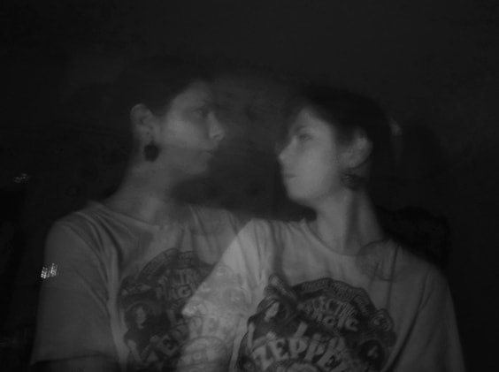
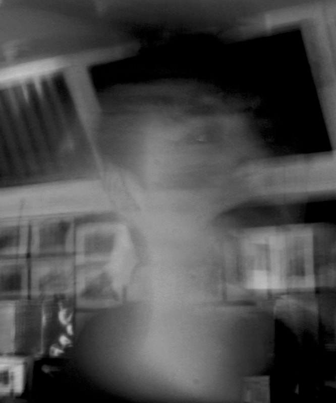
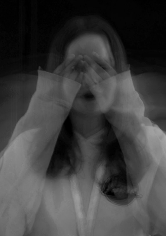
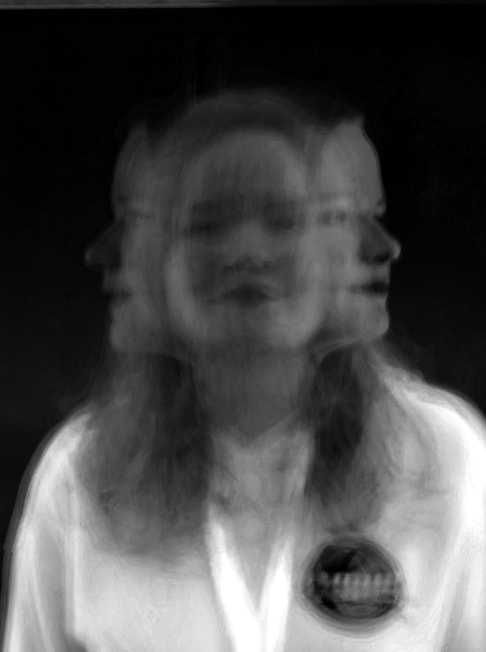
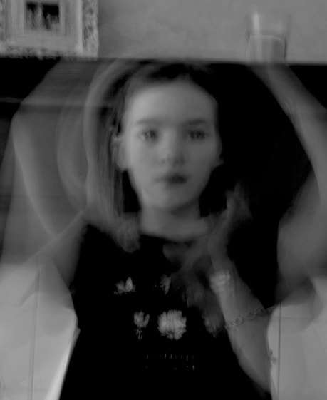
WWW: I like how ghostly these images look, it reminds me of the link artist which is good. The movement of the hands create mystery and I like how clear the images came out despite using long exposure.
EBI: I would like to expose more ideas and maybe try and get a clear image with maybe some more intense lighting to draw out the edges.
EBI: I would like to expose more ideas and maybe try and get a clear image with maybe some more intense lighting to draw out the edges.
4th response
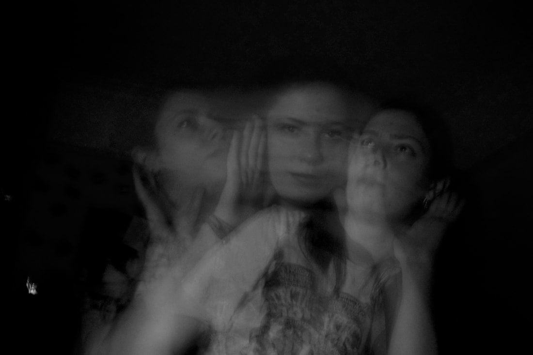
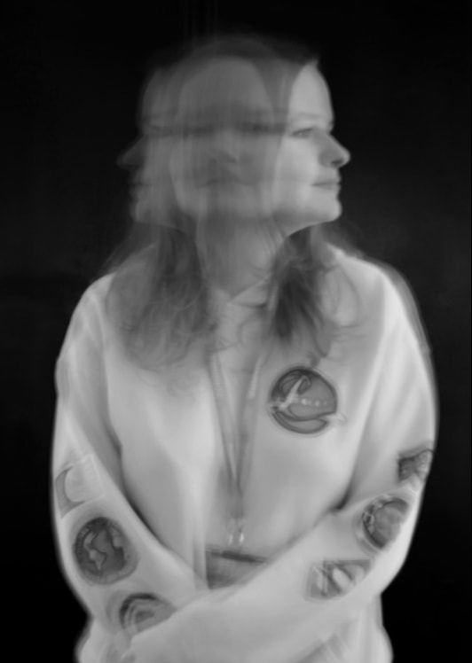
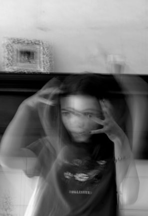
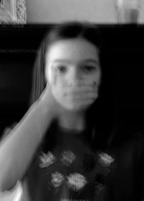
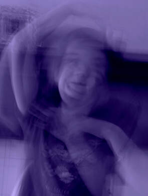
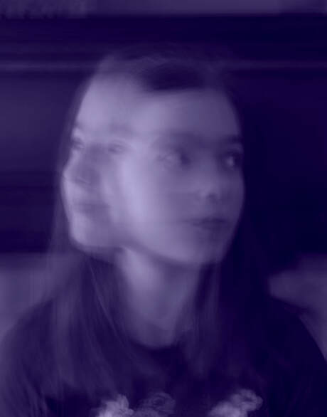
In this response I was trying to expand on my previous response whilst still having fun I though even though I was using long exposure and harsh lighting my images were still a bit boring. I did this by mixing up the movements and when I was editing since i have so much new free time i spent some time working with colour like in Organesayans original Obsessed with the moon series.
|
|
|
|
|
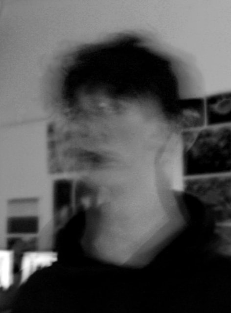
WWW: I like my images because they were pretty fun to take and i expanded on my knowledge on lighting in long exposure images.
EBI: i would like a clearer image so i might try and make an at home camera stand.
EBI: i would like a clearer image so i might try and make an at home camera stand.
bill brant
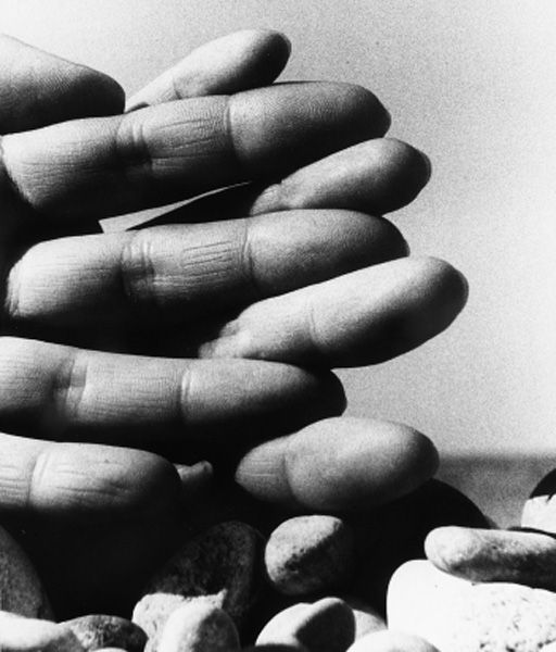
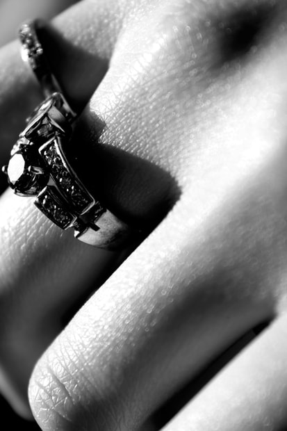
I like the clever ideas behind the image, I like that it looks a little like the pebbles underneath the fingers. The high contrast between the edge of the fingers and the sky makes them the focal point and draws attention.
|
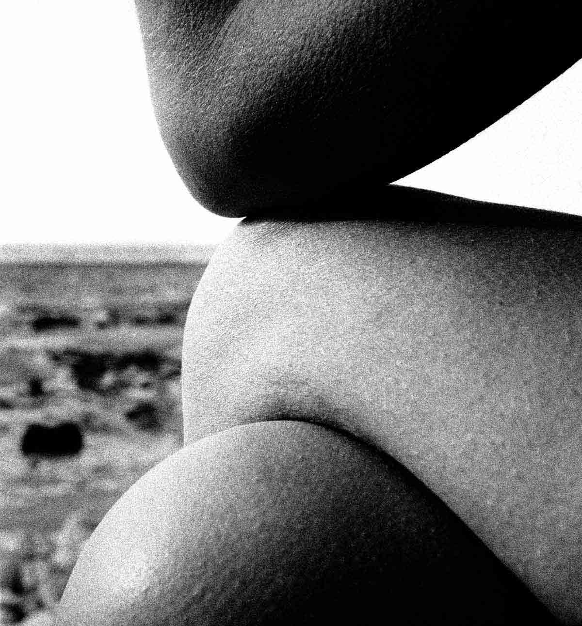
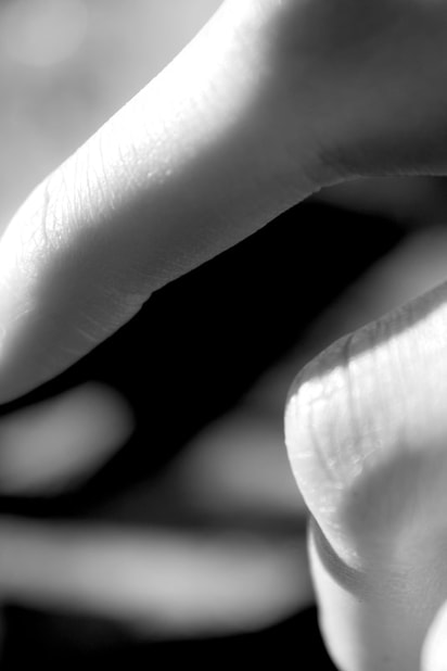
This image uses surrealism to create interest in the abstract nde. The curves of the edges of the arms and legs create the image of a cave or cliff on the cost. Additionally the goosebumps give the skin texture and create a natural look.
|
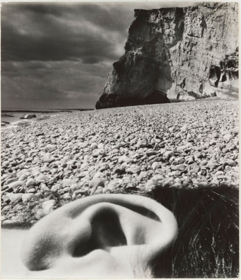
The ear in this image is beautifully abstract the depth an contrast link to the areas of shade in the cliff face and so like the foreground and background of the image.
|
Bill Brant was a German photographer born in 1904 in Hamburg that lived in England. He was a photographer of the British life and also a photojournalist. He began when she was sent to Sweden for treatment of terberculosis where he picked it up as a hobby, he became one of the most important and influential photographers of the 20th century. As he grew up in Germany through the rise of the nazis he disowned his past, often claiming to be born in South London. He began documenting British daily life in the 1930's and during WW2 he was the staff photographer I the British Home Office. He created two books English at Home and A night in London published in 1932.
IN addition Brant created a series of Abstract nudes which idealised the human form with out its personal attachment but more as an object. He made them statues and natural elements such as mountains and rocks. I love his images as they take me back to what the human form is instead of what we project onto it, it reminds me of the functionality of the body instead of the aesthetics.
IN addition Brant created a series of Abstract nudes which idealised the human form with out its personal attachment but more as an object. He made them statues and natural elements such as mountains and rocks. I love his images as they take me back to what the human form is instead of what we project onto it, it reminds me of the functionality of the body instead of the aesthetics.
1st response
|
|
|
|
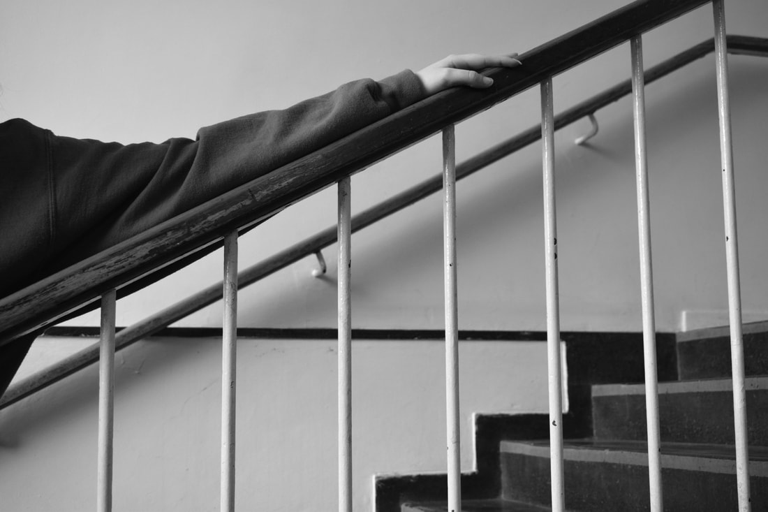
WWW: I like the contrast in the lighting of these images, and the clarity of the images.
EBI: I want to try and make some more abstract images .
EBI: I want to try and make some more abstract images .
2nd response
|
|
3rd response
|
|
|
|
|
|
|
|
|
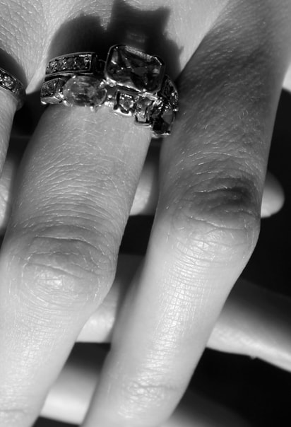
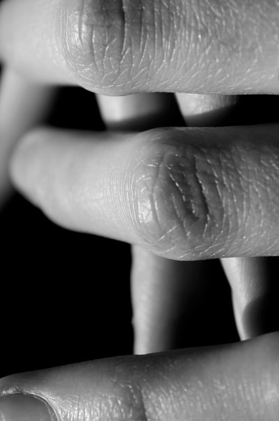
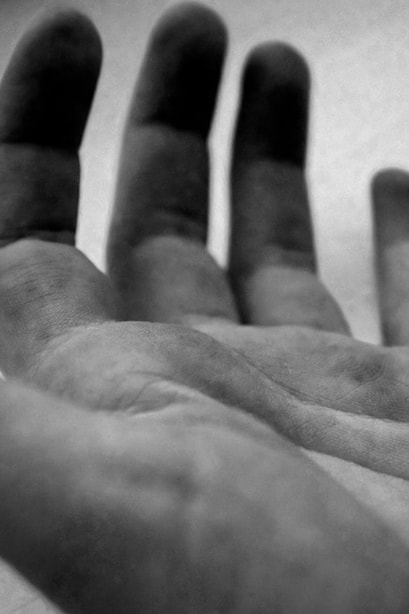
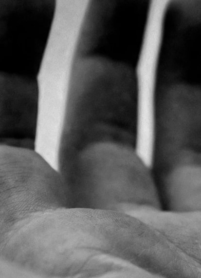
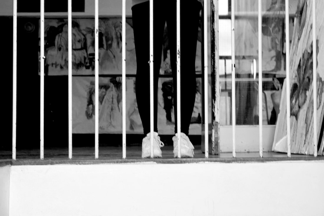
WWW: I like how the texture of the hands look and I think that the contrast looks quite good.
EBI:The texture is a bit grainy and I think that I could do something more interesting with different body parts in some different areas.
EBI:The texture is a bit grainy and I think that I could do something more interesting with different body parts in some different areas.
4th response
|
|
|
|
WWW:
EBI:
EBI:
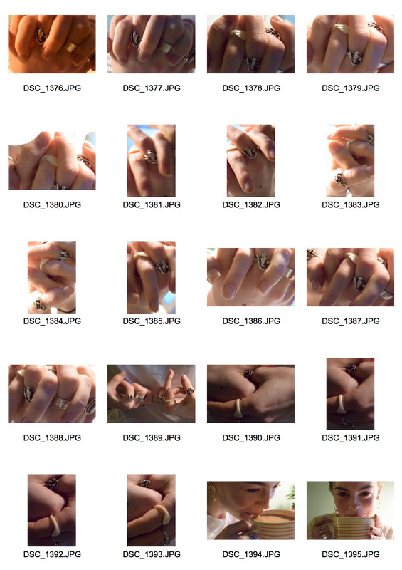
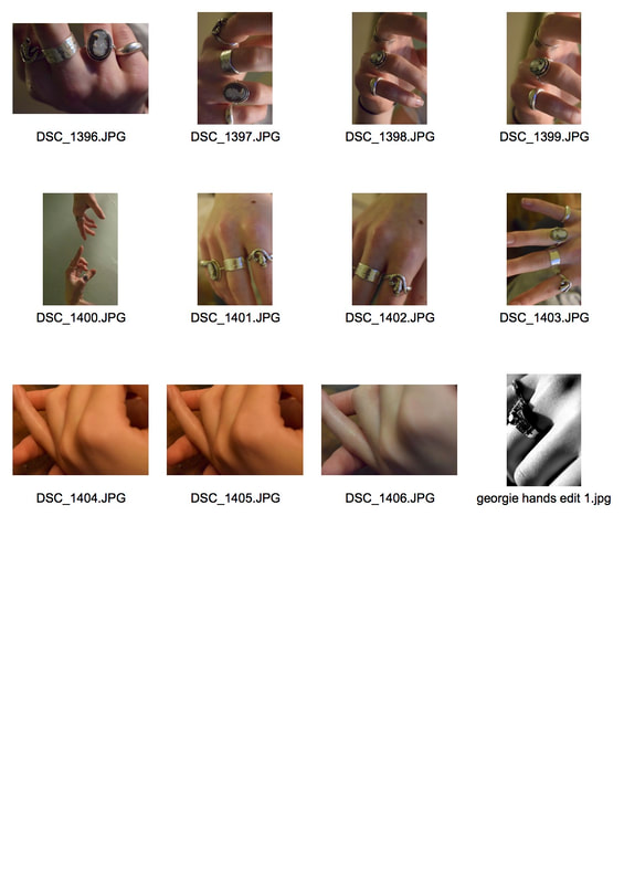
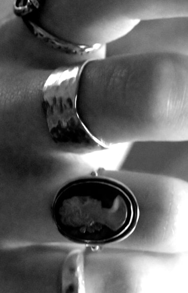
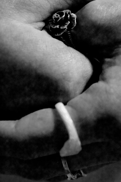
5th Response
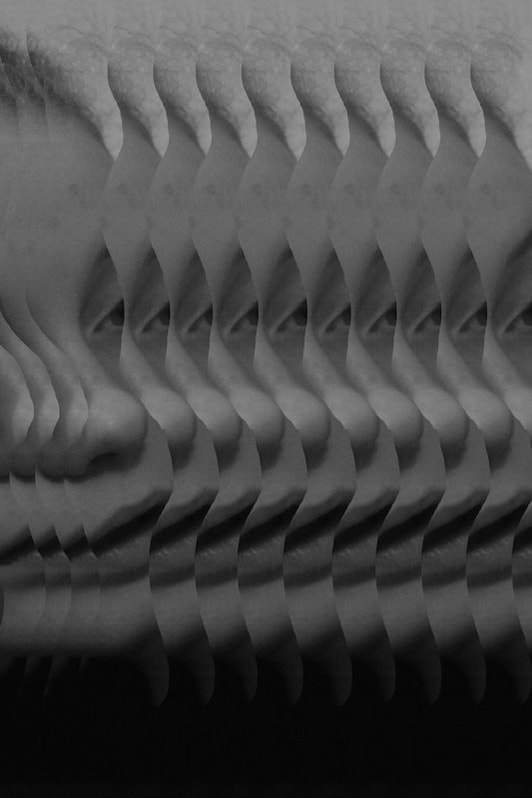
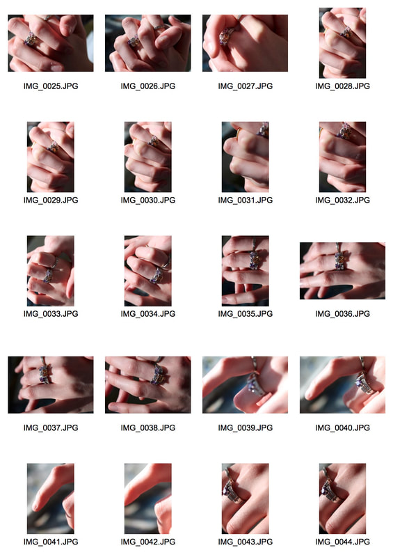
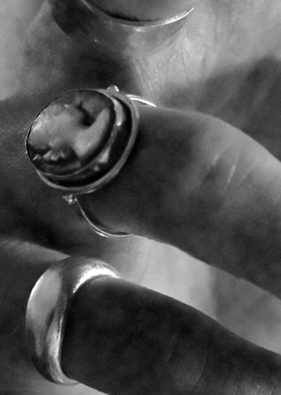
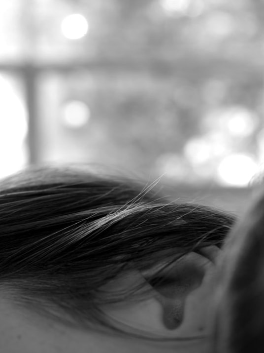
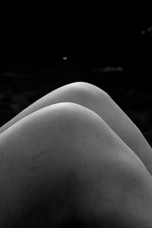
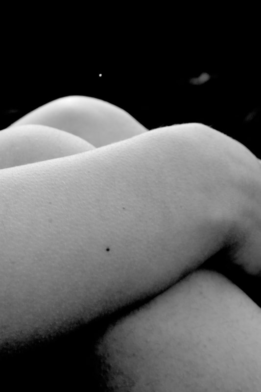
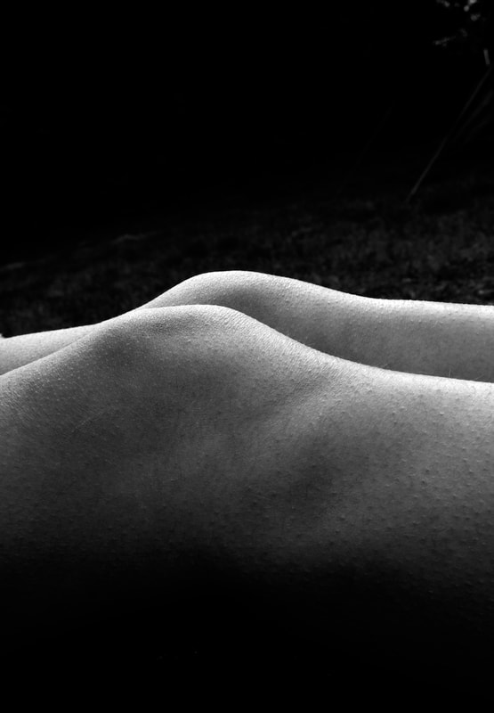
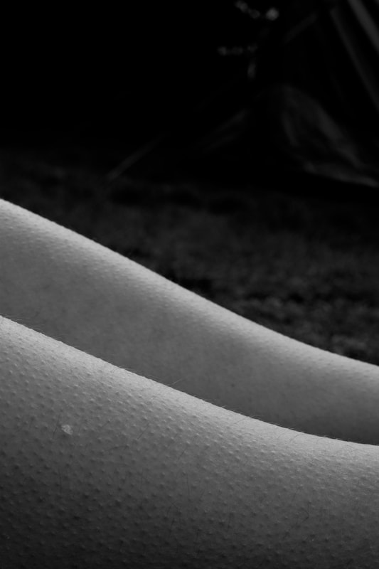
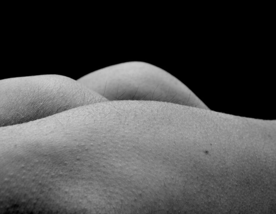
In this response i really really wanted to expand into more parts of the body. I was aiming for a more abstract image in the style of Bill brant which would hopefully mirror natural scenery and really be different then what you usually see of images of the body. I also wanted to take the images with a large aperture and harsh lighting to really exagerate the images and make them striking.
Additionally if possible i waned to include the textures of skin. I think it would be really interesting with the harsh lighting. Things like lumps and bumps and hair and moles could be really interesting with such a up close style of photography.
Additionally if possible i waned to include the textures of skin. I think it would be really interesting with the harsh lighting. Things like lumps and bumps and hair and moles could be really interesting with such a up close style of photography.
|
|
|
|
|
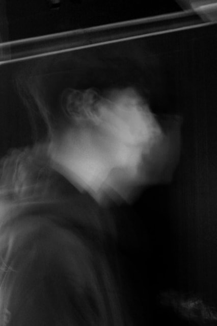
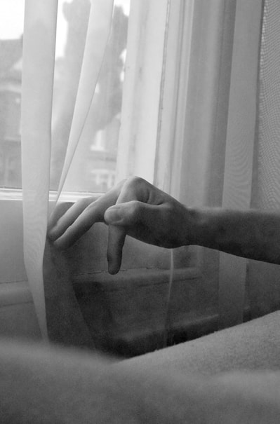
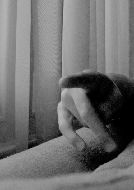
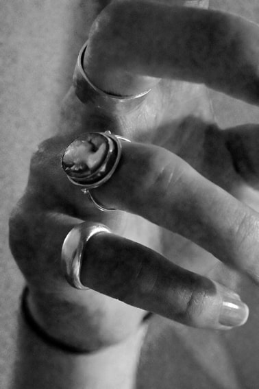
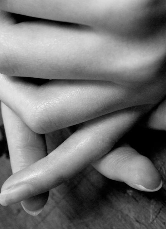
WWW: I like the harsh lighting and the high contrast in the images, I think it creates a dramatic image that is quite beautiful. I really took time to think of the layers of the arms and legs to make an abstract image. I love the flow of the images. It really draws my eye.
EBI: I would like to take more images with more natural backgrounds.
EBI: I would like to take more images with more natural backgrounds.
